UI

In order to do a third round of user testing, I designed two questionnaires to recruit the most appropriate users and to get some quantitative data on how people value the interactions. As my product aims to meet the needs of two very different users, I made two surveys, one for physical therapists, and one for end users. Below is a sample of some of the questions I asked and their responses. 

I got to meet with five people to do card sorting, three physical therapists and two end users. 

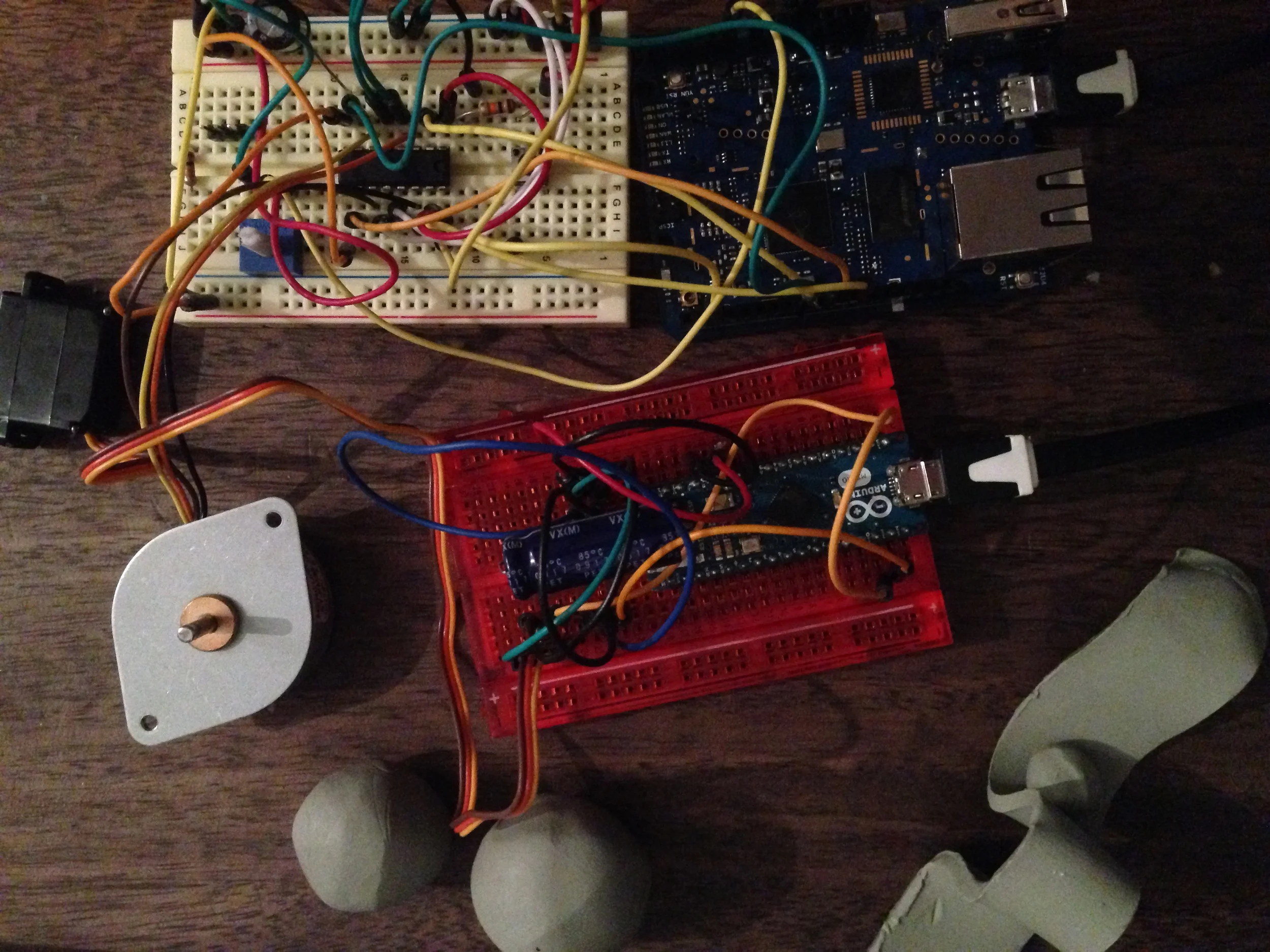
With some quick props that I had in handy (a metal rod, cardboard, two light bulbs, and a "computer" simulated by a person), I was able to in a couple of minutes build a paper prototype of my product, and test it quite efficiently with six users. 

The back and forth motion was simulated by rotating the metal rod, resulting in a "Wizard of Oz Prototype". After writing a script for the user test, I took them through the following scenarios. 


Scenario A

User gets introduced to the product step by step in order to minimize bias and gauge the affordance of the product. 

Central questions: How does the product feel? How anthropocentric is the product to the user? Is it motivating? 

  • What is your first impression of this object? What do you think this object is/how would you use it? [device is moved back and forth by Computer]
  • [User is given the product description and user scenario, then performs the exercises.]
  • How did that feel? Why?  
  • How would you compare this to performing the exercise with a regular weight? Why?
  • How did the movement of the object influence the experience? Why? 


Scenario B

User goes “back in time” to see how their performance compared to three weeks ago.

Central questions: Is this comparison rewarding to the user? How well is the user able read to the data? What is the-signal-to-noise-ratio?

  • You now want to see how well you have progressed, how would you imagine the object could convey this?
  • I would now like you to pretend that you want to know about your progress. What would you do with the object? Why? 
  • [Describe:] By dialing the knob a few steps back, the device will replay your exercise from that time. The object will shake with frustration when you experienced pain. [Activity might be repeated if user had a faulty conceptual model of use] What did you think about this as an indication of your progress? Why? Why? Why?
  • What are some other things that you noticed? Why? 


Scenario C

The device does not shut off it’s lights at the end of the day when the user is ready to go to bed.

Central question: What does the user do in this scenario?

  • As an ambient light, this object turns on each morning and will not shut off it’s light until you have performed your set amount of exercises for the day. Where would you place it in your home? Why? 
  • Now I want you to imagine you just got home and you have forgotten to perform your last set for the day. You are ready to go to bed, and it reminds you by not switching its light off. What would you do? Why? 
  • How do you feel about this functionality? Why? 


Pattern Analysis / Key Takeaways 

  • All of our six participants agreed that the movement of the device was helpful as an indication of progress, although questions about readability where brought up. People where unsure of how the movement was mapped in relation to the movement of the arm, but conversations alluded to this being easily clarified if the user was introduced to the product with a physical therapist that would calibrate it with them.
  • Five out of six people wanted to turn the light off in Scenario C, so maybe this could be considered for future designs. Unplugging the device instead of using a button might prevent the user to switch it off as it would constrain the use of the object.
  • The incandescent bulbs where too bright and although effective for quick testing, users did get distracted by the light intensity. 

The above findings where synthesized from the notes taken during the user test, which can be found here

Look & Feel Prototype

The aim of the following prototype was to get a sense for how the mechanics could potentially feel with the given materials. 

Finalizing the form and UX flow

I have reached a point where I have decided to take a certain direction with the form and interaction, although details will still need to be tested and improved with prototypes going forth. Below you can see my initial sketches of what I imagined the most important user interactions to be like. For a more detailed description, scroll down for a task analysis. 

At first I imagined the rotation of the device to give you feedback regarding your form, and the light to give you feedback regarding your timing. However, since the wearable would give you real-time feedback regarding form, I decided it would be more useful to use the rotation of the device as an indication of your overall progress. This way, I am able to slightly gamify the experience as well as letting the user know how well they have performed and if they have that day moved closer or further away from their goal. The goal of each day is to have the device switch off it's light. 

Below you can see a quick look and feel prototype. Things I need to consider for the future is how the lighting can play a more integral part in the piece, and how some real-time movement can be added for the user to create a more intimate bond with the object. I aim to further my designs this upcoming week. Central questions I am asking myself at the moment are: 

  • Which size is the most gratifying? 
  • Which graphic display is the most gratifying and has the best mapping? 
  • Would sound help to amplify the experience and physical progress? 
  • Would color of light help to amplify the experience and physical progress

Task Analysis: Physical (numbered in bold) and cognitive (listed below each step): 

Pre-purchase

1. User is recommended to use product by physical therapist due to a certain condition. 

  • User questions the efficiency of the device and asks for customer reviews. 
  • User questions the price point of the product and evaluates the cost benefit of the product. 
  • User questions if the product meets accessibility requirements according to their needs. 
  • User questions where to place the device in their home. 
  • User is excited to use the product as they believe it could help them stay on track and get better quicker, and the product appears fun to use due to the aesthetic usability effect. 

2. User decides to purchase the product, and user and physical therapist together come up with a rehabilitation plan and calibrate the device. 

  • Exercises are tested with the wearable. 
  • User is skeptical towards the product due to unfamiliarity with technology. 
  • User does not have a smartphone. 
  • User does not want to learn how to interact with the product. 

3. User gets to customize device according to set parameters. 

  • User is excited to choose color and graphical elements. 
  • User gets to decide how the device reacts in certain set circumstances.

4. User takes product home. 

  • User gets the device delivered to their home, but is not happy about the additional cost. 
  • User takes product home with the help of a friend. 
  • User takes product home themselves, but finds it to be difficult to carry. 

Chronological tasks

5. User sets alarm through app. 

  • User is able to set a wake up schedule for their week. 
  • User does not want to set a wake-up time. 

6. User wakes up by gradual light. 

  • User is reminded of their injury, surgery or physical condition. 

7. User puts on wearable for the day. 

  • User does not think it matches their outfit. 
  • User forgets to put device on. 

Non-chronological tasks

8. User pushes button on wearable to activate tracking and performs their routine with visual and haptic feedback. 

  • User is confused by the feedback system. 
  • User is nicely guided by the feedback system.

9. User is able to get a sense of the status of their overall recovery plan and performance by glancing at the device. 

  • The device’s rotation and light intensity is a successful indicator of the user’s physical status in relation to their recovery plan. 

10. User is reminded to perform their exercises by their caretaker, housemate or partner.

  • User receives text message or phone call.
  • User receives verbal and/or physical reminder.

11. User is reminded to perform their exercises by the device or wearable. 

  • Device moves when user is near as an indication of exercises needed to be performed. 
  • Wearable gives haptic feedback to remind user to perform exercises. 

12. User gets positive encouragement by their caretaker, housemate or partner. 

  • User receives text message or phone call.
  • User receives verbal and/or physical reminder.

13. User gets positive encouragement by the device. 

  • Device moves as an indication of exercises performed well. 

14. User gets negative feedback by the device. 

  • Device moves as an indication of exercises performed poorly. 

16. User forgets to perform the exercises at the end of the day and is reminded by the device through light. 

  • User is encouraged and gratified that the device reminded them of this, and performs their routine on the spot. 
  • User is tired and wishes that the device had reminded them earlier, so user ignores prompt and falls asleep with the light on. 
  • User is irritated and disappointed, and so does not perform the exercises and either moves the device or falls asleep elsewhere. 


Prototypes / Demo Day

The aim of these prototypes are to determine the final form of the product. These are general directions in which a visual language and feedback system could be further developed. Additional signifiers could be added and amplified, but part of the challenge here is to give the user just enough information so that it stays abstract and doesn't become an annoyance. 

The following is a simple exploration of balance through motion. 

  1. If the user has done well; it rotates and lands on the white side.
  2. If the user had not done well; it rotates and lands on the black side.
  3. If the user is right on track; the circle is perfectly balanced. 


The one below takes the route of a more anthropomorphic form, inspired by the actual deconstruction and construction your body goes through. This one also explores balance through form rather than motion. 

  1. If the user has done well; the form is more positive and expands vertically. 
  2. If the user had not done well; the form deconstructs and contracts vertically. 
  3. If the user is right on track; the circle is perfect. 

This one explores how a physical data visualization system could emerge from balance. How could different positioning of the ball into pockets signify progress at different stages? How could the ball in motion be perceived as rewarding, anthropomorphic or engaging? 

  1. If the user has done well; the ball rolls to the rightmost pockets. 
  2. If the user had not done well; the ball rolls to the leftmost pockets. 
  3. If the user is right on track; the ball is balanced in the middle. 


Demo Day 

(Parsons, Feb 19th)

I wanted to synthesize the feedback I got from demoing my most previous prototypes. These where the most interesting points that I would like to consider for the final outcome: 

  • The idea of a physical data visualization was well received.
  • Desk lamp that also gives you information was liked, as long as not the product looses it's utility.
  • Desk toys where brought up as a reference. 
  • The product needs to amplify physical progress in a positive manner. 
  • Methodology was well understood. 
  • The idea of balance in conjunction with health and motivation was well received. 
  • Using light was well received, if used as an environmental signifier. 
  • How can I balance it not being in the way and still you not noticing it after a while? 
  • Conversations highlighted the signifiers that would result when a user had not done well. 

Pareidolia

All art attempts to project emotion, but certain art has another more human quality that is just subtle enough. Pareidolia is the effect we experience when we think that we see a face in a could formation. The quote below by David Hume, an 18th Century Philosopher, explains it beautifully: 

"There is a universal tendency among mankind to conceive of all beings like themselves, and to transfer to every object, those qualitites, with which they are familiarly acquainted, and of which they are intimately conscious. We find human faces in the moon, armies in the clouds; and by a natural propensity, if not corrected by experience and reflection, ascribe malice or good will to every thing, that hurts or pleases us".

I am looking for this kind of emotive art as inspiration for my sculpture, as I want it to have certain qualities that make you feel companionship without going too much into anthropomorphism and staying far away from the Uncanny Valley. Below are a few examples that I find particularly relevant to my design. 

Tackle the Truth with Comedy

A lot of the stigma around disability and growing old clearly stems from our fear of death. I was watching Louie CK the other night, and some of his jokes clearly highlight the dark truth of the healthcare system. Comedy is a great way of tackling these things, which reminds me how important it is that I include a playful element in my designs. 

Senior Style & Inclusive Design

A few weeks ago I attended an event at the Cooper Hewitt Smithsonian Design Museum called "Inclusive Design: Myth or Reality?". The event featured talks by John Marshall, design director at MAP, the industrial design firm that created the Sabi bathroom range. Below you see how it is designed to be esthetically pleasing yet practical in the way it is easily assembled and can serve as a support grip. 

Scott Summit, founder of Summit ID, a firm specializing and revolutionizing the way prosthetics are made through 3D manufacturing was also there, amongst many other people that have a true passion to innovate in this field. I was glad I went, as it confirmed much of the strong need for innovation in this field, and how much it is appreciated by those who need it. There was a nice mix in the audience of old and young, disabled and non-disabled, and the appreciation of this type of design was very strong - people could not express enough how much this all meant to them. The conversations confirmed much of what I believe in and also want to reflect in my designs as an artist and designer: 

- The elderly think they are young, and don't want to be treated as old. 

- They don't want us to design with this stigma in mind, that they need to be empowered. 

- The main point is to design for the most common issues, without making it obvious: poor sight, reaching and memory. 

- Make packaging easy to open and instructions in life-size. 

I also met one of the colorful women of the Idiosyncratic Fashionista's, who gave me her business card. I plan to reach out to them in hopes of an interview, as they represent my target audience perfectly in terms of how they carry themselves. My product would only be enjoyed by a person who enjoys art, sculpture and cares about their aesthetic environment.

Although older people don't like to be distinguished in terms of style, there is a certain distinction when it comes to aesthetic preference that is inevitable. Looking through blogs, talking to people and pondering over what this could be, I came to the conclusion that what makes them stand out is a strong inner core that is not afraid to show itself.

Women of that age are confident and therefore more playful - even sculptural - in the way they carry themselves. They are not afraid of death, and therefore not afraid of splashing with color or openly talking about health concerns. However, they feel that they deserve to do so boldly and beautifully. 

Judith, another known blogger names herself Style Crone, and uses her style as a form of meditation: 

"I am always inspired by diversity and individual expression and find inspiration everywhere! I spent most of my career working as a psychiatric nurse in an emergency setting.  I also spent a period of time managing the care of head and spinal cord injuries.  Choosing my outfits, which always included a hat, was a way to express myself creatively and as a form of meditation as I approached my day, which usually included extreme and painful stories told by interesting, traumatized people. " - http://stylecrone.com/biography/

The Accidental Icon is a woman that is very inspired by Yohji Yamamoto's fashion and lifestyle, and has a very sophisticated look. Although her aesthetic preference is more modernistic, she still has qualities to her style that make her outfits sculptural. 

Prototyping Phase II

I hope to be able to experiment with form as much as possible for the next upcoming week, so that I can settle on a final design to work with. It feels like I have been moving forward slowly, but I have learnt a lot. Much of what has slowed me down is getting aquatinted with different types of motors and how to handle them - every type and even brand is it's own beast. 

The shelf is something that I have been thinking about for a longer time, and although it might not be as much of a desired product and more of a critical design piece (your things wouldn't fall off of the shelf however) I like the idea of leveraging a utilitarian object that already exists in your home, and making it come to life. Why get a separate object that can tell how well your body is doing? There is something about the algorithm behind it that makes sense to me as well (see post on inspiration & objectives). It turned out this was more difficult than I thought, but am testing out a final solution below that I will fine tune. I figured I could use a string to transform the rotational motion into linear, since I don't have a solenoid. I'm a big fan of using what materials are available - design constraints inspire creativity! 

2015-02-13 01.44.47.jpg

Going forth I have two directions: one that would be a wearable with a separate tracker, and one that is a modular weight.

I want to make a few iterations on balance, as I think this is a very interesting concept in conjunction with health and my conceptual framework. 

Below you will see a circular design that I have started to prototype, that will be divided into two or more slices that would visually map with your bodies progress. 

I will use a stepper motor and a gear, and I actually made half of the gear using clay (!), as this was all I had at hand. It took several iterations and finding the exact right time to get the right consistency of this particular self drying clay.

Here I am working on a clay sculpture that works a little bit like a scale, with the pivoting point in the middle. The ball will move according to how well you have done, and there are small pockets where it will rest for more accurate mapping. Also, metaphorically you need to overcome hurdles along the journey.  

I would love to combine both momentum with the actual controlled input from your body. The ticking sound also makes us think of time. 

The third concept I want to explore is the deconstruction/construction of the object in and of itself. Below I am working on a round object that will squish and deconstruct from the perfect and balanced circle - just like your body does when not doing well. 

Unfortunately when I was about to assemble it the motors broke. These servo motors from RadioShack are of very low quality and I don't recommend them. Generally speaking I have had a lot of trouble with servo motors, as they tend to behave erratically. For the future I plan to invest in more high quality motors for more control and smoother movement. 

Below is another idea I have been thinking about, one that is a self-contained product that has both the tracker, LED shield indicator, music visualizer so that you can groove out to your exercises and when you turn it - it balances as feedback. 

Materials and form

As I am a big believer in the materiality of a product being essential to how we feel about it, I have been thinking a lot about which material would be suitable for my project. I took a trip to Material Connexions, where they have one of the biggest material libraries to find materials that would be delicious to touch, or that change shape when a current is passed through. I have been very interested in using electroactive polymers, but they are difficult to find and very expensive. The material expands and contracts about 300%, which is fascinating and could be used for interesting kinetic constellations. 

Below are some of the materials and processes I found particularly interesting for my project, one of them being a flexible PLA that you can 3D print with!

I have also for the first time worked with casting and different types of clay. Clay is good for many reasons - it is a quick prototyping tool, it gives you great creative freedom, and it's got inherent sculptural qualities that I would like to reflect in my project. I started preparing my prototypes using clay and casting techniques to get a feel for the material. 

Inspiration & Objectives

Inclusive design too often means attempting to be everything for everyone - however, adding too much functionality most often hinders beautiful and functional design. Inclusive or universal design has many contradicting principles, and I found Graham Pullin's book "Design meets Disability" useful in helping to sort out some of these conflicts. Not only does the book have a myriad of good examples (some of which featured here), but he also suggests a new approach to inclusive design that I have been attempting to strive for with my thesis:

"I would like to propose the term "resonant design" for a design intended to address the needs of some people with a particular disability and other people without that disability but perhaps finding themselves in particular circumstances. So this is neither design for just able-bodied people nor design for the whole population; nor even does it assume that everyone with a particular disability will have the same needs. It is something between these extremes, not as a compromise, but as a fundamental aspiration". -93

For we are all disabled somehow ... 

Naoto Fukasawa's philosophy regarding designing products that require no thought is also very relevant to my design, as such a product truly allows for cognitive inclusion. His Muji CD player is a classic example of this. 

"Fluidtime", a time piece by Crispin Jones and Michael Kieslinger at the interaction Design Institute of Ivrea, demonstrates our events based perception of time and proposes an alternative. This is not unlike what I aim to do with my sculpture, as exercising requires breaking up the habits my user currently has in place. The sculpture needs to not be a distraction, simply indicate the state in a subtle manner. Pullin states in his book:

"In Fluidtime, the movement of an abstract object on the wall of the design studio reflected the progress of a communal washing machine in the laundry block - meaningful if you knew what to look for, but otherwise discreet. Only when the washing cycle had finished and the machine was free for the next person to use did the display unfurl an array of bright blue ribbons. It was "Designed to be unobtrusive until it had significant information to impart", and in this way it worked well in the background of an architectural space." - 262


The objective is to make it a useful and beautiful indication of time in relation to your body. 

  • Utilitarian: The object has a specific function aside it's main purpose. This is one that correlates to your body algorithmically. If you fail, the function starts to fail. Furthermore, the stigma within disability is much derived from the fact that assistive technology solely serves one purpose.
  • Sculptural: When not used, it is pleasing to have around and serves as part of your interior decoration. 
  • Time Piece: It serves as an indication of your body, only for those who know how to read it. Hence, it is a visual language system that correlates to the wearable, and communicates time to the wearer and potential caretakers. 
  • Reward System: It shows you when it is proud of your accomplishments by acknowledging your presence. It shows you when you could have done better by demonstrating tension. The object in this state shows how close it is to loosing it's specific function - just like your body could when not taking care of it. 

Alessi is in this sense a great source of inspiration, as they are known for designer objects with a personal and humoristic touch. I'm not sure I want to go for something quite as "fun", but many of their tools exemplify how playful touches can truly be integrated into a product to communicate emotion. 

I was also very happy to see that Lunar created this beautiful bike and yoga mat that allows for people to think about their health in discretion and style, demonstrating the need for such devices. 

I was at Reuven Israel's "Multipolarity" exhibition a few weeks back, and realized here how the aesthetic qualities are very similar to what I aim to achieve in my final design. Read more about the exhibition here

Find a long list of precedents and inspiration on my thesis Pinterest board

Which form does disappointment and proudness take?

A UX designer must constantly inform their designs by their user. As I am considering form at the moment, I wanted to explore in which ways I can be creative and to the greatest extent match the form with the feeling that I wish to project on the user. An easy way to do this was to hand out small pieces of paper with the two emotions together with a chunk of clay and ask users to project the feeling onto the clay. 

Although I acknowledge this is very subjective and difficult to attain, my goal is for the object to act as a friend, holding your hand through your often tedious rehabilitation plan. And as a good friend would, he feels proud when you have done a good job, and disappointed when not. Asking people how they perceive these emotions in physical space helped inform my decisions. As you can see below, twenty miniature sculptures started to take shape and revealed some (not too surprising) patterns. 

As you can see, all the "disappointed" sculptures let your eye flow start at a more positive point and end negative. You could clearly see how users attempted to communicate a sense of time or change of state with this static object - as disappointment requires a prior condition. 

Proud exhibited static, strong vertical lines as expected, but also representations of simple joy. Although this exercise did not yield any extraordinary results, this was a very helpful exercise in my design process. It got me thinking about how I can represent different states even within a static shape, and how generalized forms can be re-contextualized. 

2015-01-29 18.42.05.jpg

Prototyping and User Testing / Phase I

Different types of design case study methodologies have guided my user-centered explorations, all of them focusing on one specific question. For my first prototype I aimed to answer how kinetic movement can have presence and if it is rewarding after completing a specific type of exercise. For this I set up a flex sensor to measure how many bicep curls the user had completed within a specific time frame. An abstract set of rectangular shapes would then move in accordance to your performance. By asking people to fill out a questionnaire before and after as well as seeing them interact with the device, I was able to gather that it indeed was very rewarding to see this object move as a response to the users exercise. However, users reported they would have liked to see more real-time feedback, and the flex sensor as a wearable was uncomfortable and redundant.

As testing with my user group has been difficult due to liability issues, the next natural step was to put myself in my users situation to the greatest extent that I possibly could. In my opinion, good design stems from empathy. So I challenged myself to be my own observer in an empathetic design probe, where I emotionally detached myself from my legs for one full day. I aimed to put myself in the situation of someone that has T9-T12 spinal cord injury, which typically means that you have good control of your upper body, but no control or sensation in your legs.8 Although I have witnessed my mother being bedridden for over six years, the insight that I gained during these twelve hours where invaluable to my design approach. I found myself loosing perception of time as I was physically confined to this one space. I also felt helpless, and experienced stiffness in my legs much quicker than expected. This lead me to incorporate range of motion exercises into my design, as I experienced how crucial stretching and simply moving around to stimulate blood circulation is to our wellbeing. But more importantly, how can I break up this monotony? Although I could feel the stiffness in my legs, I didn’t feel inspired to perform the exercises. Rather I wanted to immerse myself in something more escapist. So how can visual and kinetic cues inspire my user to move? 

With these aspects in mind, I wanted to nail down the pure functionality and user experience that such a device needs in order to be effective. The findings above lead me to consolidate my design into one contained object, creating a device that allows for real time visual as well as haptic feedback in accordance to how timely you have performed your routine. Incorporating an accelerometer also allows my user to see if they are holding proper form. This way I am able to test the pure functional aspects of such a device without worrying about the emotional aspects getting in the way of results and vice versa. The motion data is captured and displayed on a webpage using Arduino Yun. Below I am also testing how angular momentum might be used in order to fluctuate the weight.

Conceptual Framework

A person with physical disabilities typically feels very trapped due to restrained impact on their direct environment. Therefore, I am asking how kinetic movement in an object can be used as a reflection of that person’s physical progress and alleviate much of this frustration. How closely is kinetic movement associated to how we anthropomorphize? As most devices today are exceedingly screen based, how can a more tangible interaction have a strong presence and provide companionship through this emotionally burdensome time?

Being a caretaker, I have realized that physical rehabilitation requires constant action. If you where to think of Deconstruction / Construction as an algorithm, deconstruction is the dominant value - constantly working to deconstruct what you have been working so hard on to construct. Hence, time works against you. Moreover, experiencing persistent illness often results in people’s self concept becoming tied to either the past or the present. This is not surprising, as the present becomes very monotone, and joyful conversations in the home easily get shaded over by caretaker’s concern about medical conditions. It is my aim to help facilitate the communication with caretakers through this object in order to make room for more positive energy, and help turn a patient's home into a person's home.