
Find various samples of work I've done at athenahealth here. If you're curious to know more about a project, please contact me and I'd be happy to show you more complete designs in person.
ATHENA TELEHEALTH

Athenahealth holds medical records for about half of the American population. Once the pandemic hit, athenahealth put together a tiger team to get a telehealth product out to market within 2 months. I was the only designer with a PO and three developers. The goal was to create an inclusive product that was easy to access, using as much of our existing platform as possible as the need was urgent. athenaTelehealth topped many charts in satisfaction and usability, among them KLAS and ended up serving thousands of patients daily already after the first launch.
LEAD DESIGNER & Researcher
Design research, ideation, UI design, implementation, tracking. service design.
design process
Implementation strategy: I worked with the clinicals team to ensure the patient could connect with their medical records in a safe manner. Technical leads got involved to ensure the barrier to entry was as small as possible, so we ended up choosing a web application as an MVP, to meet the timeline requirements and avoid the need to download an app to get care.
Design research: the goal was to get grandmother that was inevitably seperated from the rest of the family during the pandemic, to be able to access care seamlessly on her own. With a tight timeline and budget, I did a guerilla friends and family qualitative research initiative to map the pain-points in our prototype.
Design iteration: after discussions and workshops I arranged for our team, the designs were iterated according to the research findings. The biggest problem to solve for was the different browser alerts, guiding users to hit “allow” to access the microphone and camera. I recruited a copywriter to work with me to write custom copy for each browser and phone, to ensure the directions were clear and users wouldn’t get stuck. There was also a large emphasis on error handling, and building trust as healthcare is a very sensitive and private matter.
Implementation: I designed all the frames, and found points of delight during the “waiting room” by creating an animation patients could breath to that would calm their nervous systems.
Tracking: we used different tracking software to measure the success of the product, and I worked with developers to iterate the product to hit our target. One key finding discovered via Amplitude was the drop off in the waiting room. After I interviewed users to find out why, turns out we discovered a bug in that the phones could not take calls while the product was in use due to speaker and microphone permissions. Service Design became the solution to this, as we needed to educate clinicians not to call patients as they where used to prior. Also, a signpost in the UI informed users of this. These two solutions resulted in a join rate increase of 8%.
Key features: Pop-up tips on troubleshooting technology, tracking of technology connections e.g. if audio is not working, the patient would get a notification and guide on how to connect bluetooth, chat with image and attachment features, multiple language toggle that remembers the users preferences, seamless integration with clinical lab results and medical records.
See the product demo video
Samples of UI design and main flow

SPARK - THE PATIENT FACING DESIGN LANGUAGE SYSTEM

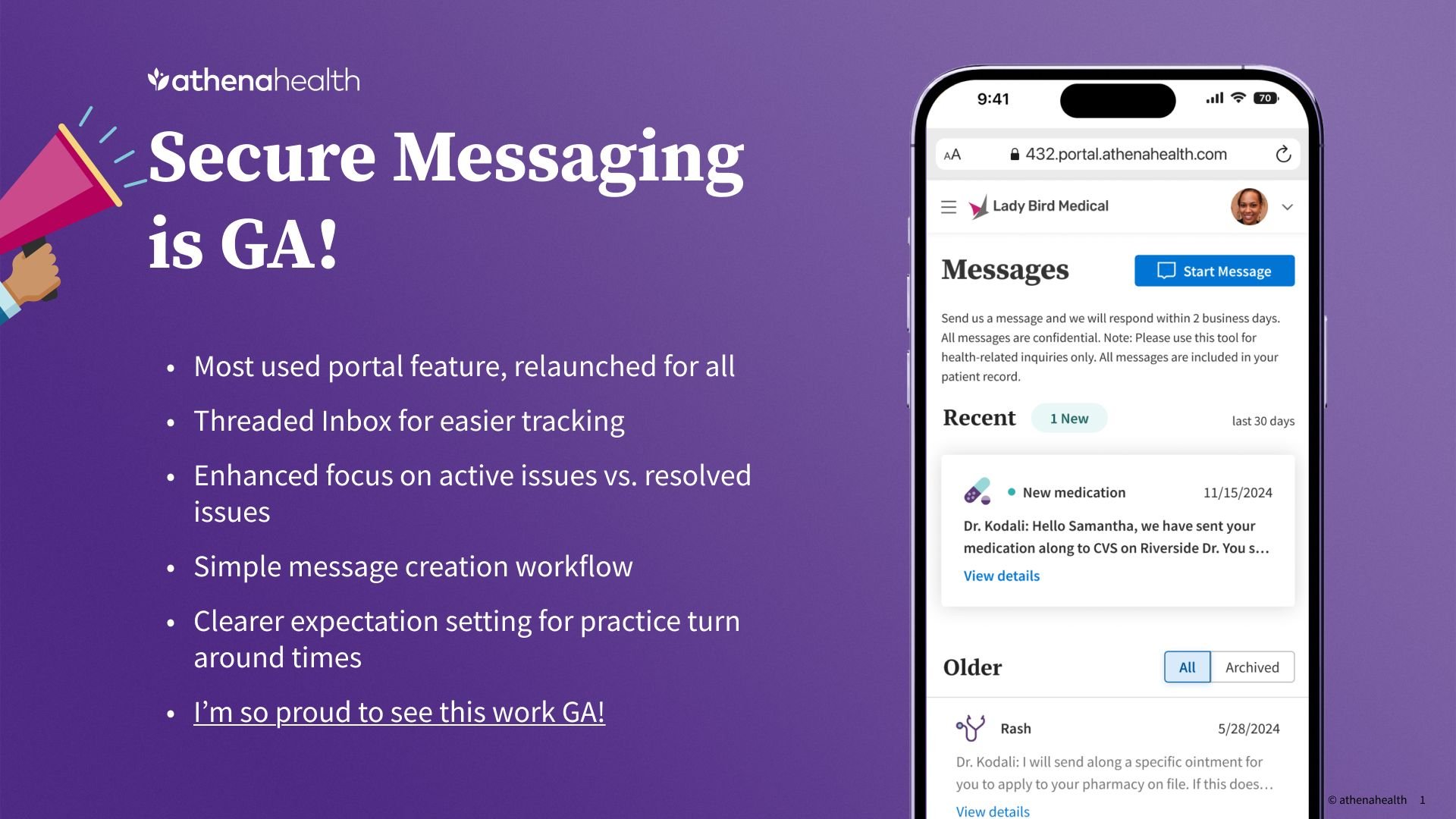
I became the lead for our newly created design language system, taking athenahealth from a very clinical focused company to one that started to equally prioritize the patient experience. athenaCommunicator (the suite of products that I lead the design for), thanks to Spark, ended up making it to the leading medical record system in the US by winning a KLAS award in 2023 and continues to top charts. Thanks to this new design system, usage went up by about 10%, and engagement by 32% (from 41-73%).
My priorities as a lead designer was to ensure our product was inclusive - namely that it met the needs of people from all walks of life - from the old, sick, and culturally diverse. I also wanted it to provide some delight in very hard times. Another priority was aligning our design team on usage and guiding them in implementation across scrum teams. This product had both a web and mobile application, meaning the design language had to be compatible yet different enough to meet the platform specific requirements.
Roles
Create and maintain asset library in Figma, art direction, branding, PO, creating new components according to user needs arising from research or product, ensuring development turnaround is as fast and efficient as it can be, guiding the design team in it’s correct usage and principles, writing principles and usage guides, working with copywriters to create a Voice and Tone guide for designers to use, working with accessibility consultants to ensure WCAG standards, guide ideation workshops across teams, lead research initiatives to further develop the products that use the library, staying on top of the latest Figma features for design optimization, working with lawyers to ensure HIPAA compliance, and more.
design process
From MVP to widely usable: I took over the system when it was a baby and only had a handful of basic components. My role became to mature the system, create principles, expand the library and help our system match the larger re-brand initiative that was company wide.
Speeding up the development cycle: the less custom components, the more time saved. It was my job to understand when a component was developed within a scrum team and it would be useful for me to audit it with the design team to implement in Spark, or when I needed to come up with a component from scratch.
Close collaboration with development: I worked closely with developers to ensure the components where easy to implement, and usable across different use cases. I was meticulous about annotations to minimize error and the need to go back into the code several times to brush things up. It was important for me to have regular walkthroughs with developers, so they understand why the user experience and certain elements where important, turning them into user experience advocates.
Inclusive design: I brought in an accessibility expert, and always conducted user research cycles with the least capable to ensure that our product was intuitive to everyone. WCAG standards where hightened, and special walkthroughs before launch where implemented.
Tracking and optimization via joint workshops: I held weekly meetings with the design team and developer teams to take questions, feedback and optimize the system. We went through user tracking to analyze it together, to come up with improvements that met the users where they were at.
SAMPLES OF UI DESIGN WITH COMPONENTS


Re-brand of components and monthly review deck


Part of what made this role unique is how involved I needed to be in the clinical workflows, as they where the other coin of many of our core products such as messaging and appointment scheduling. This gave me insight into the complex journeys of healthcare providers at scale, and the intricacies of table and data design for large, complex and regulated systems.

Spark also shaped components for the native apps, that always needed to be consistent with the web flows I was leading. Working closely with our native designer on point, we spent a lot of time understanding when to break and not break design rules or components.

