Find various samples of work I've done at frog here. If you're curious to know more about a project, please contact me and I'd be happy to show you more complete designs in person.
PFIZER DESIGN COLLABORATIVE
This was a 40 week program, starting with design and desktop research, ending with five products that are set to go to market in the following years in the categories of healthy aging, better breathing and vitality. The client worked with us at the frog studio most of the time, which was a wonderful way to stay effective.
Roles
Design research, ideation, UI+3D prototyping, user testing, storytelling, photography, set design.
design process
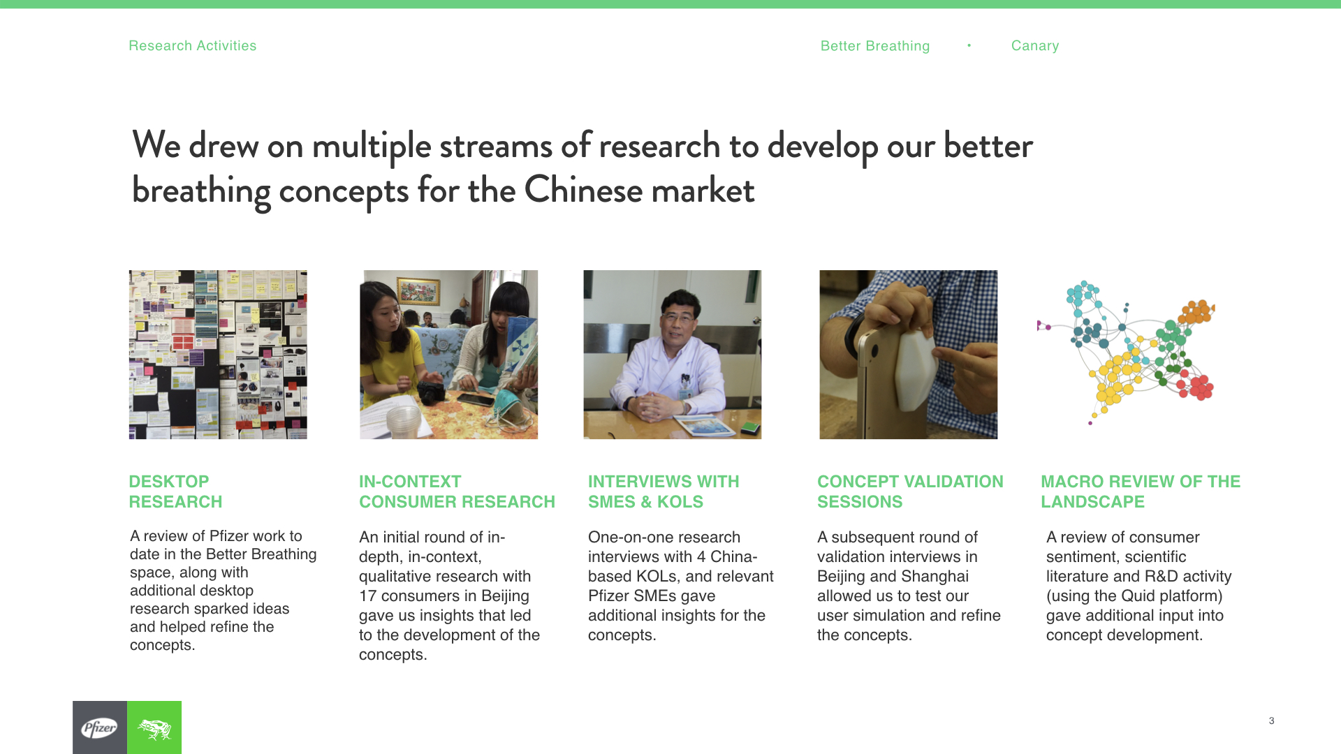
Desktop research: We started by looking into interesting technologies and known user needs that could be leveraged to inform the research plan and probe on some early ideas. This way we could jump ahead and have a research plan that was about 50% foundational, 30% explorative and 10% generative.
Screener, research plan and guide: I put together the plan based on our early desktop research and prior experience doing research within the healthcare sector.
Field research: Over 30 elderly, people interested in better breathing, and health conscious people where interviewed across multiple states and countries.
Synthesis: We came home with thousands of observations on sticky notes, that then got synthesized into patterns and then insights. These insights were then used to create opportunities and brainstorm new products.
Ideation: Using what we learnt, we had many ideation sessions, using timed quick capture sheets (small one pagers that allow for short descriptions and sketches) which allowed us to stay focused yet playful.
Concepting: The best ideas got voted to the top internally and externally, and executed on further through storyboards, user journeys and low fidelity UIs where needed.
Prototyping: The best concepts got made into prototypes. Here I got the chance to 3D print some products, use Arduino to prototype some interactions, and design screens for click-throughs.
User testing: Prototypes where brought into field along with user guides and a whole new research plan.
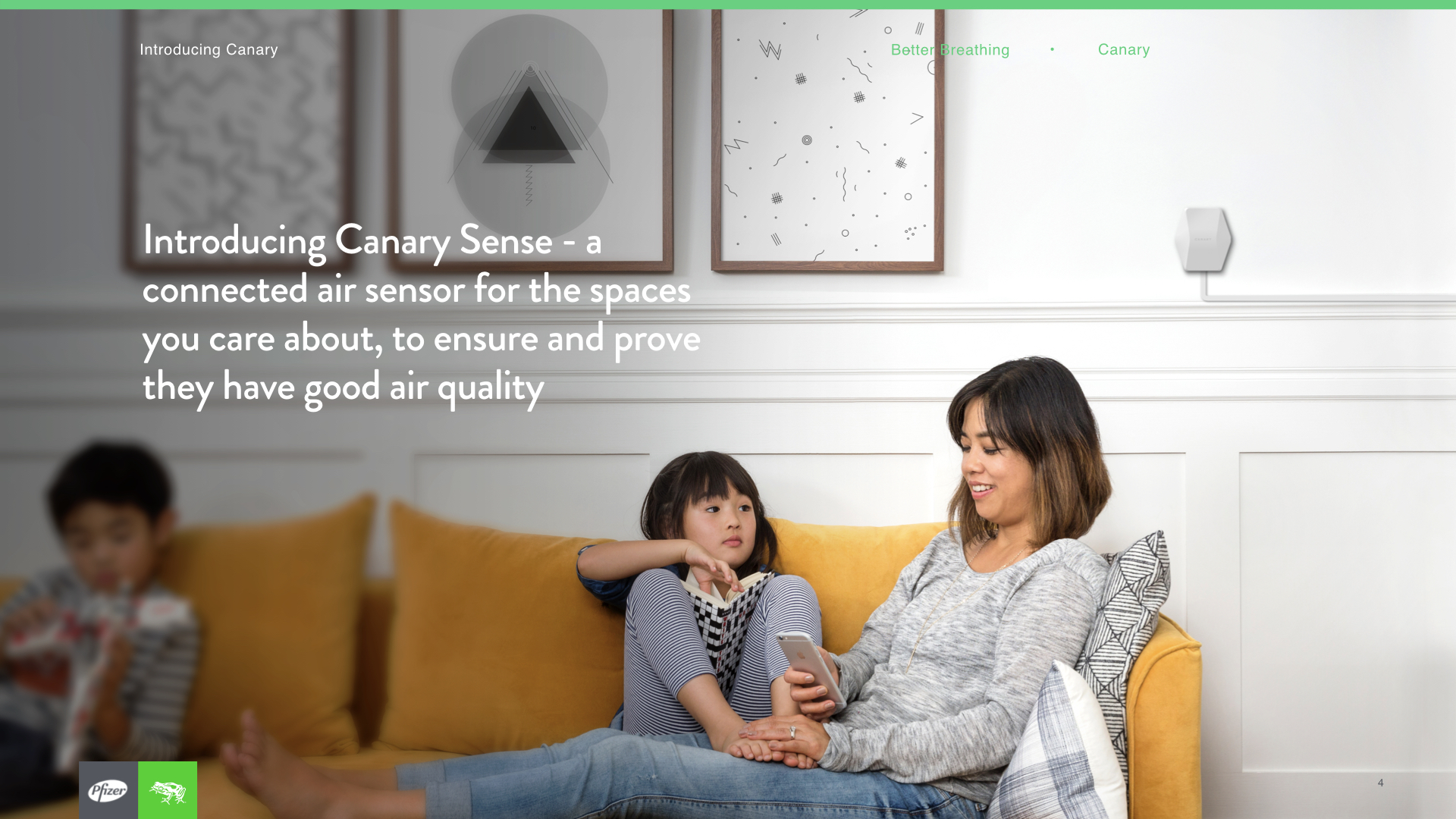
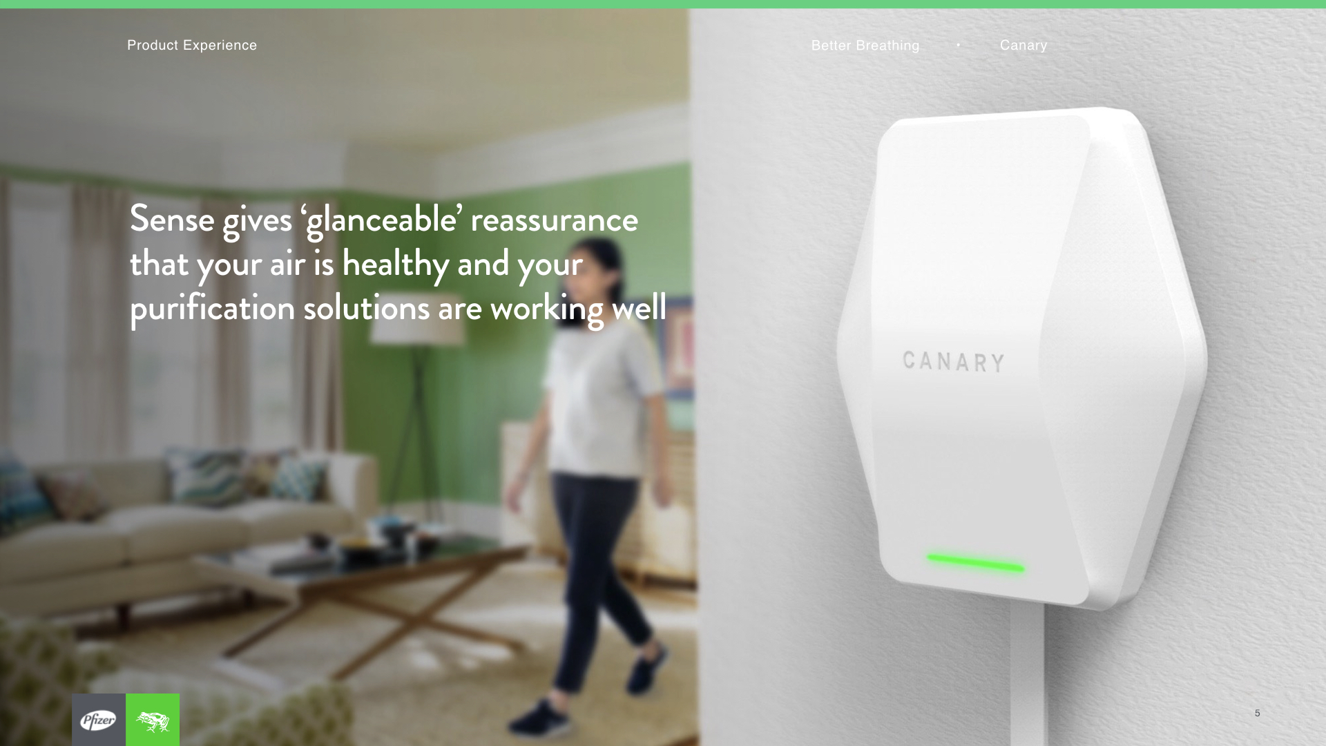
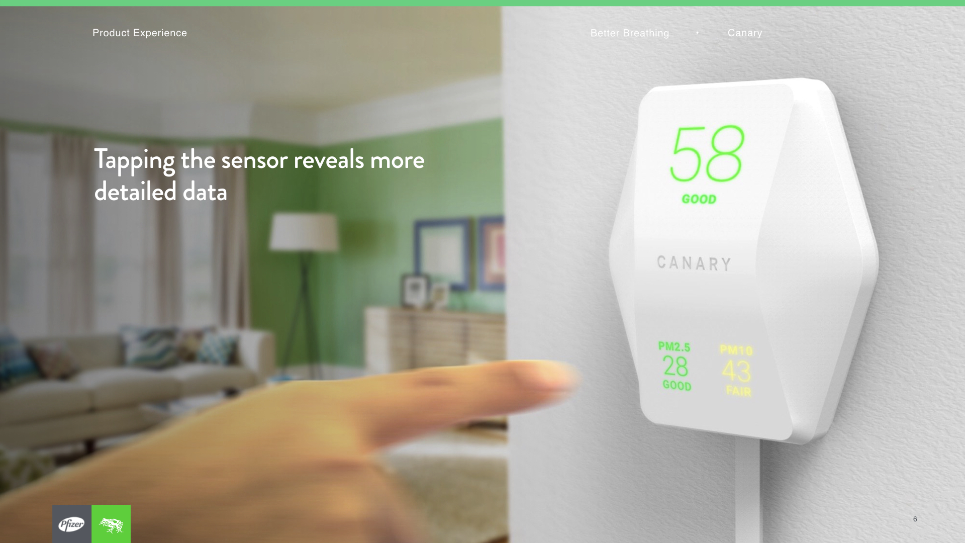
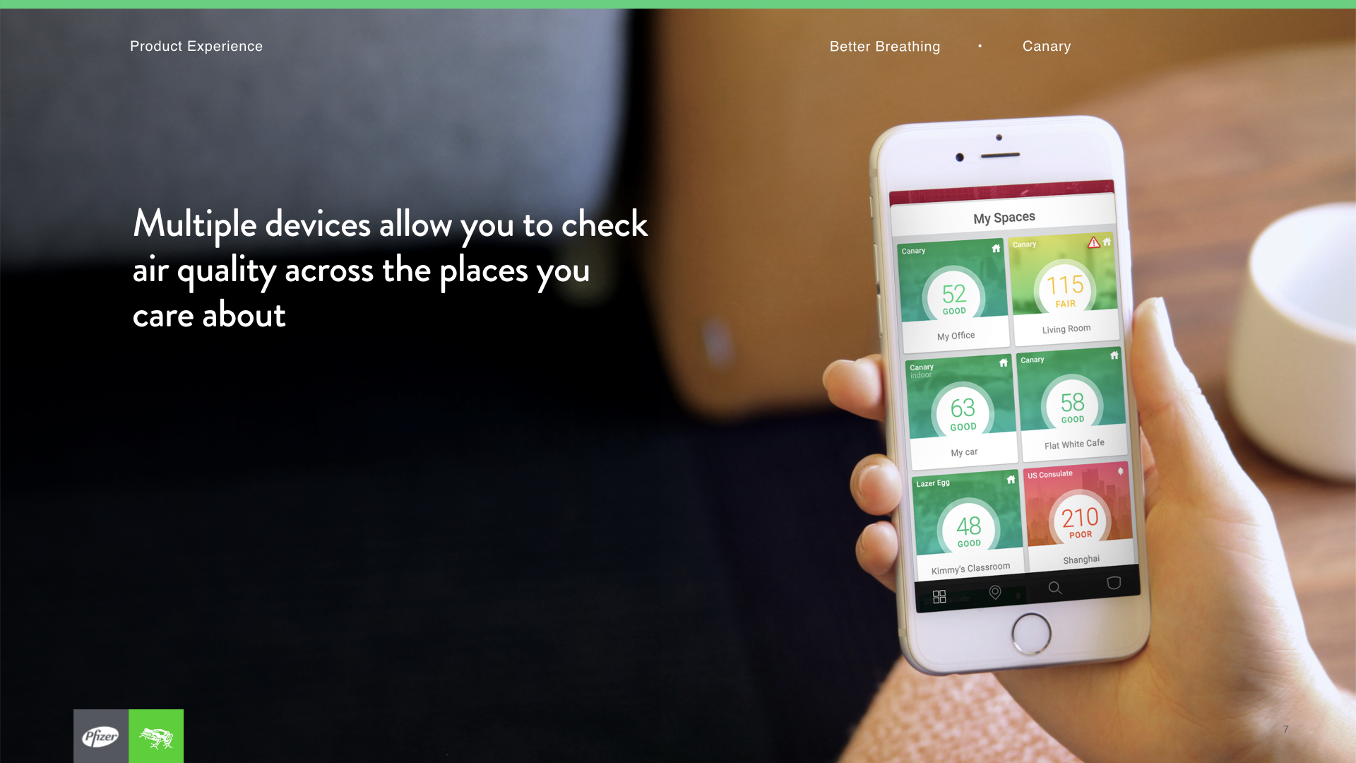
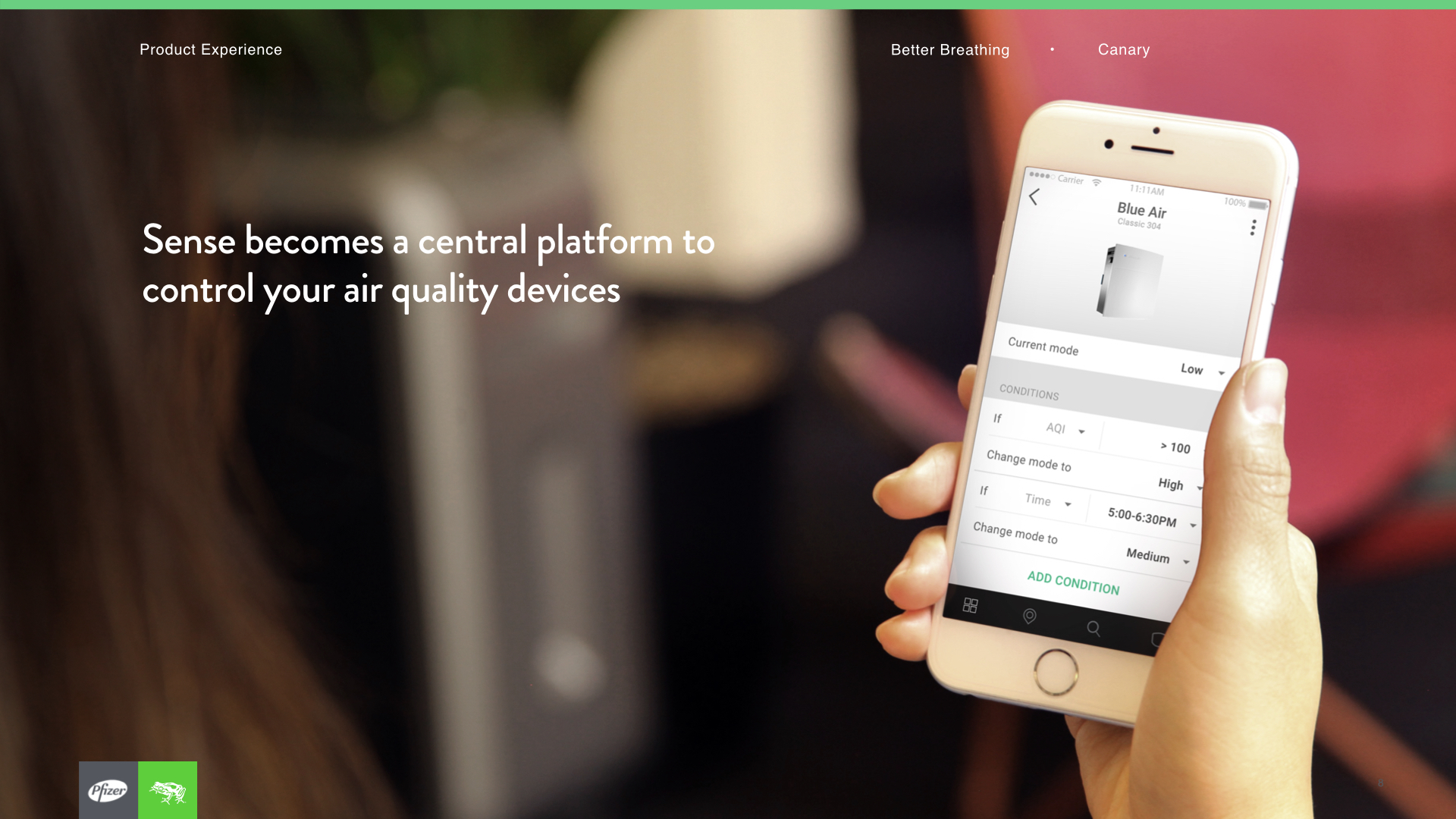
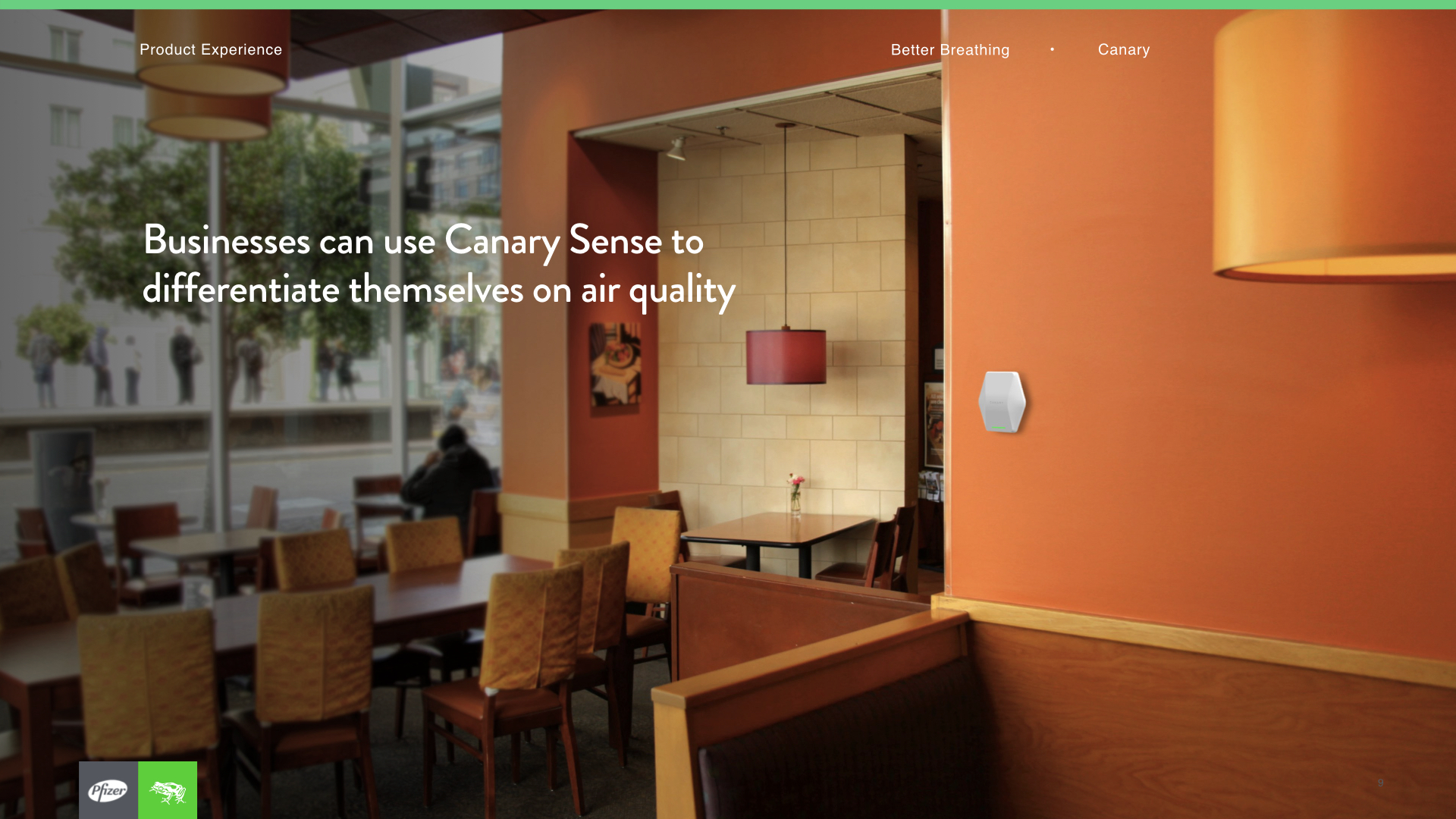
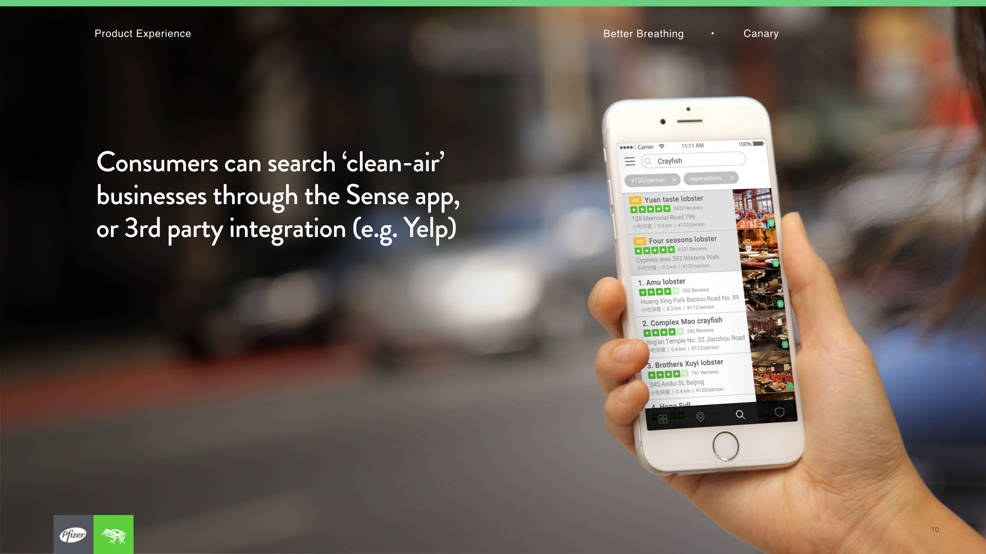
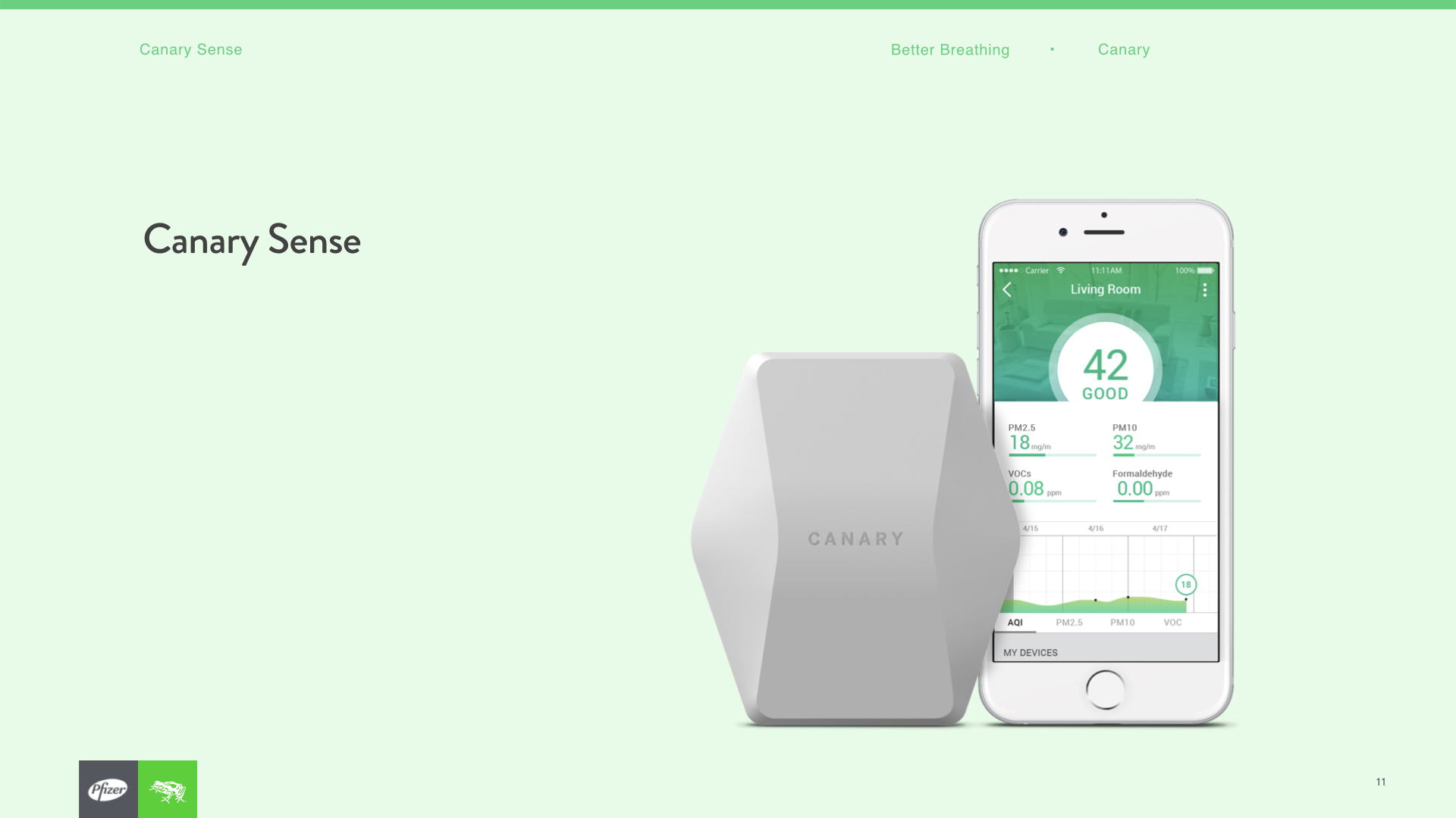
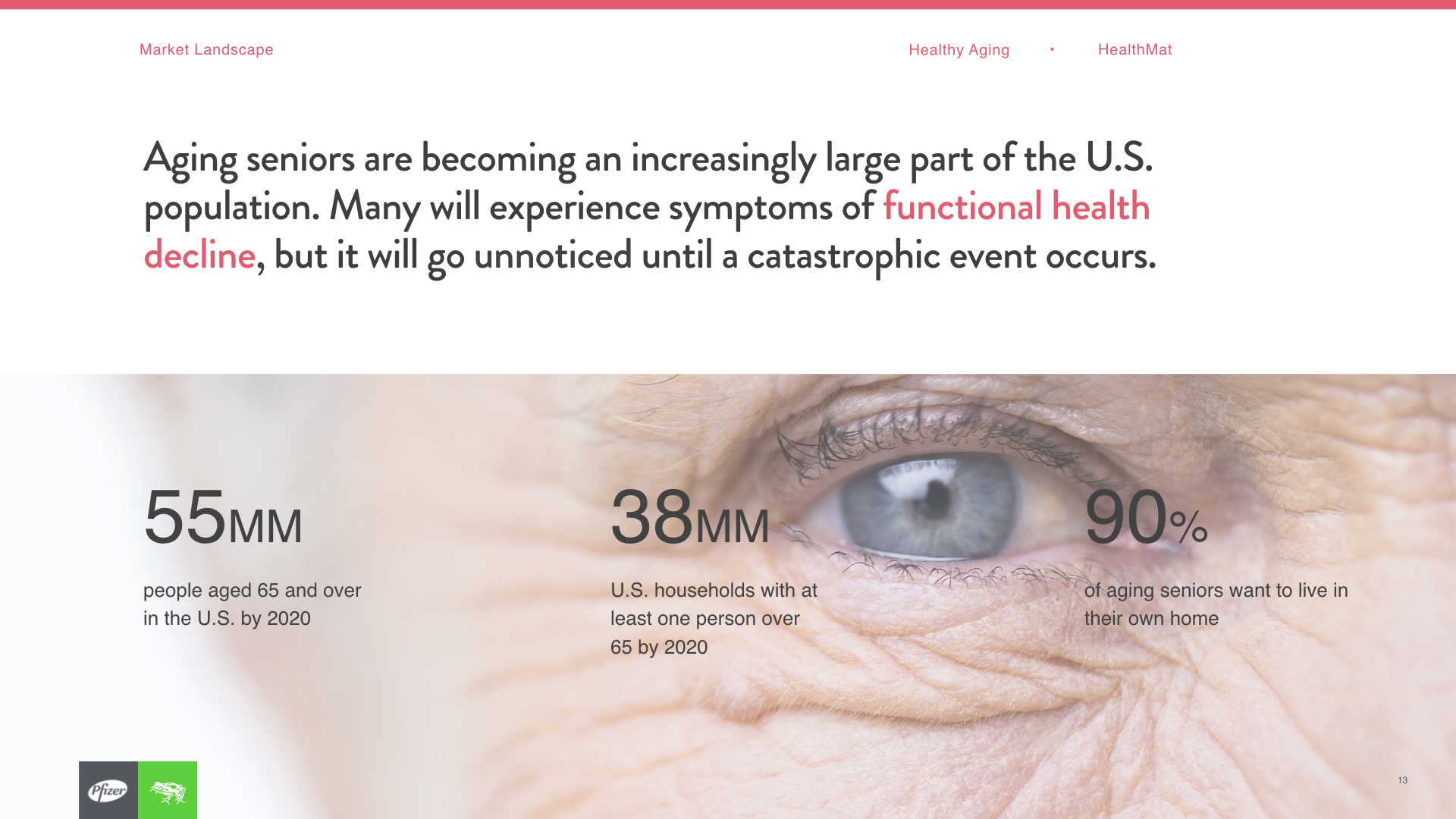
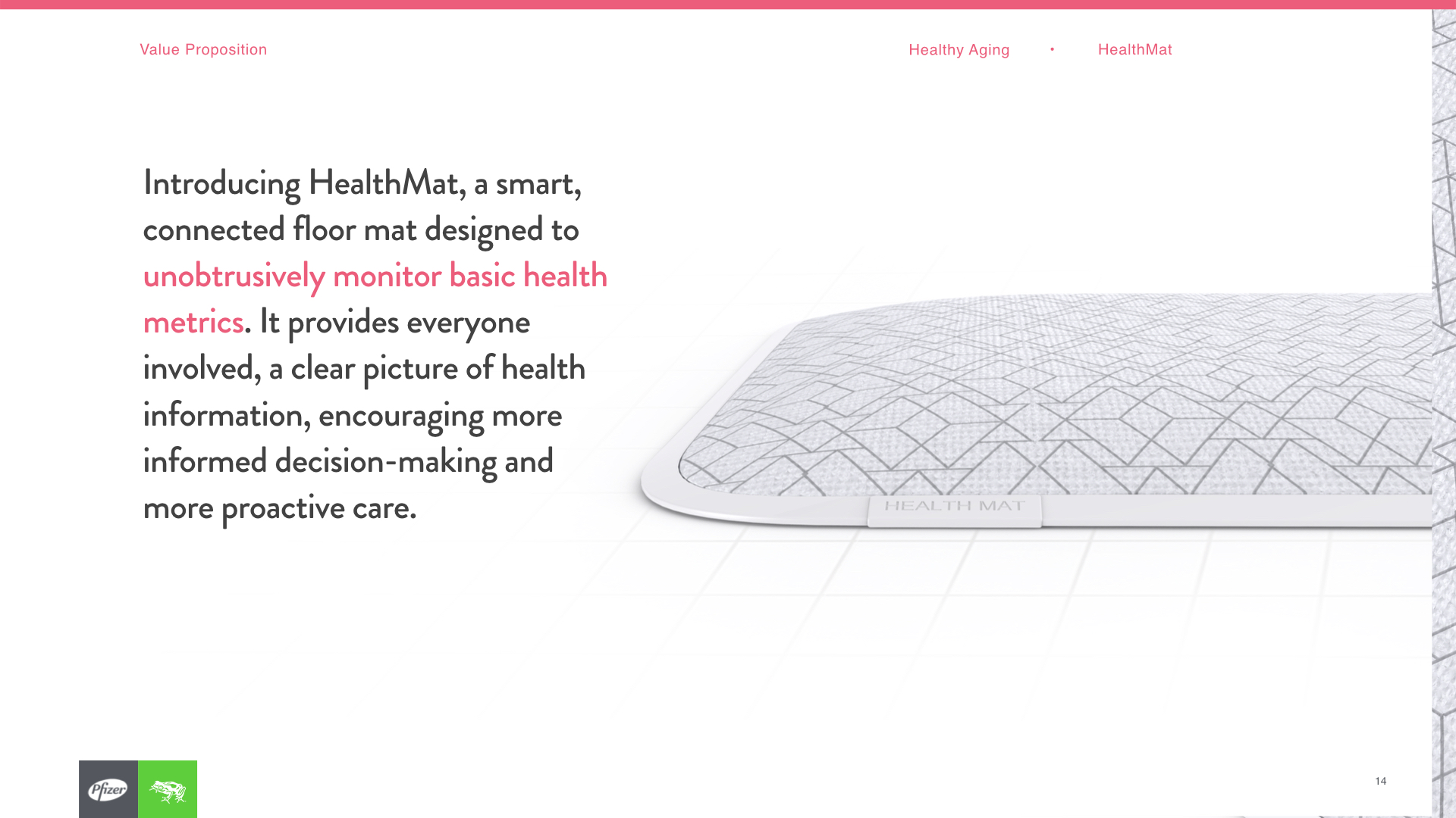
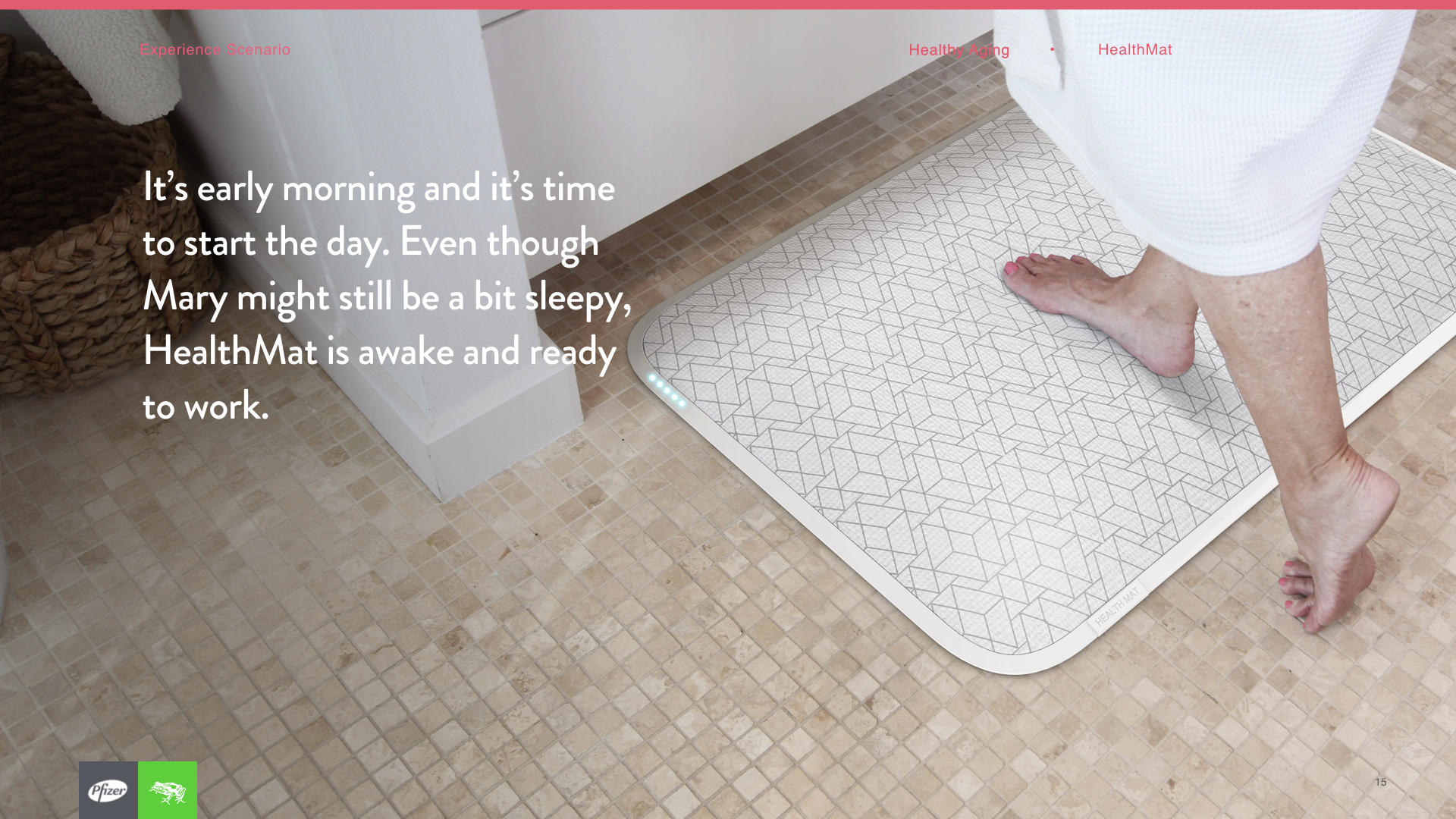
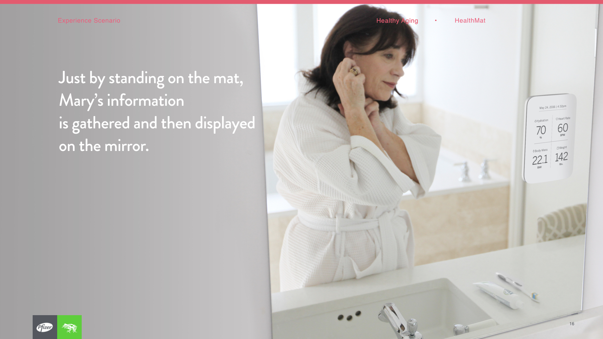
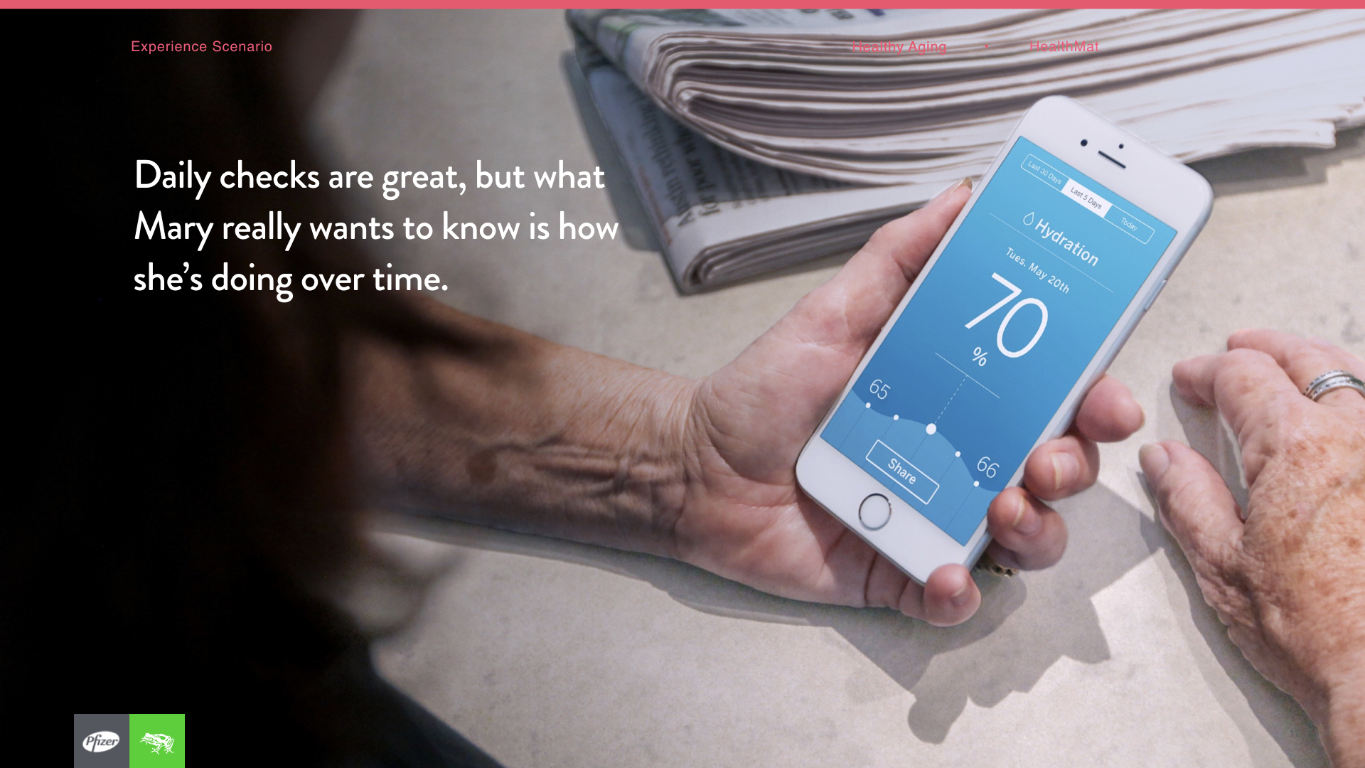
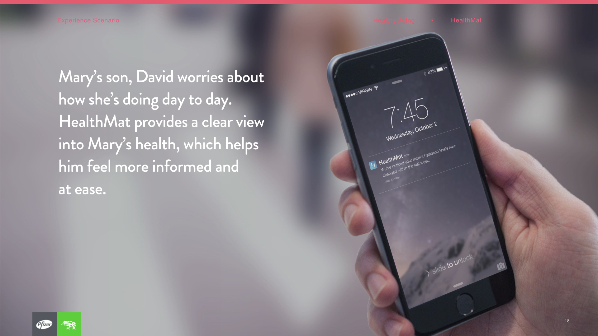
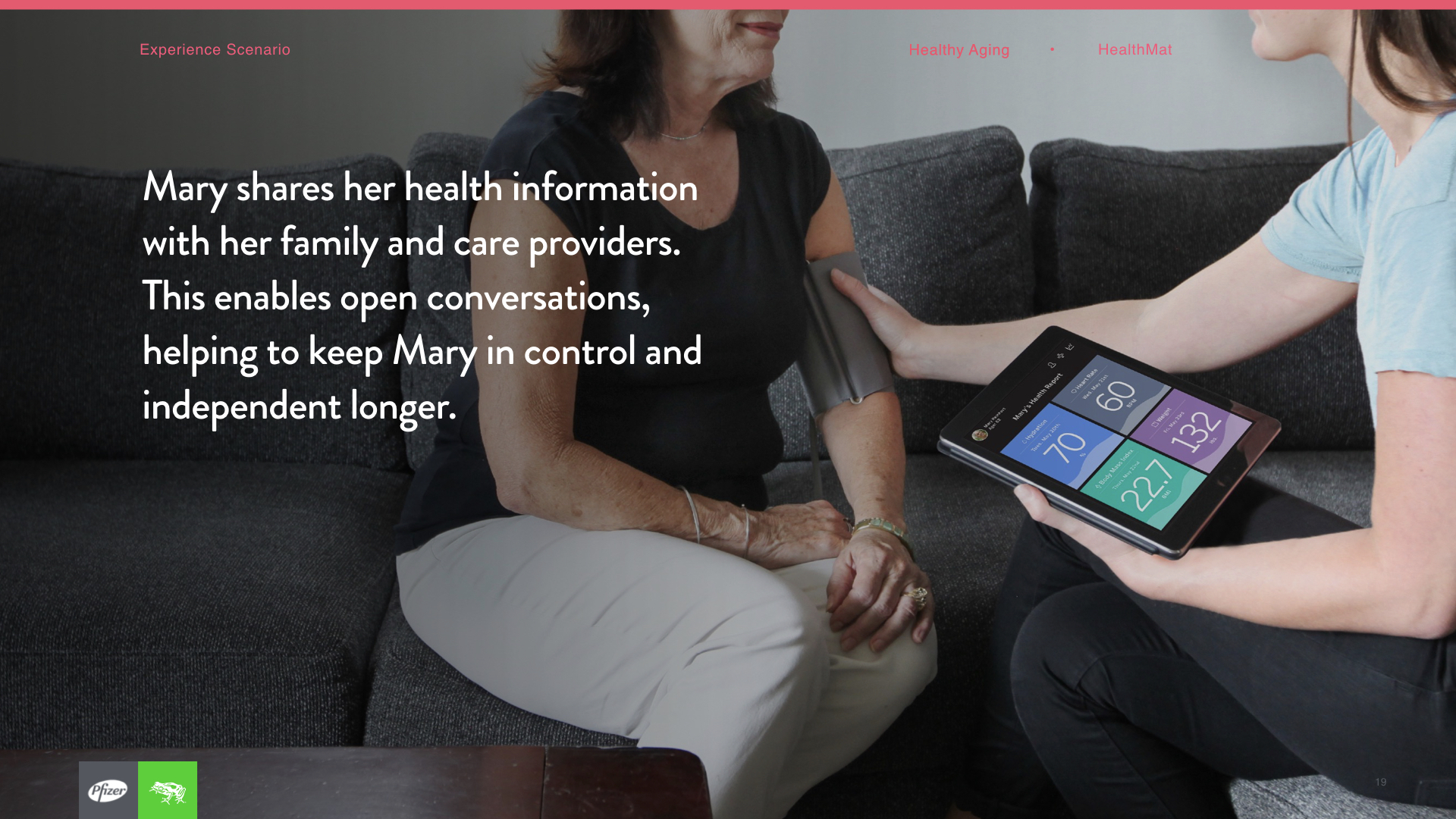
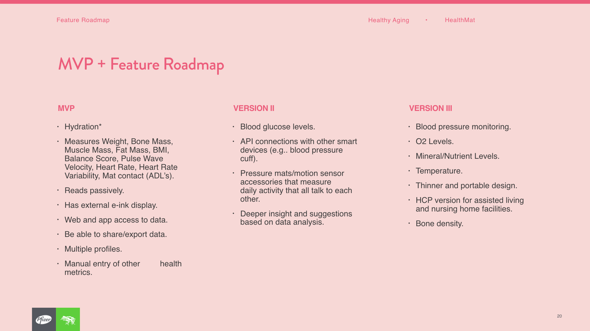
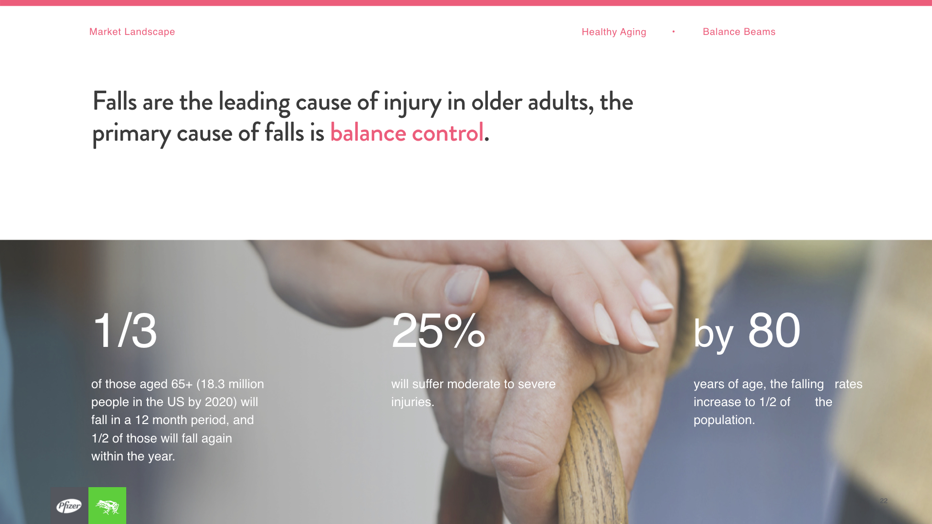
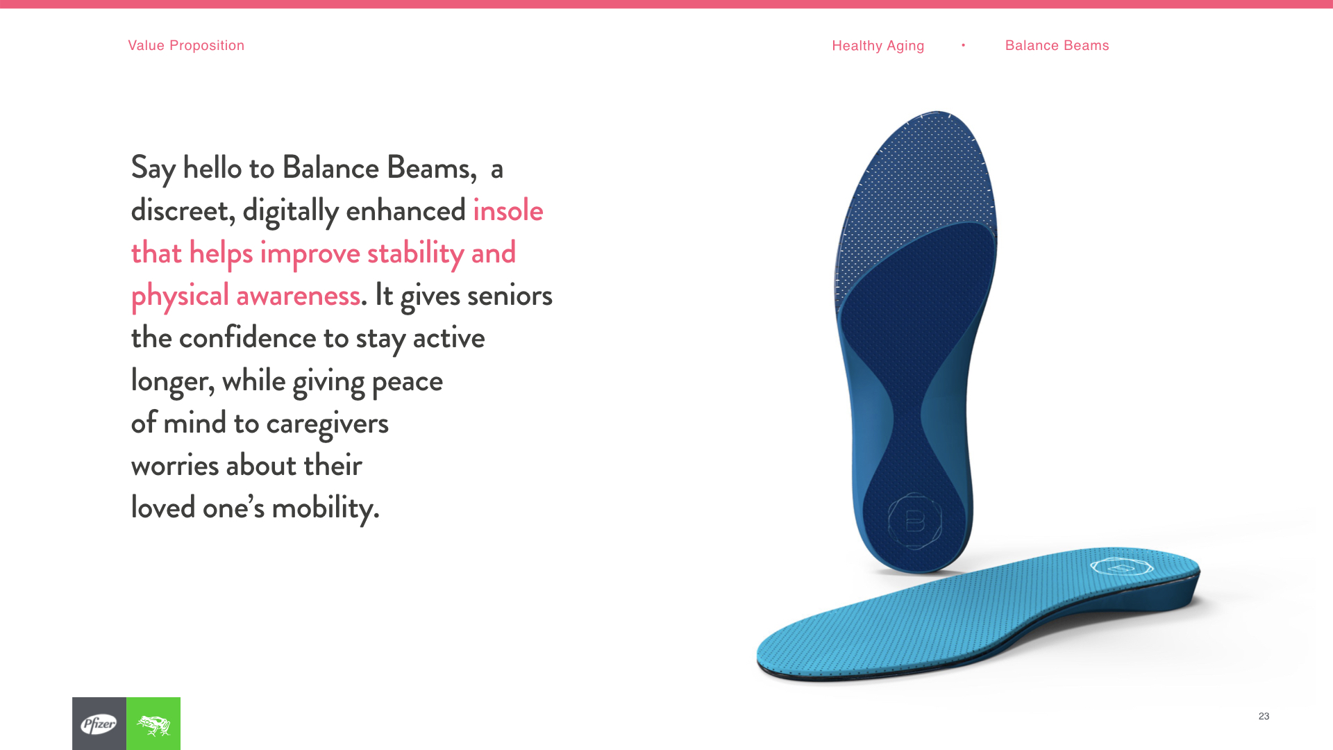
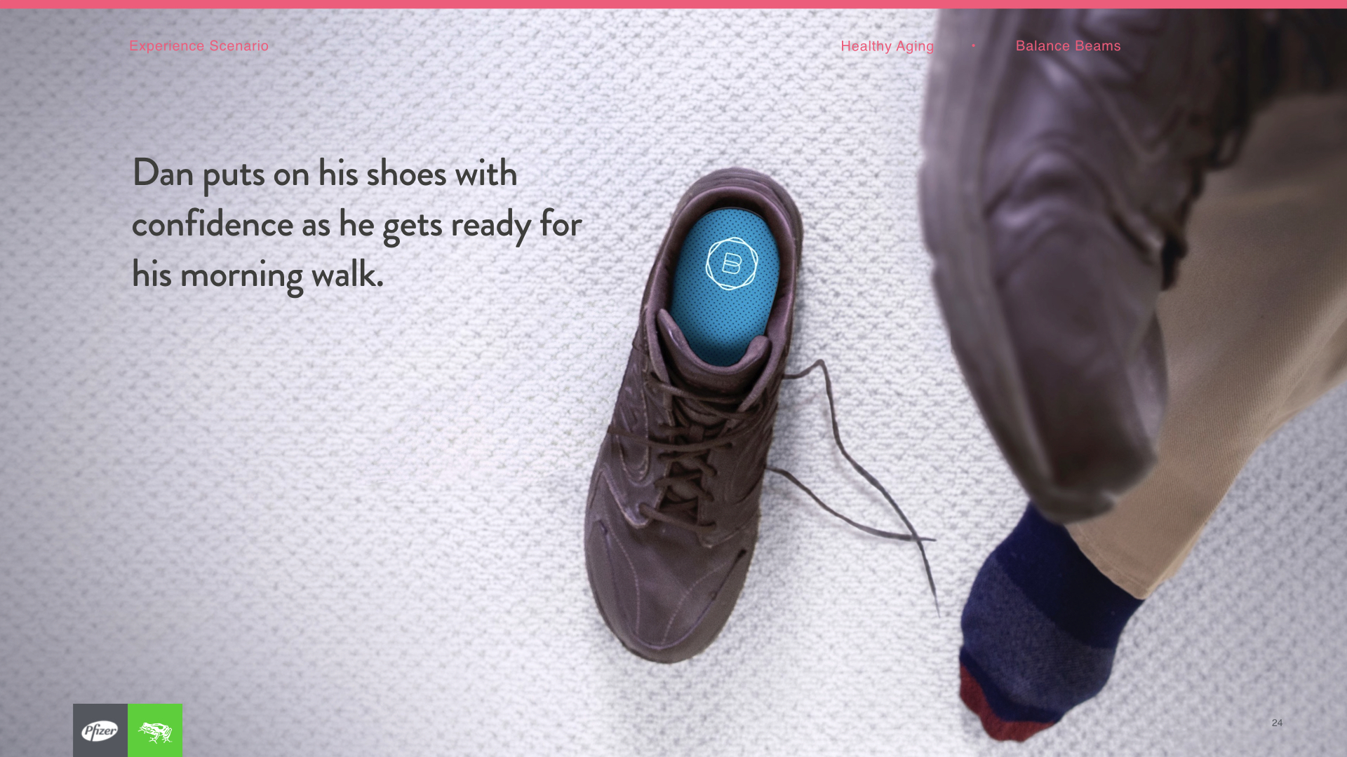
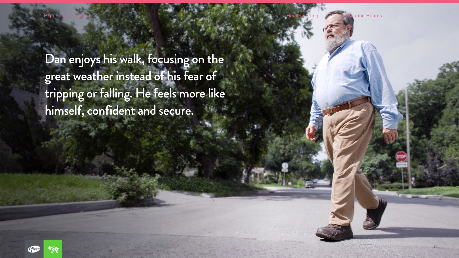
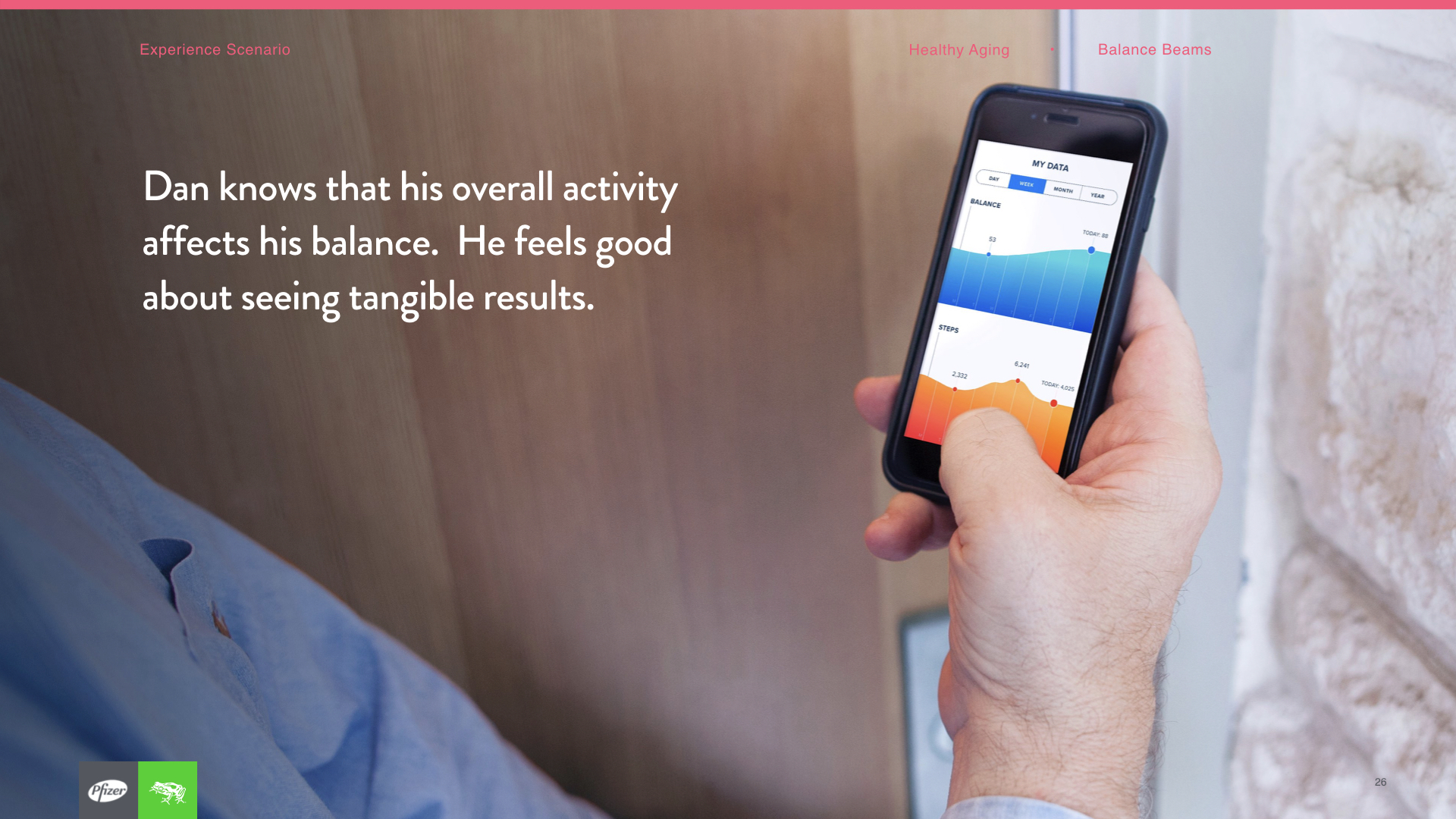
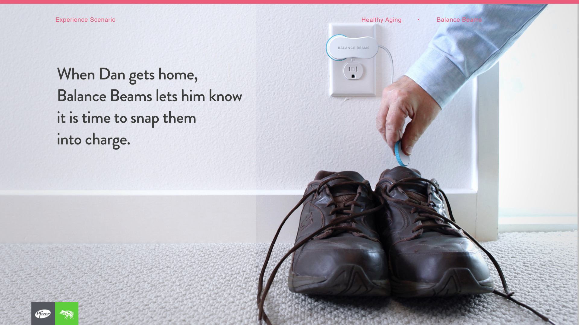
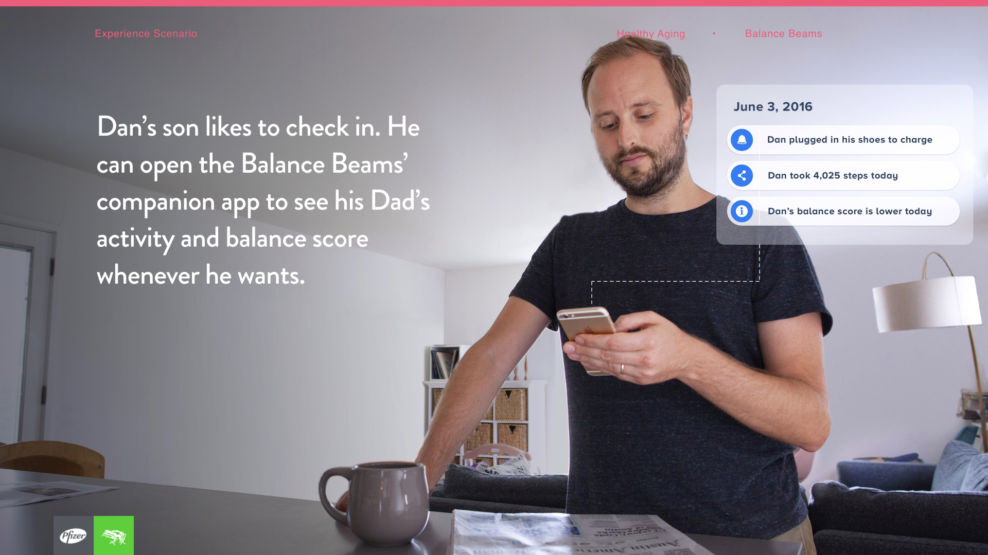
Execution and storytelling: After synthesizing our findings again, we went into creating a whole new round of higher fidelity concepts, along with MVPs and a vision for Pfizer to bring these products to life. We went ahead and did the whole set design for the vision ourselves. This is what you're seeing below.
TEVA END-TO-END CARE FOR MOVEMENT DISORDERS
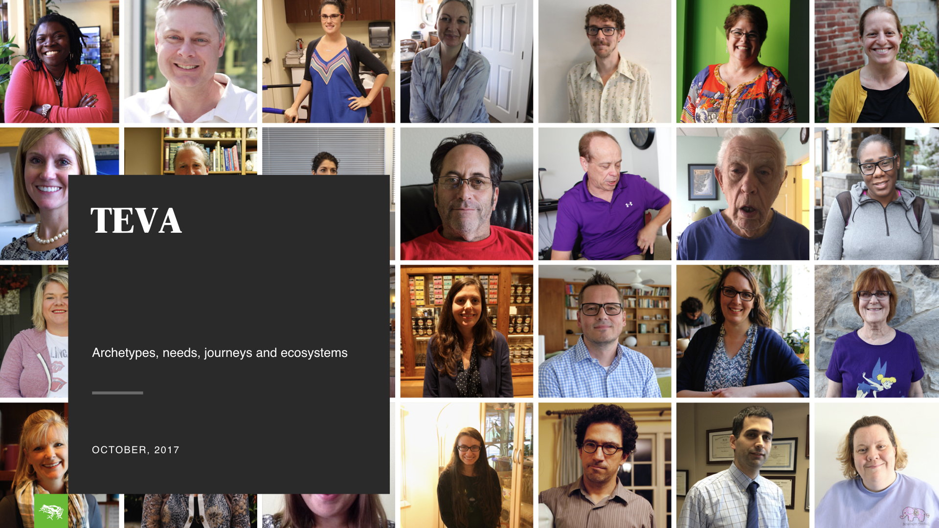
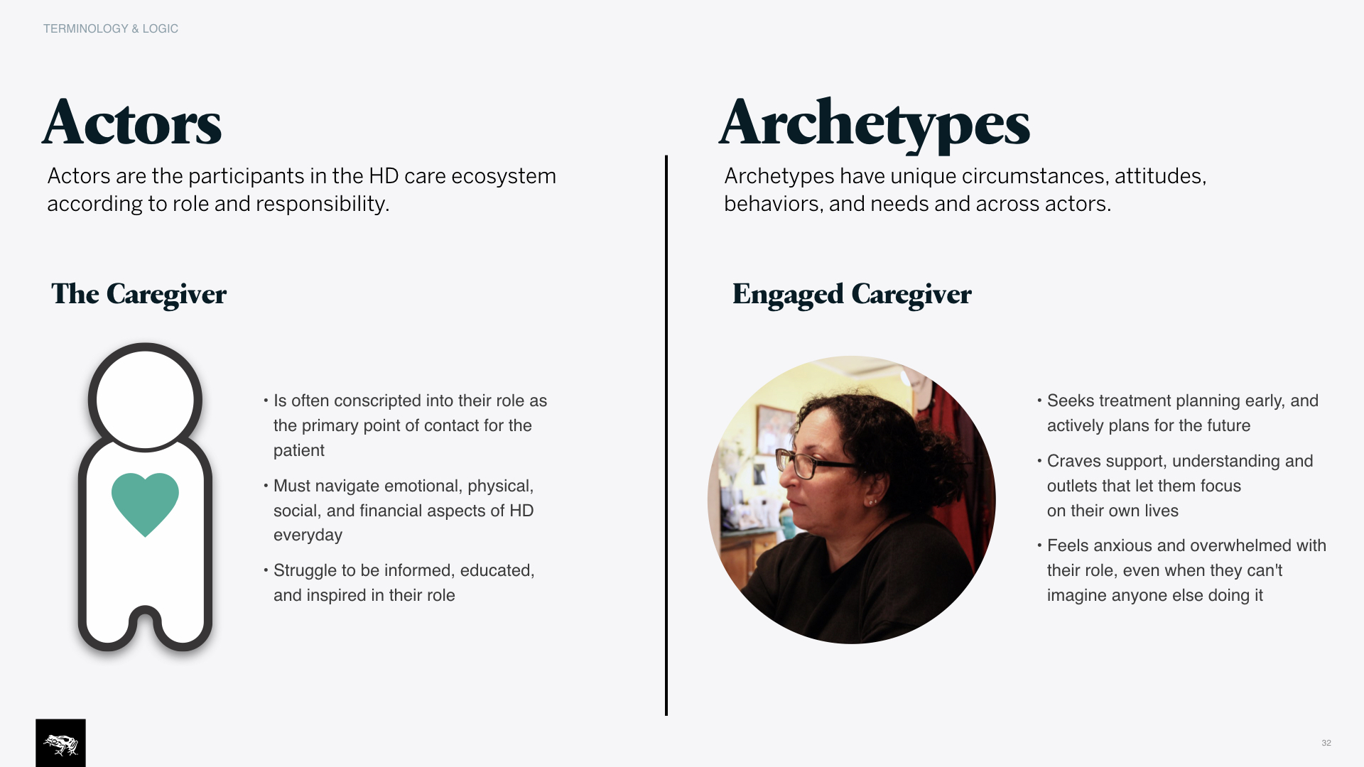
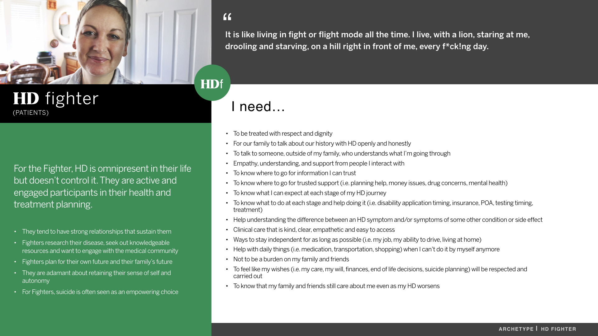
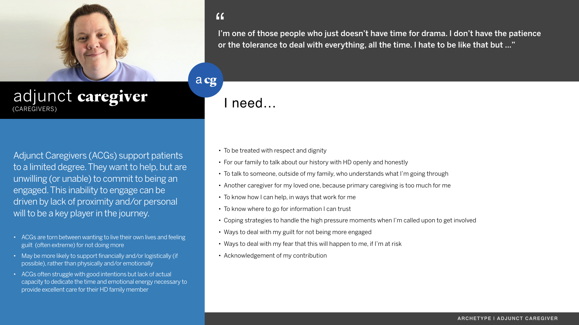
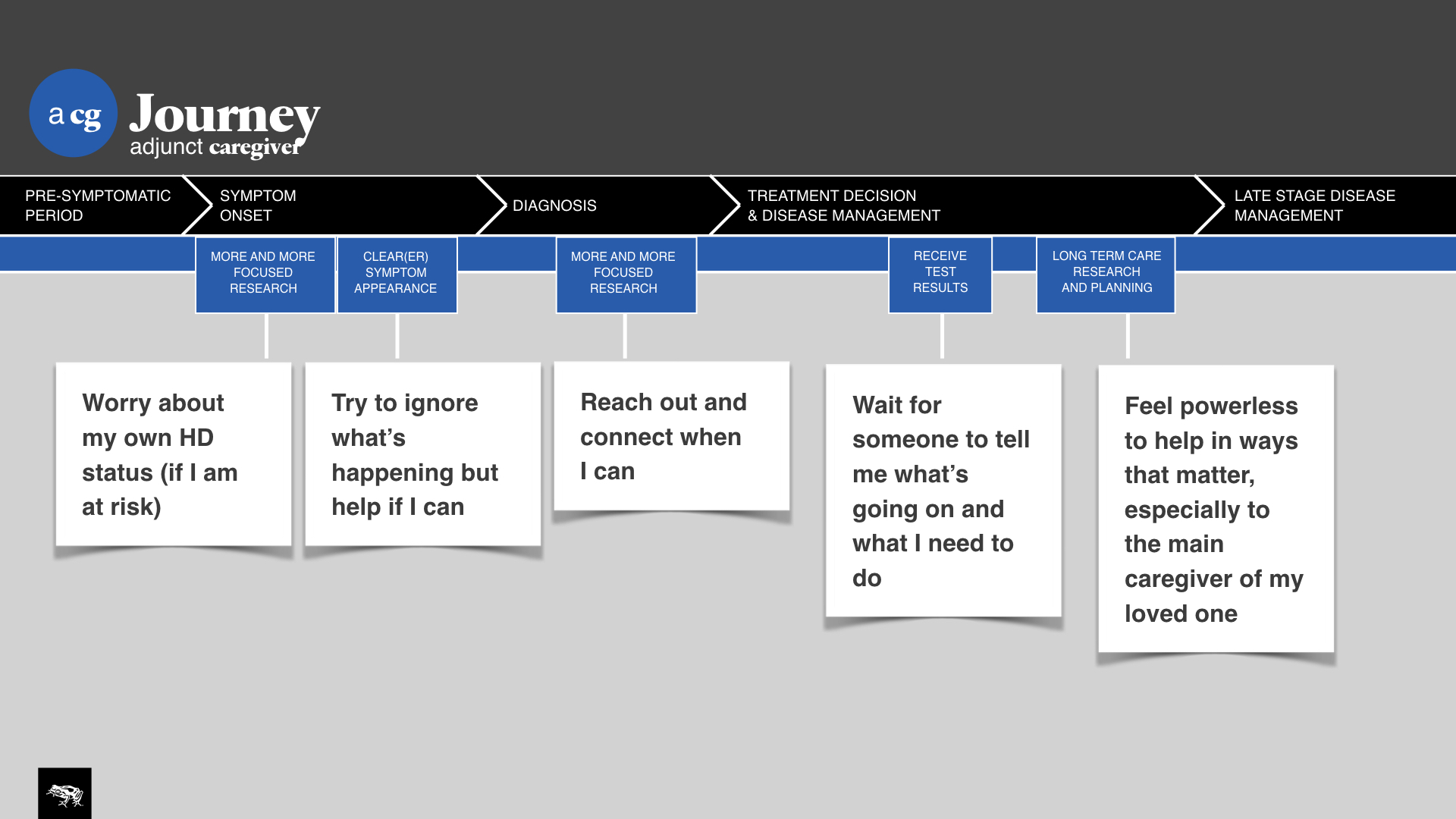
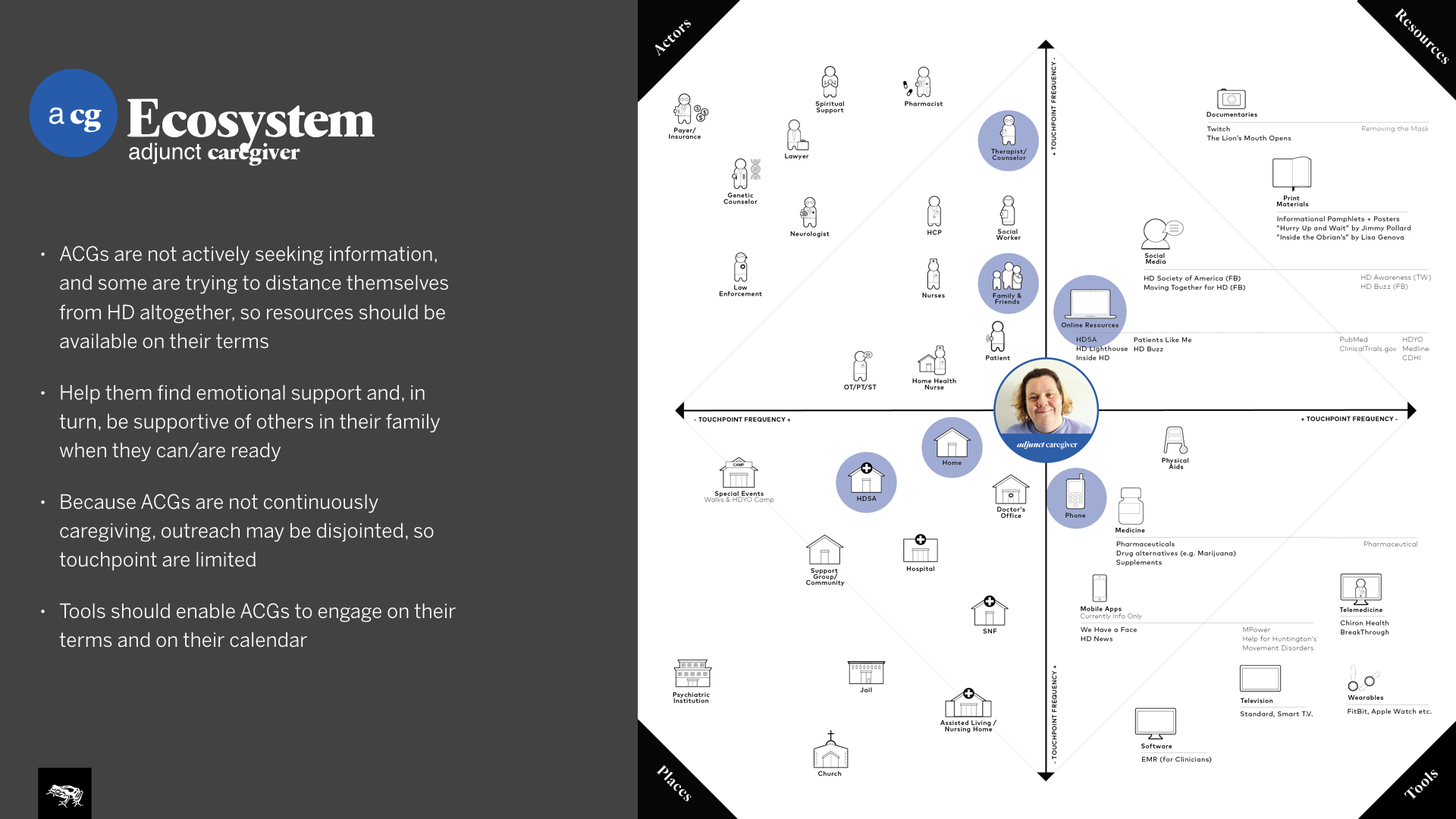
TEVA approached us to conduct a heavy research program and figure out how they can tie all their services together, from the beginning to the end of the patient journey, and become a leader in movement disorder management. They asked us to focus on Huntington's disease in particular, a very cruel disease that can be described as a combination between Alzheimer's and Parkinson's all in one. This was some of the most challenging, but rewarding design research I've ever had to conduct, as it was such a sensitive subject matter.
Roles
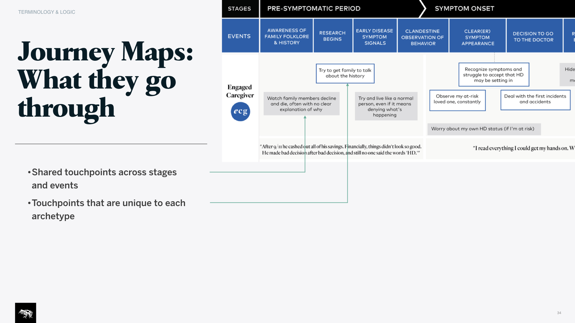
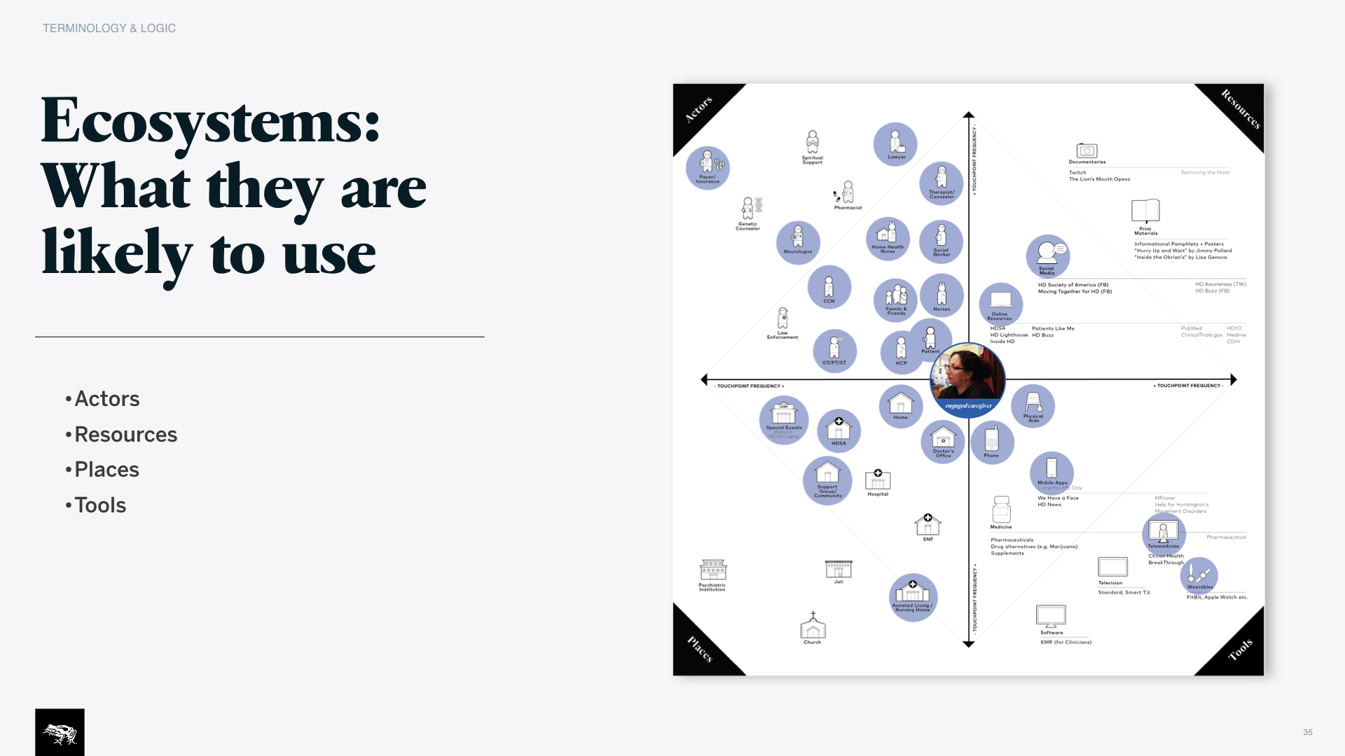
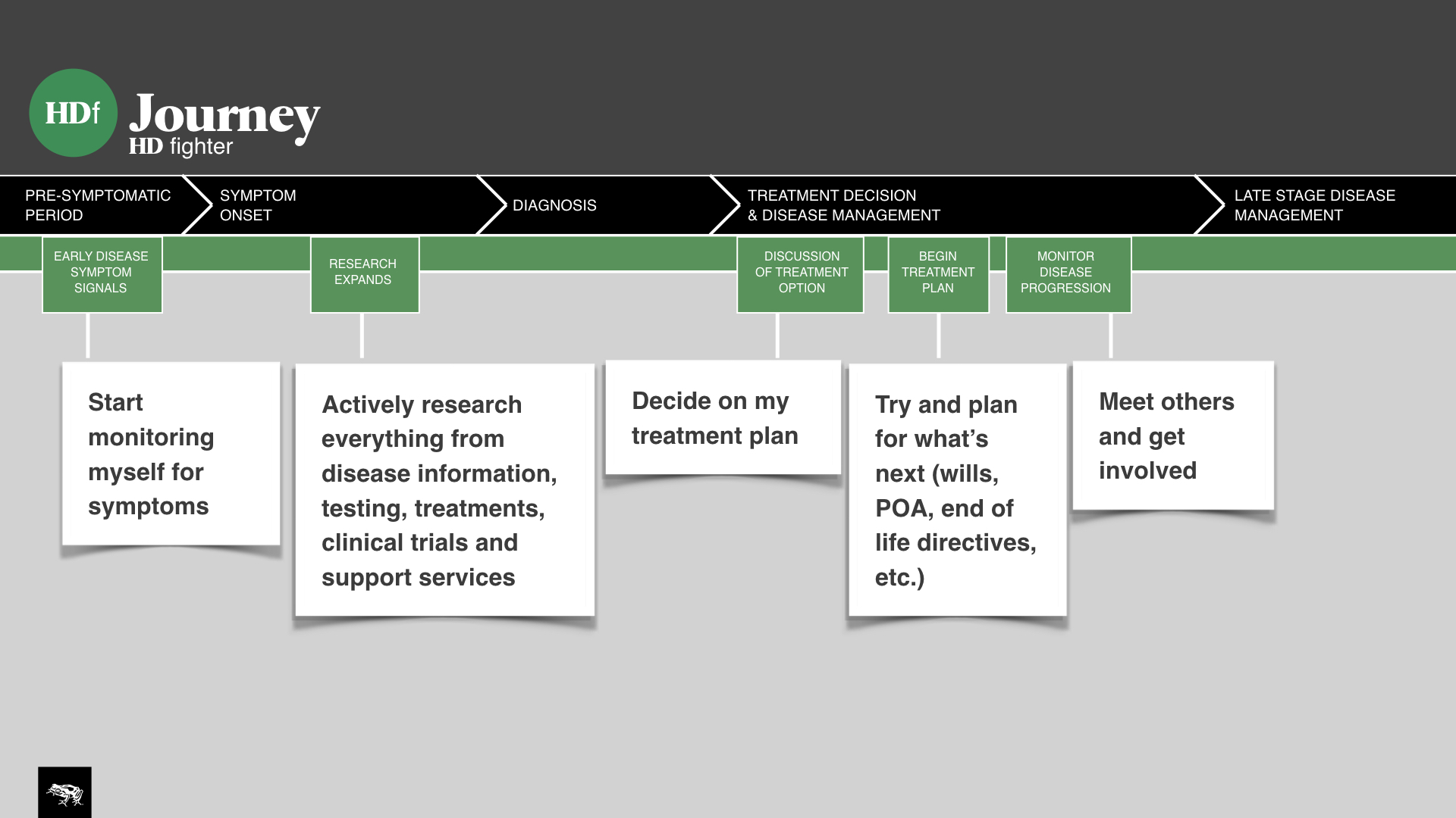
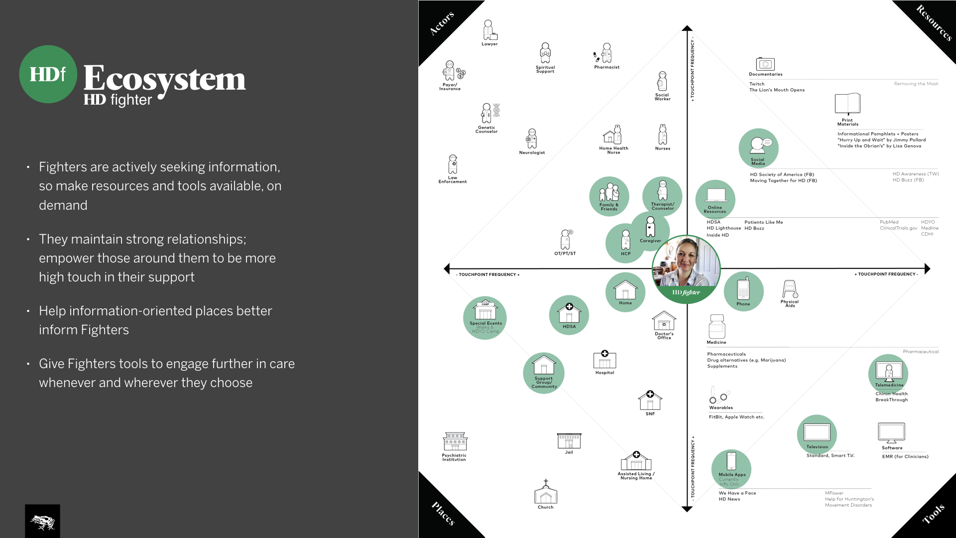
Design research lead, synthesis, journey maps, ecosystem models and creating new frameworks and methodologies for presenting the research (ecosystem maps).
design process
Desktop research: The first step was to get thoroughly educated regarding everything that had to do with Huntington's disease (HD). Learning all the nomenclature and resources was crucial.
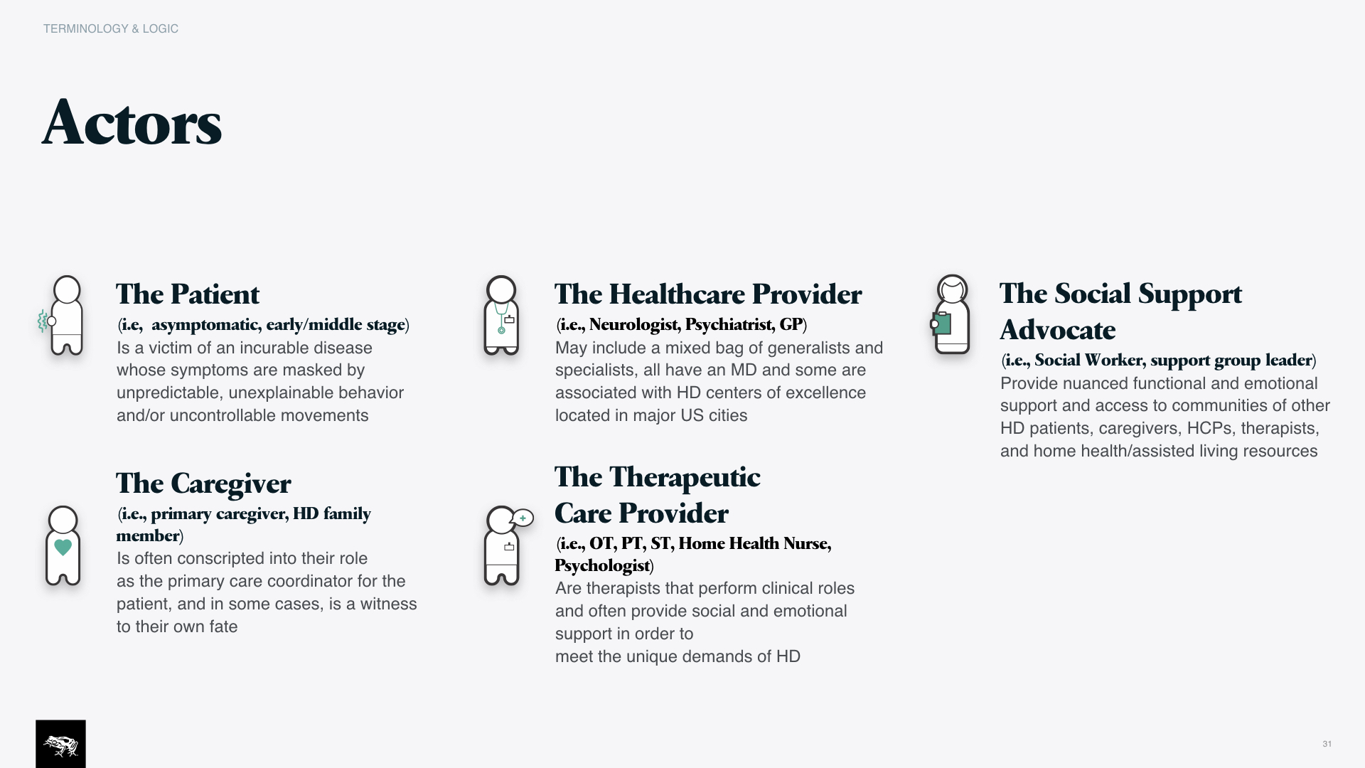
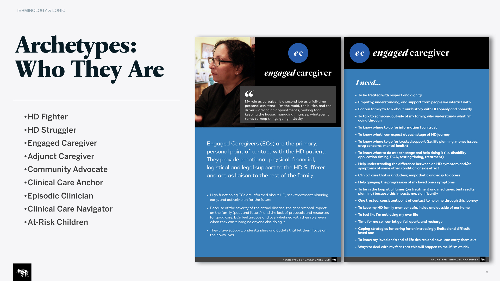
Client workshop: We approached the client with a set of actor cards to confirm our hypotheses, and a journey map that could inform our research plan.
Screener, research plan and guide: Recruiting, as you can imagine, was especially challenging as it's not only a rare disease but also sensitive. Guerrilla methods came in handy. The guide was carefully designed to talk about death and the genetic nature of the disease in a very respectful way, yet still digging deep.
Worksheets: Besides the classics like cameras, clipboards and audio recorders, this time we spent a lot of time bringing worksheets specifically designed for us to map out the user journey's and ecosystem's of care with our participants.
Field research: Over 40 patients, caregivers, care coordinators, neuroscientists were interviewed across the country.
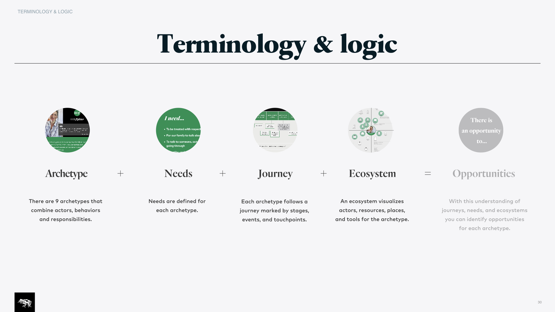
Synthesis: Again we came home with thousands of observations on sticky notes, and carefully turned them into patterns, needs and insights, using the tools we brought with us in field and had designed specifically for the program. The breadth of insight and tangible design solutions those brought is what you're seeing below.
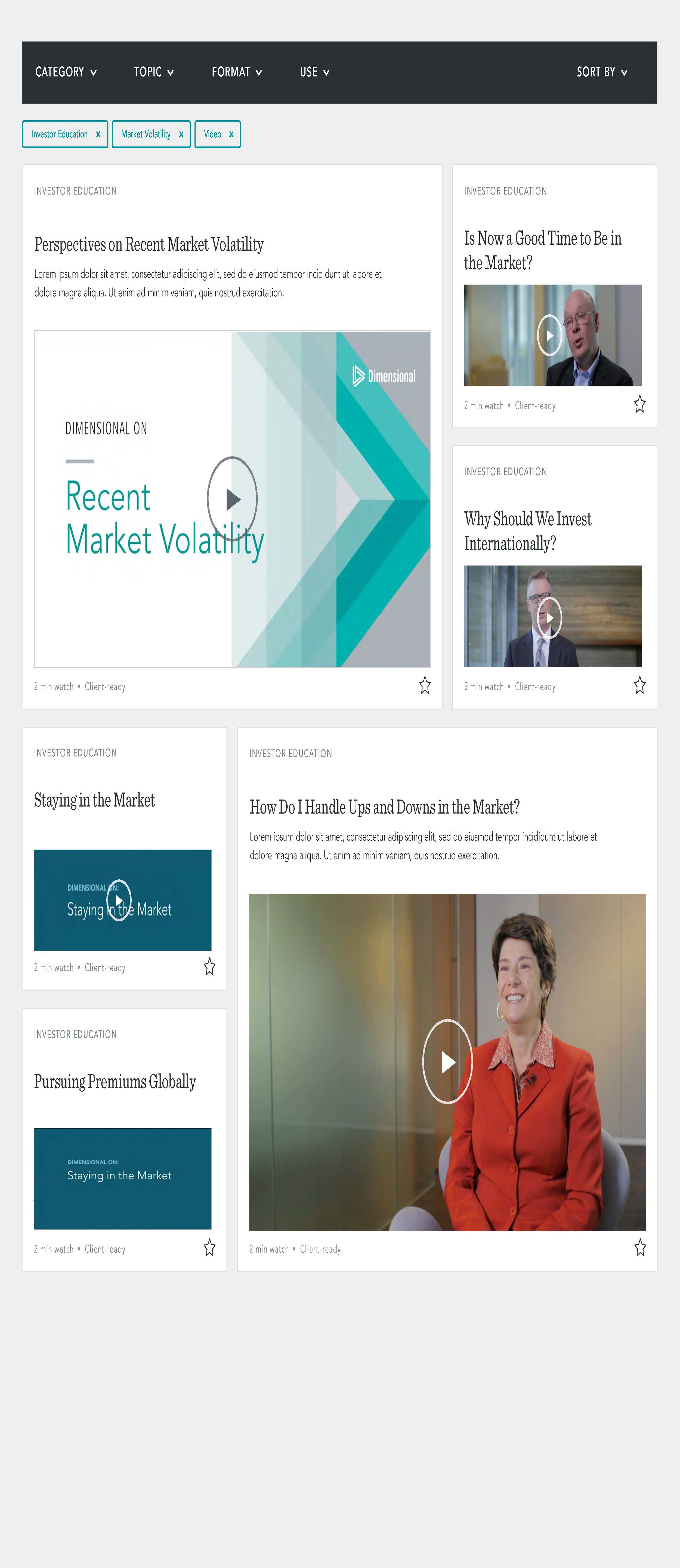
DIMENSIONAL FUND ADVISORS
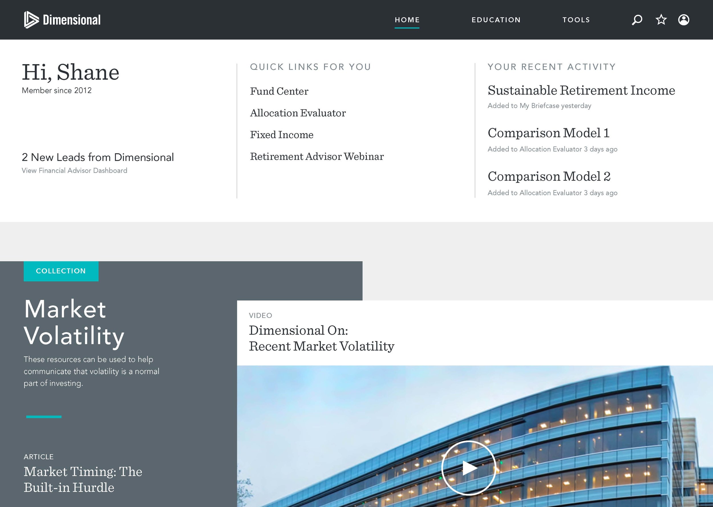
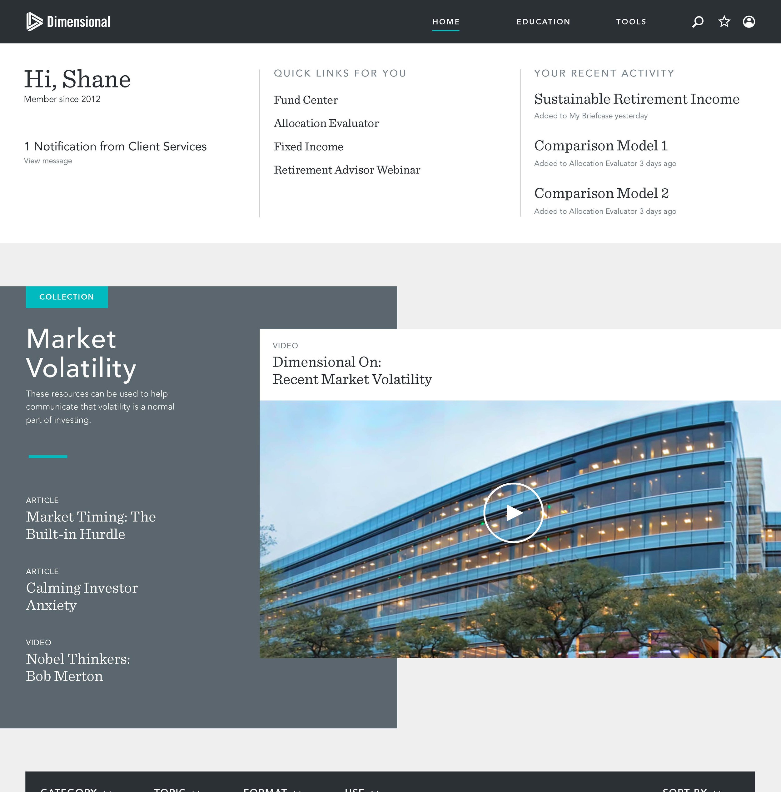
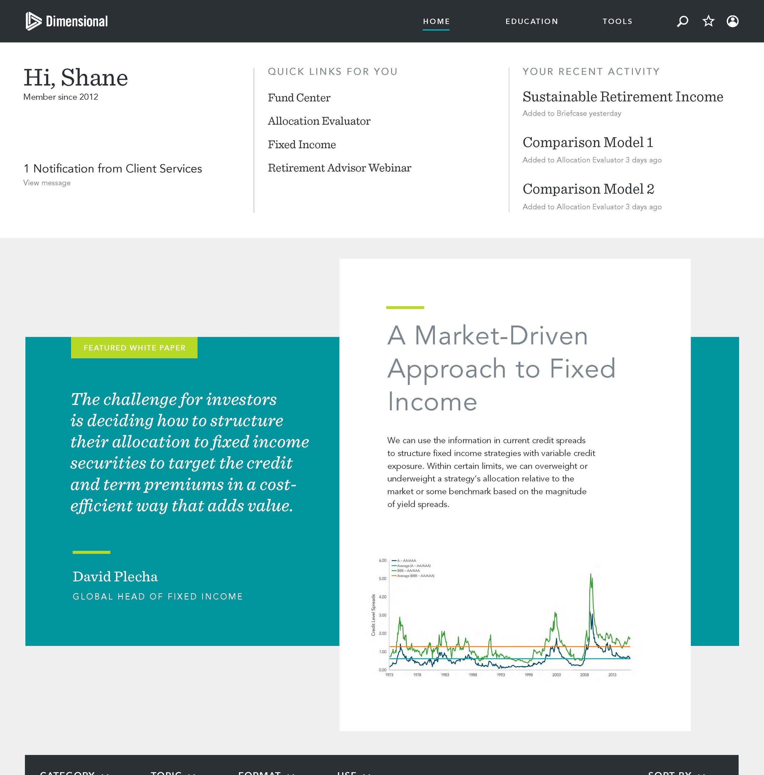
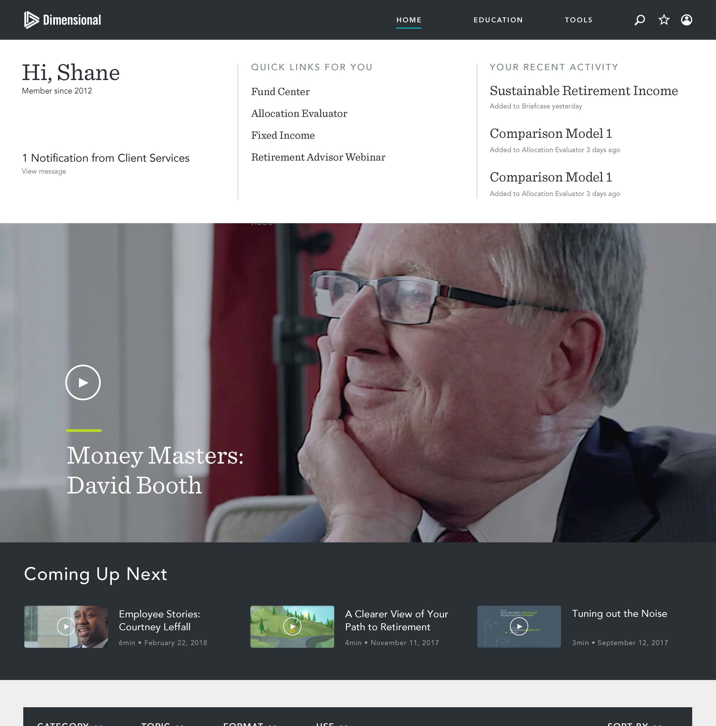
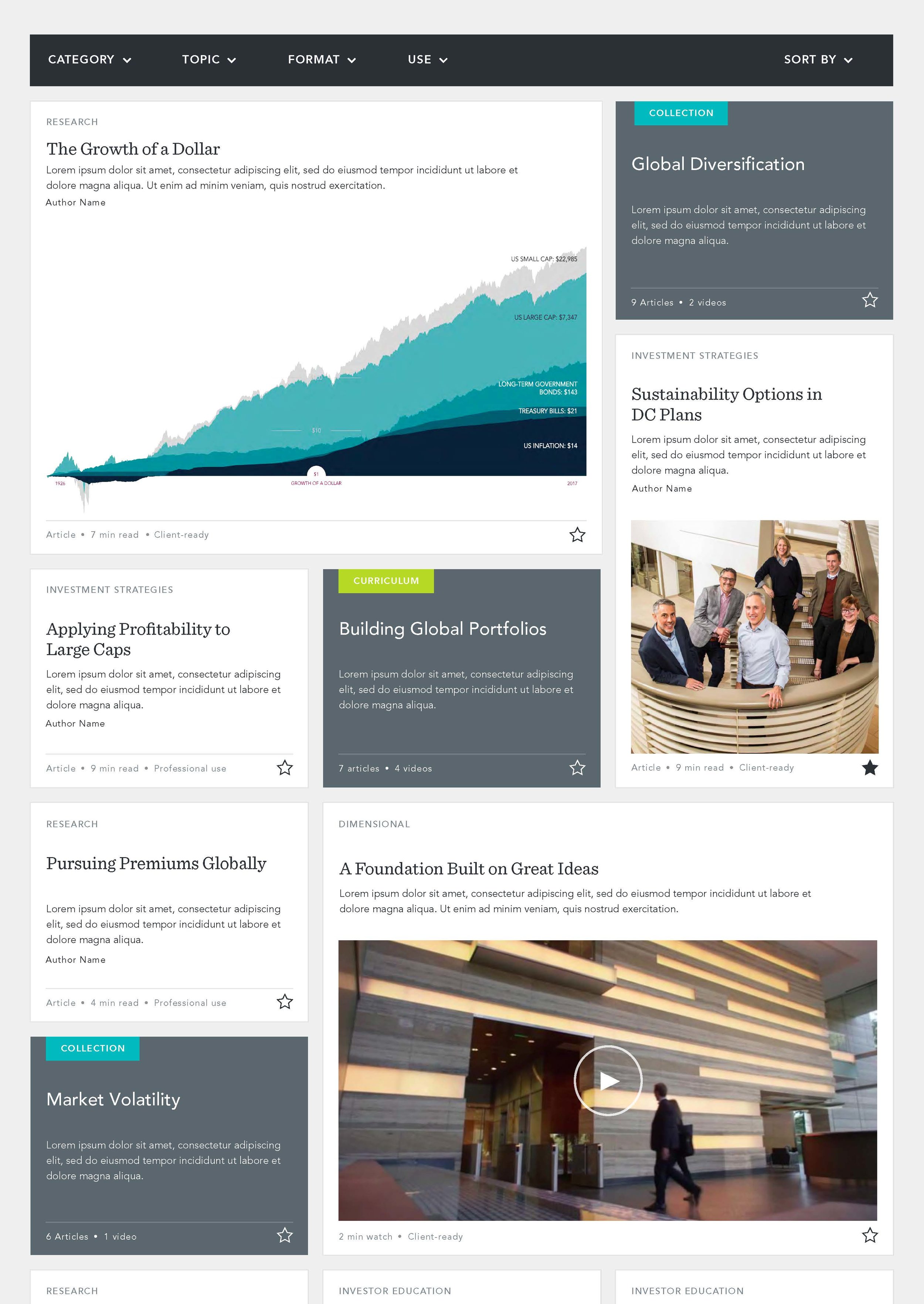
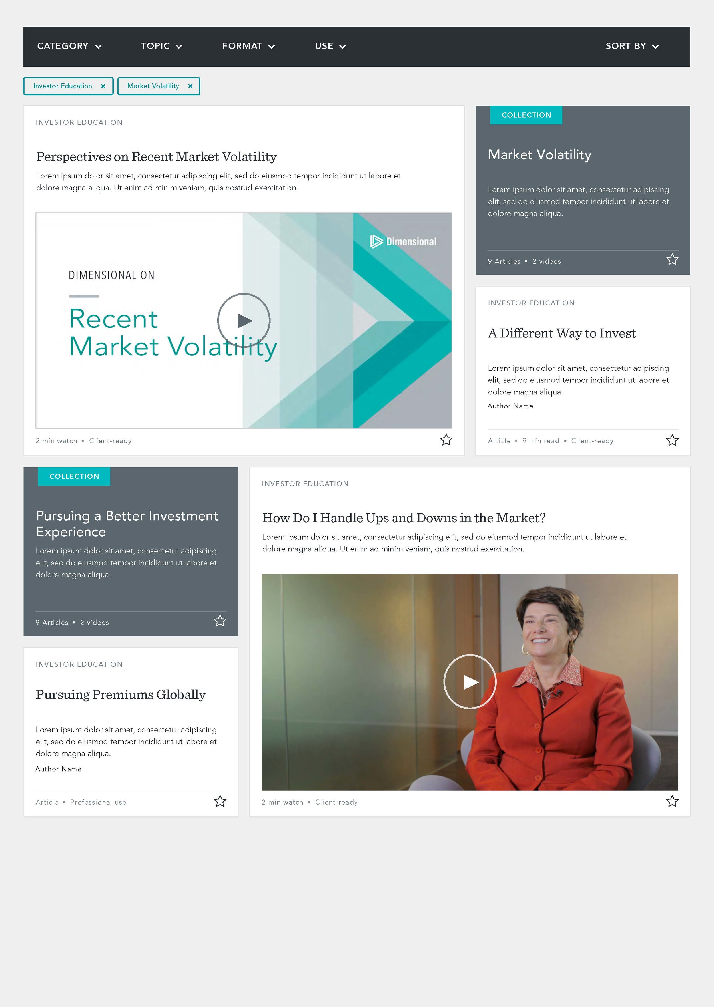
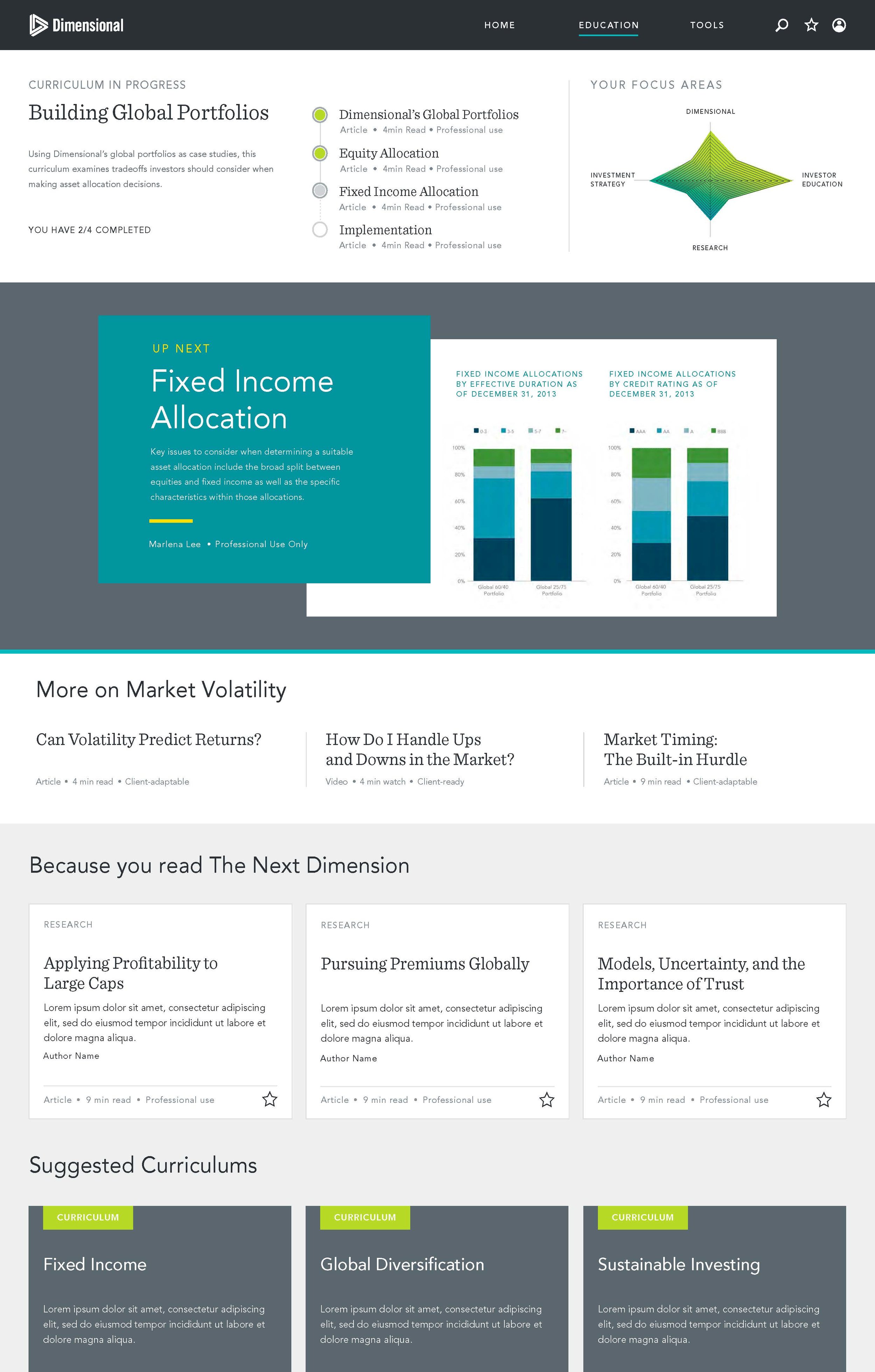
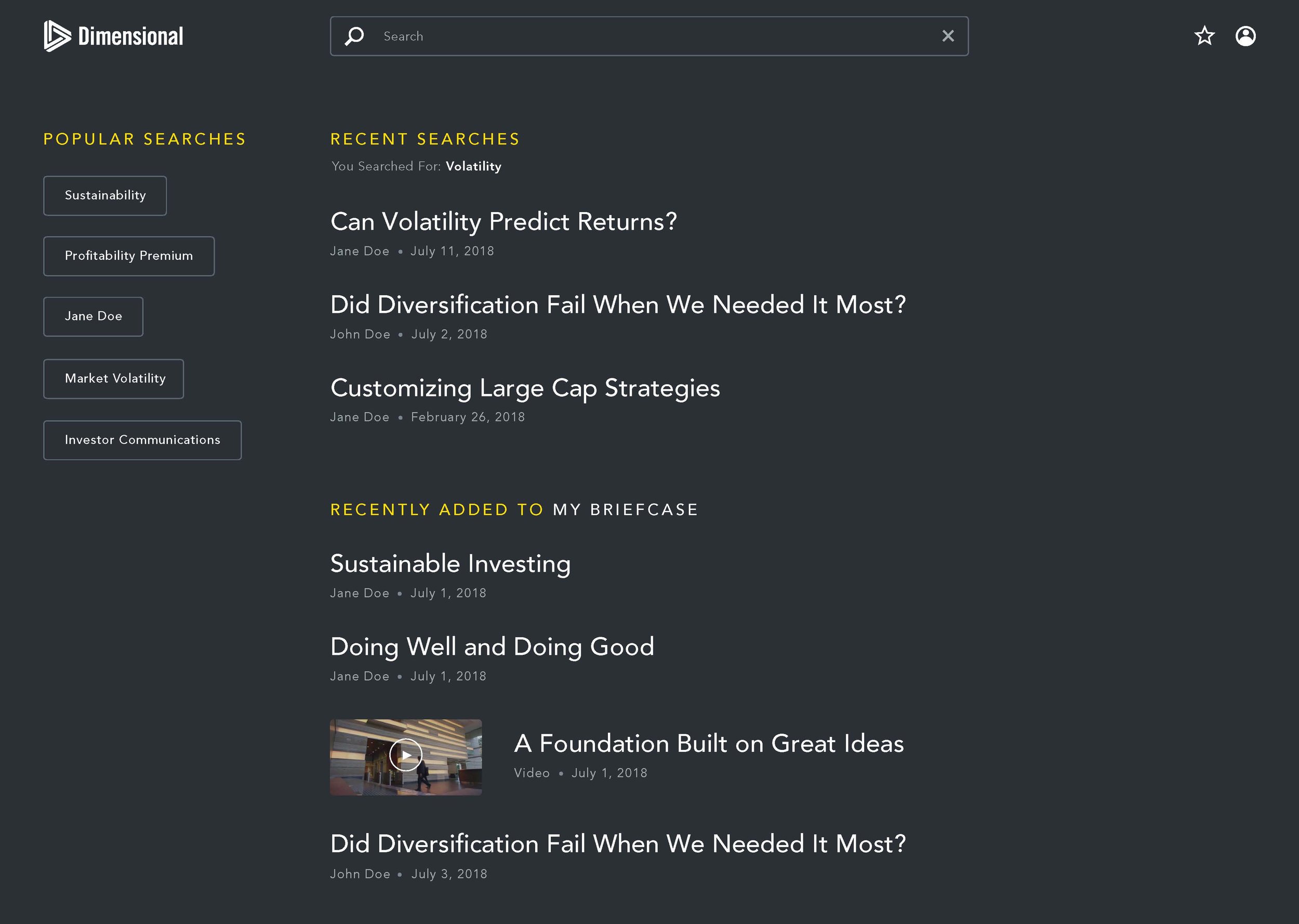
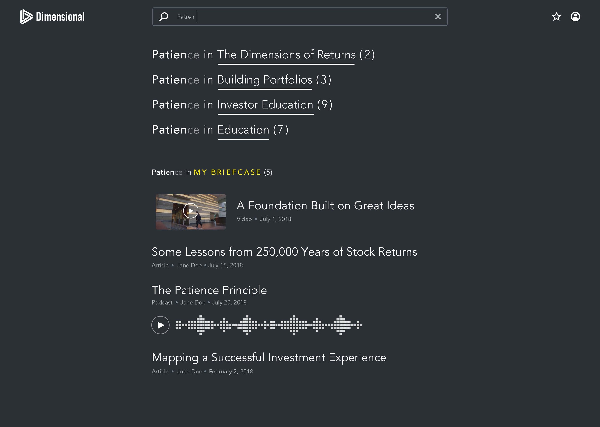
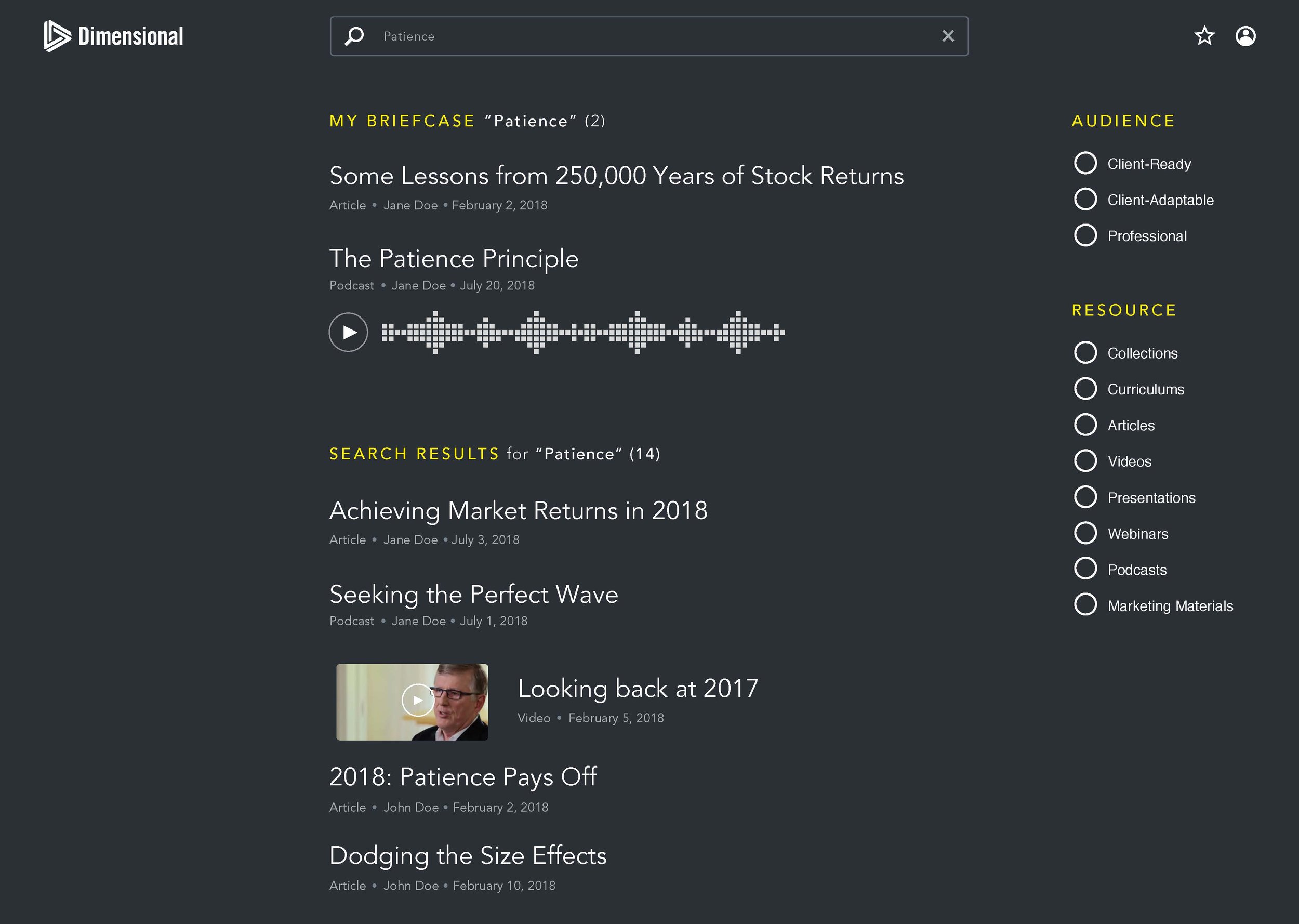
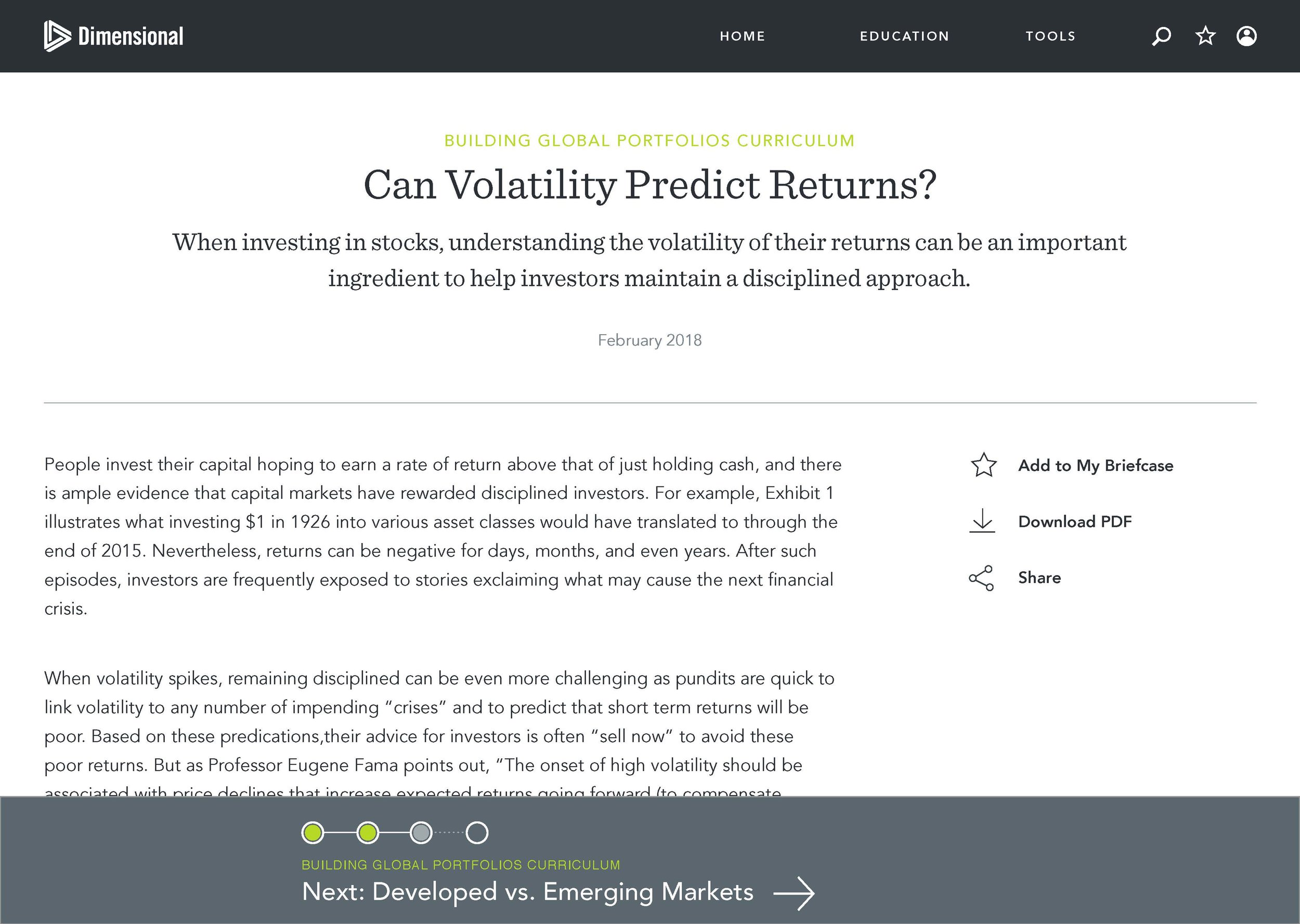
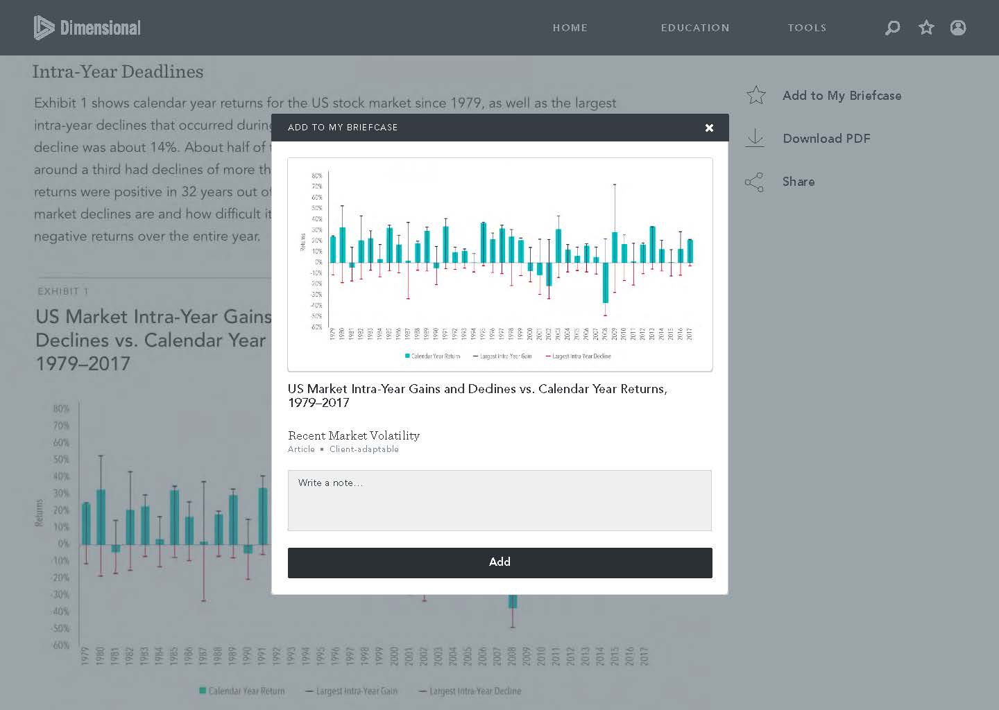
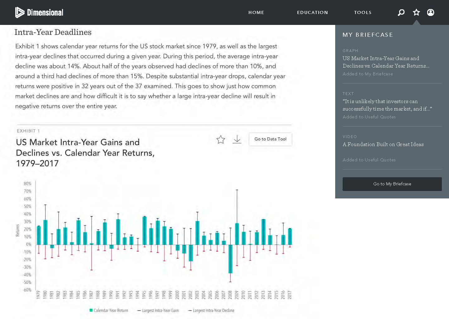
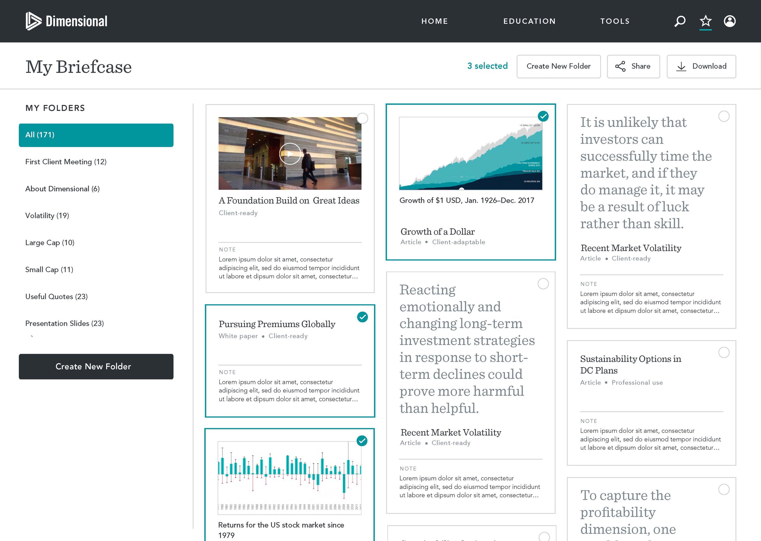
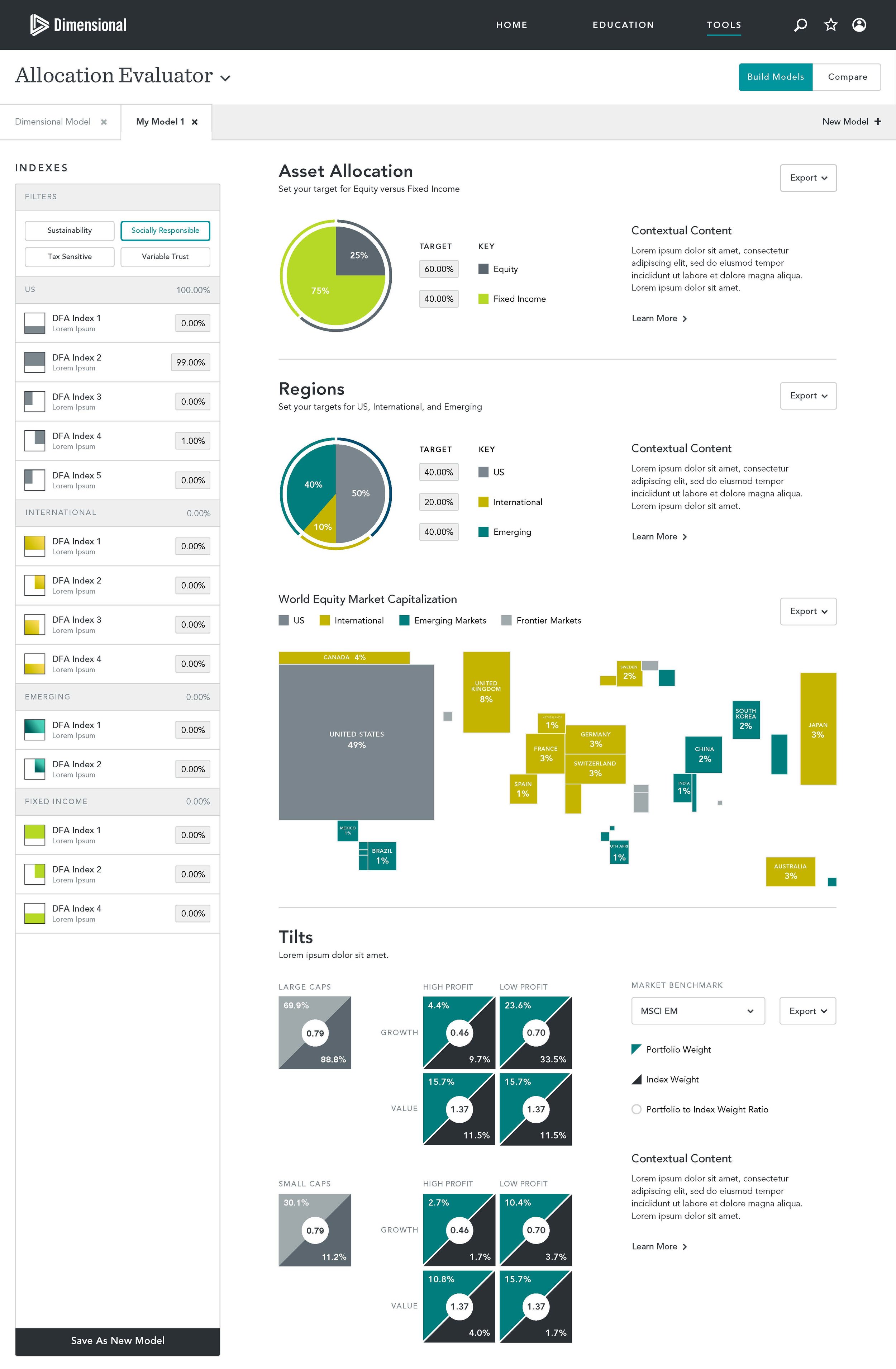
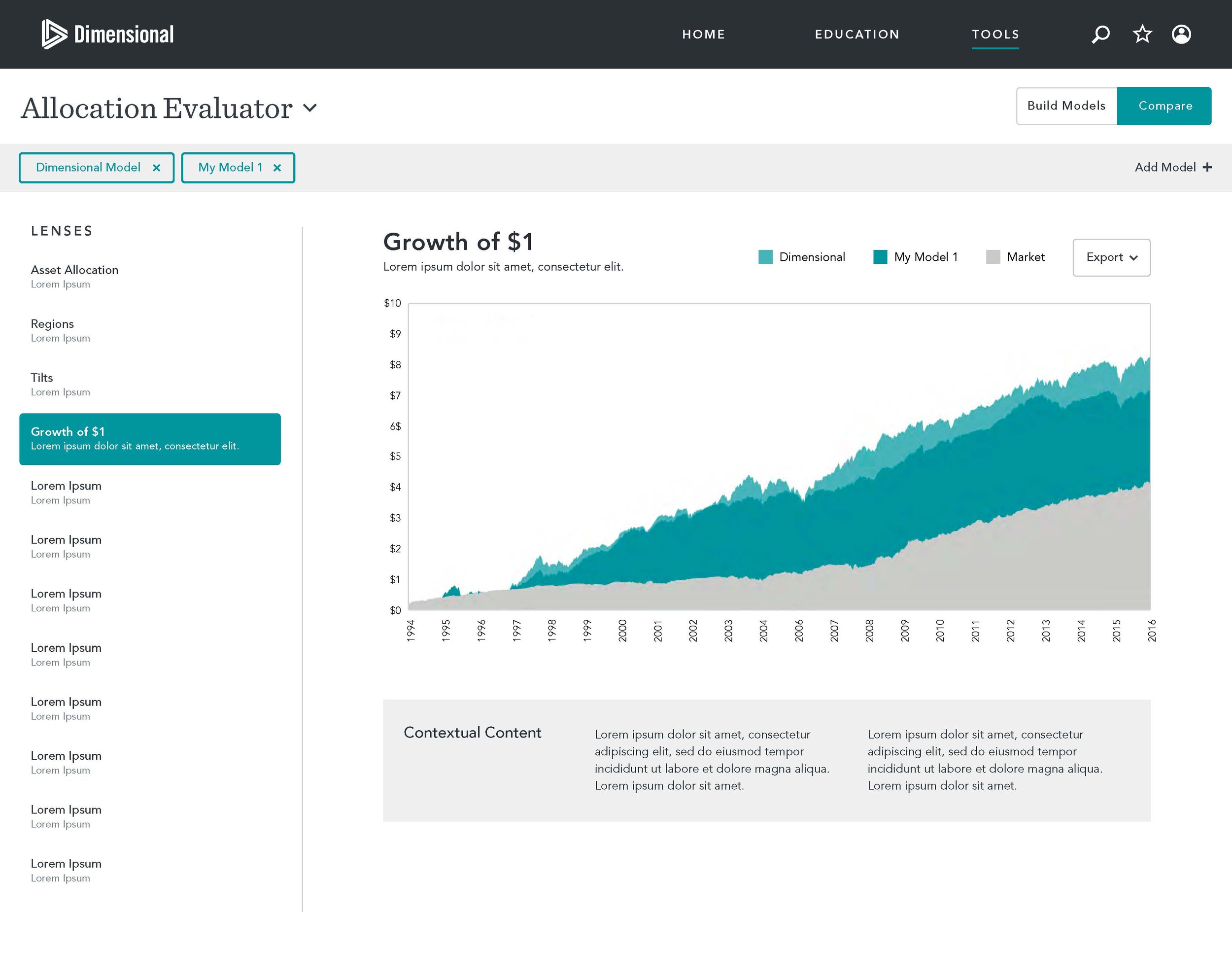
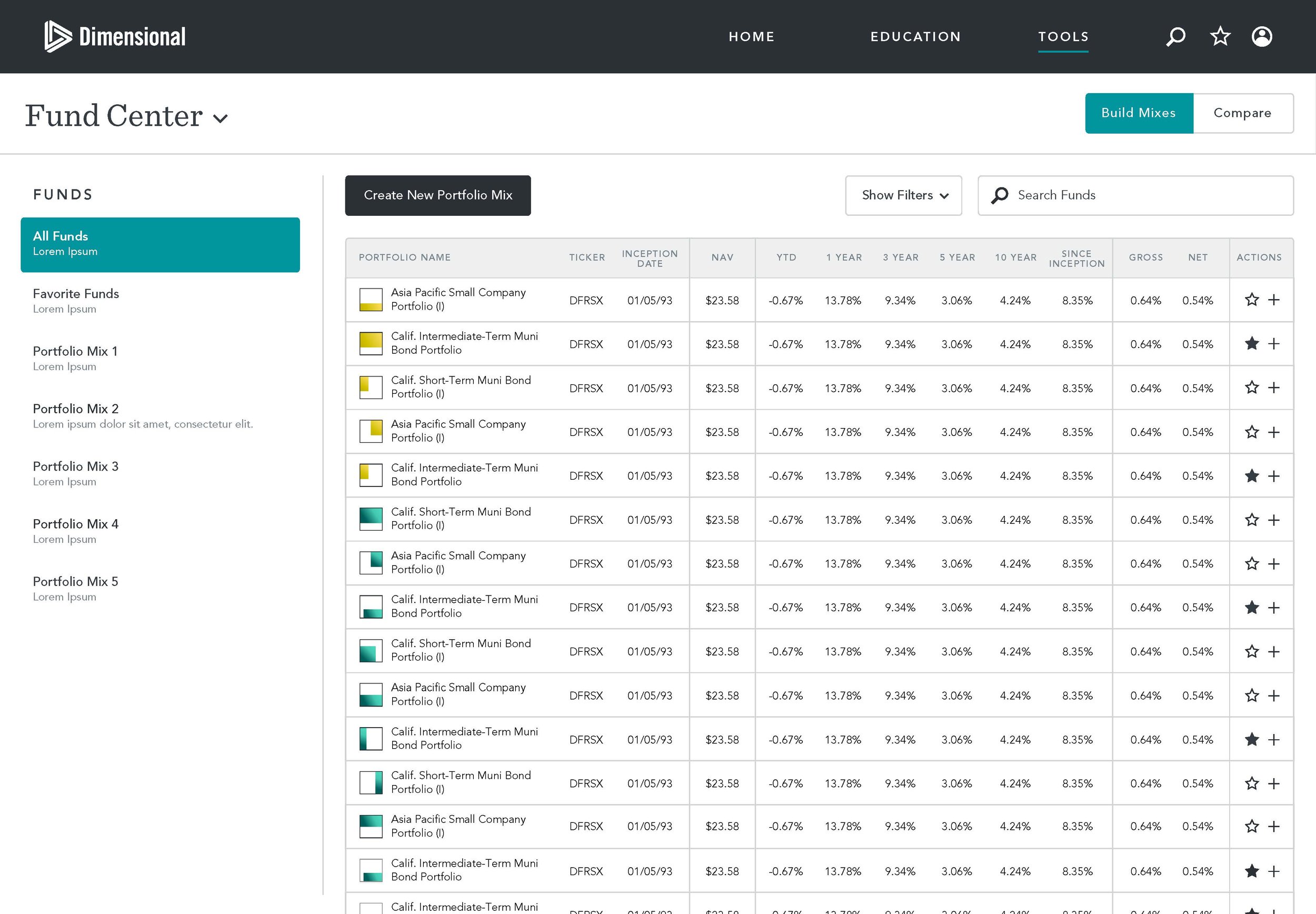
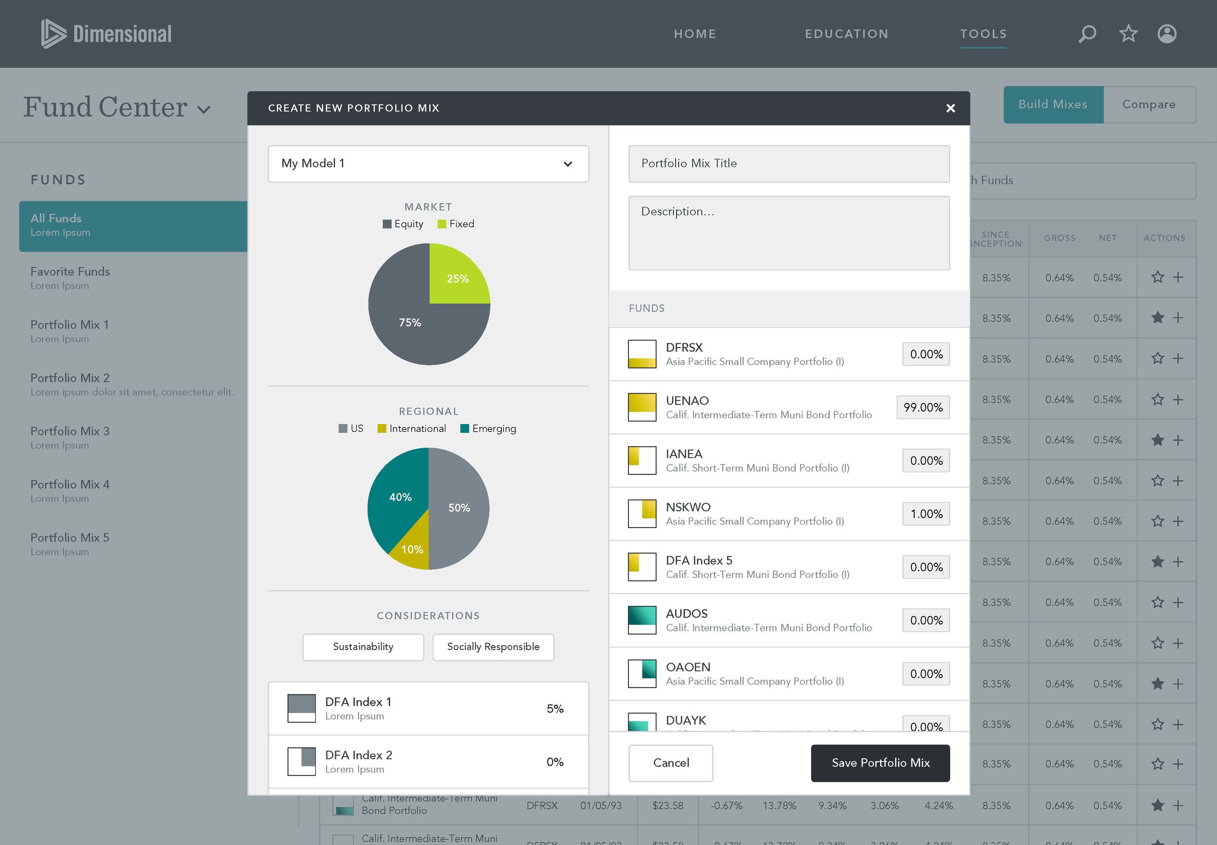
Dimensional came to us to make their internal tools more user friendly, as usage was very low, but their site was packed with complex functions that were buried in old interaction models. This program started with a conceptual phase and then went into detailed design - the frog scrum team's goal was to educate the new Dimensional UX team how to work and implement digital products in a fast paced scrum fashion.
Roles
Content strategy, IxD, desktop + mobile UI design, detailed design.
design process
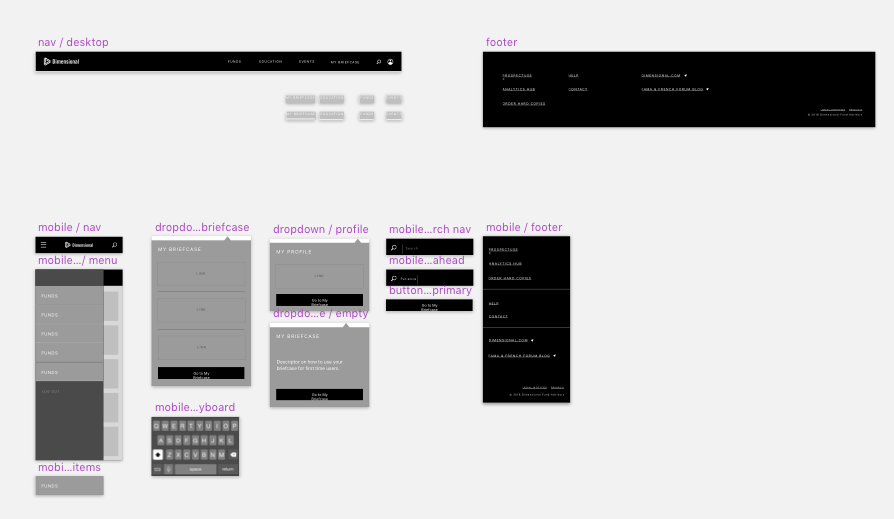
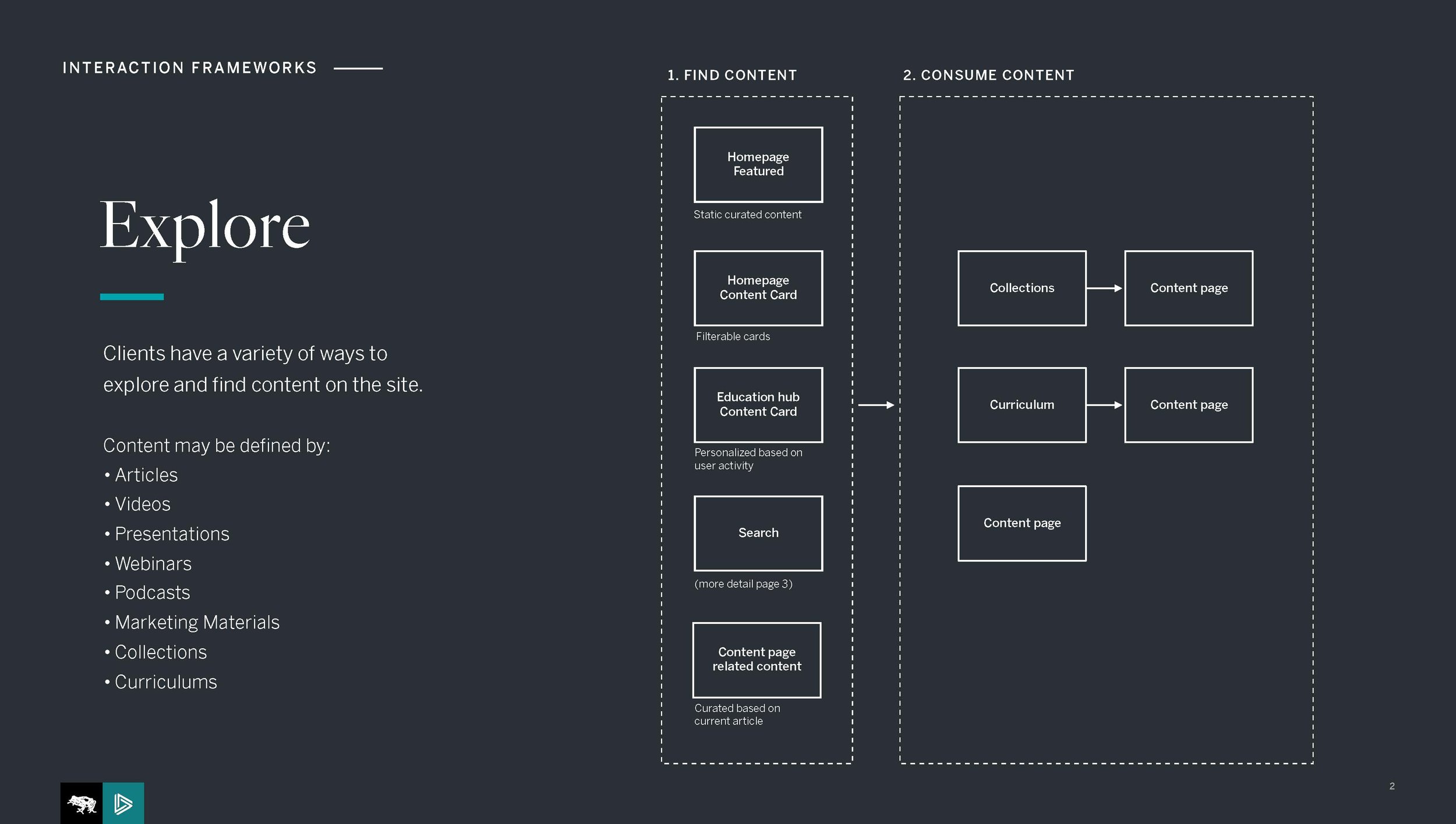
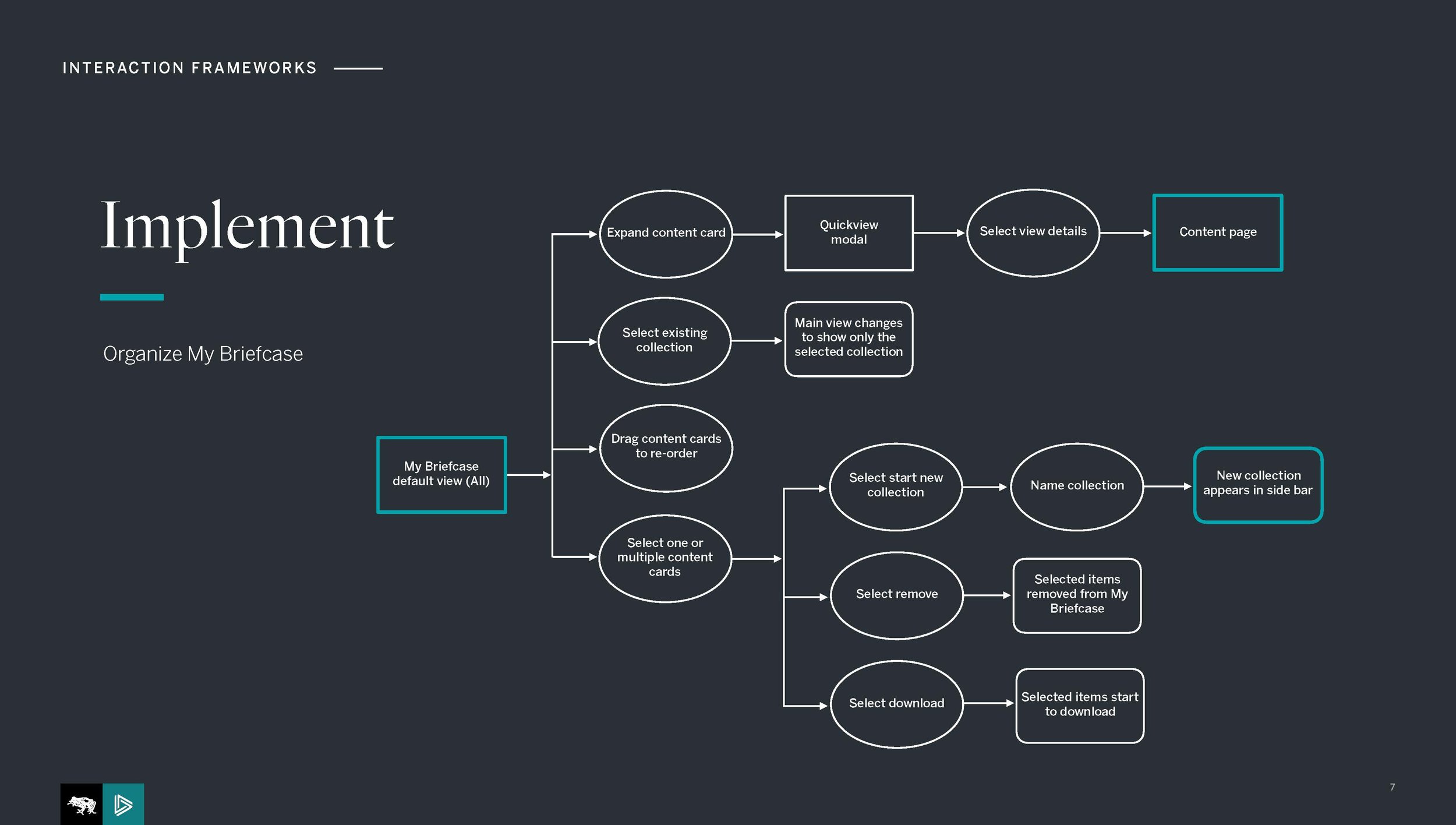
Establish interaction model: Visual design had brought us concepts from the prior phase, but no interaction models where established, and so all comps needed to be thoroughly thought out and a system needed to be created.
Sketch library: I started building the IxD library, and became the "symbol master" for IxDs. We started using Abstract a bit into the project so that we could easily stay on top of the VD explorations in parallel.
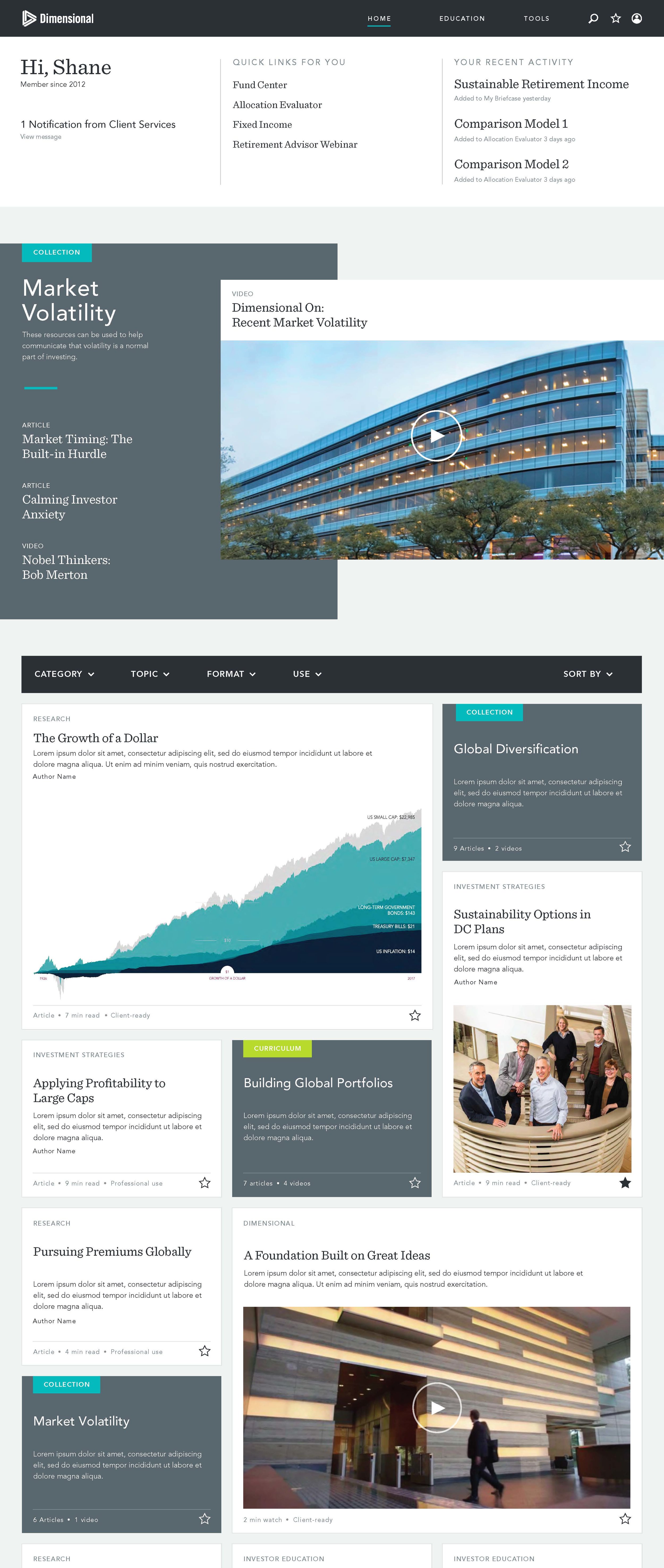
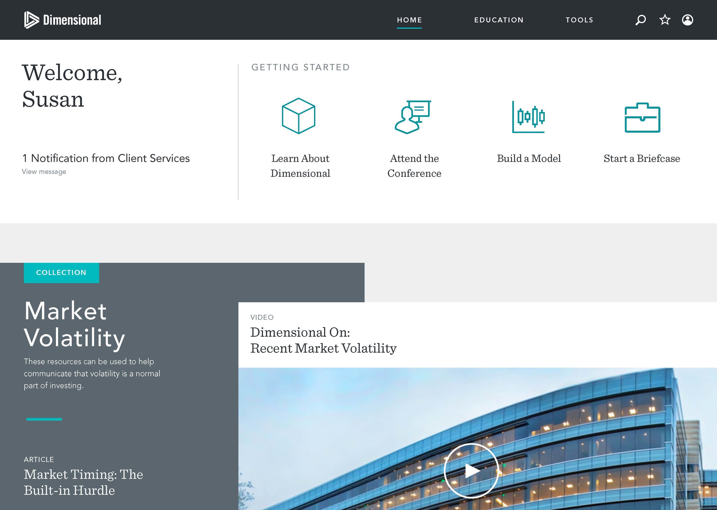
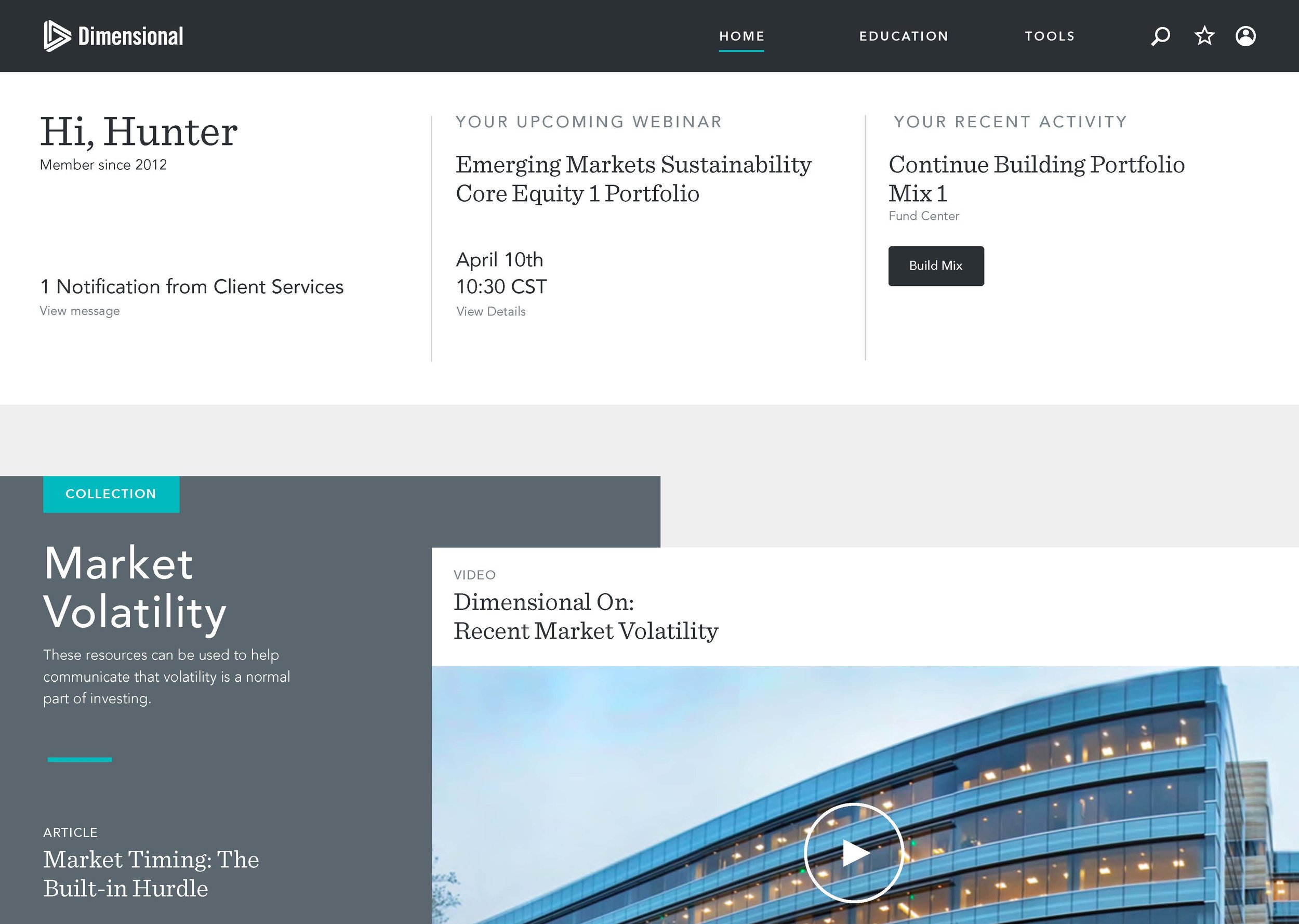
Execution: Then it was all about comps and flows. We used Zepelin to hand off files to the Dimensional UX team to implement.
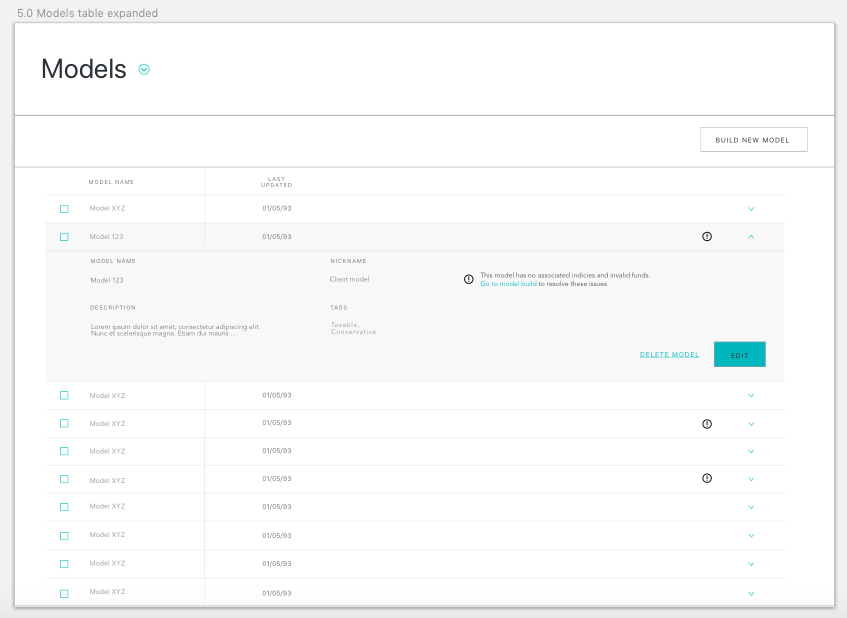
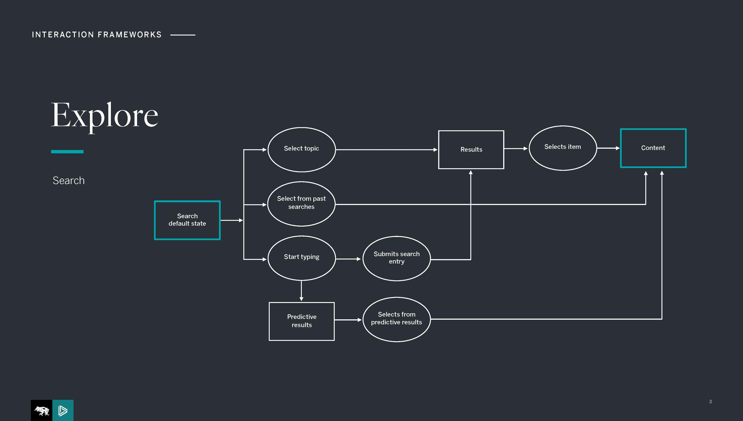
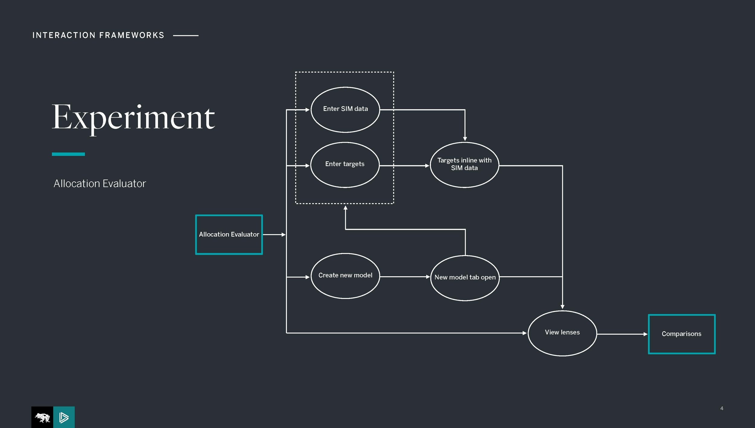
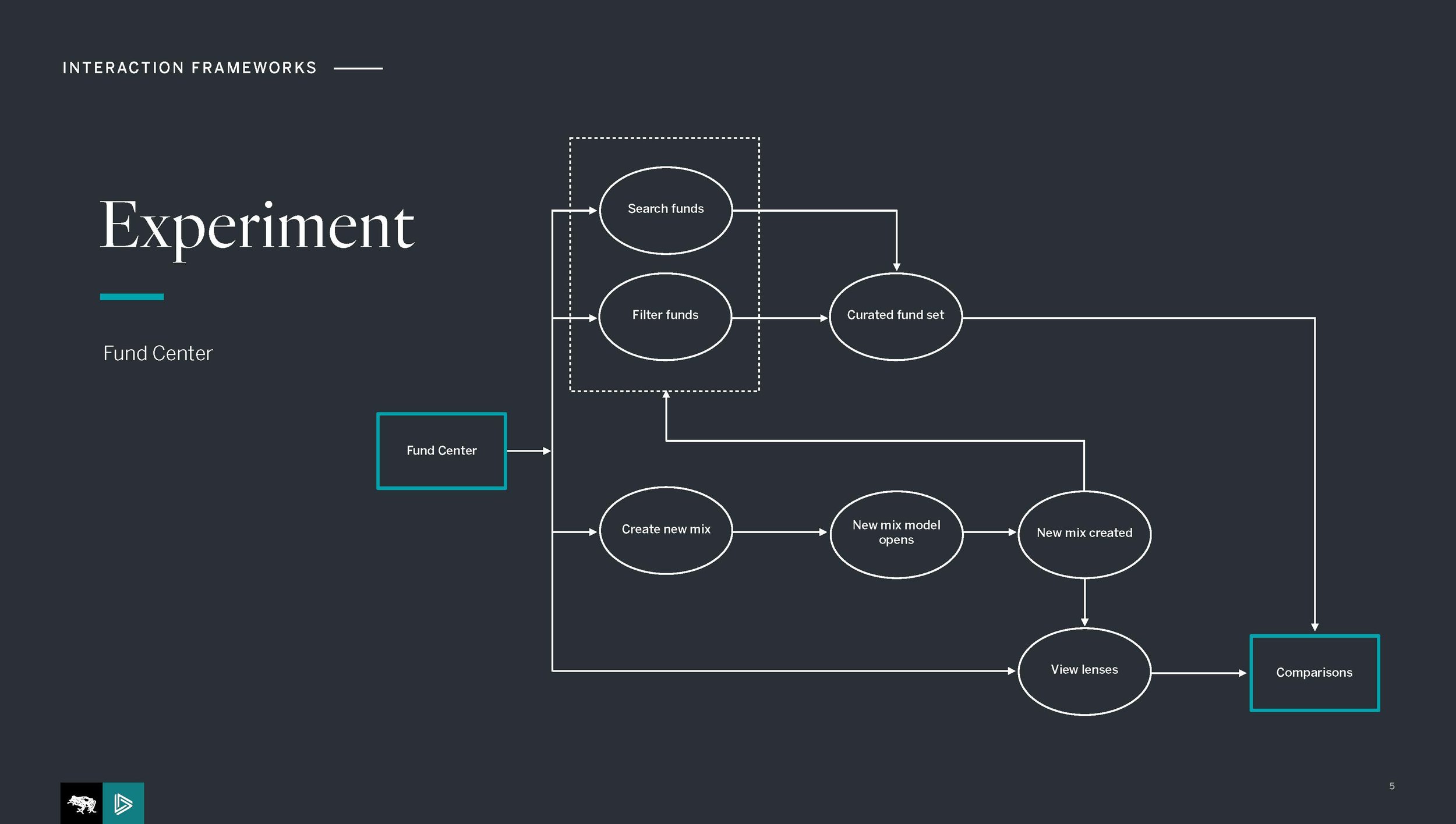
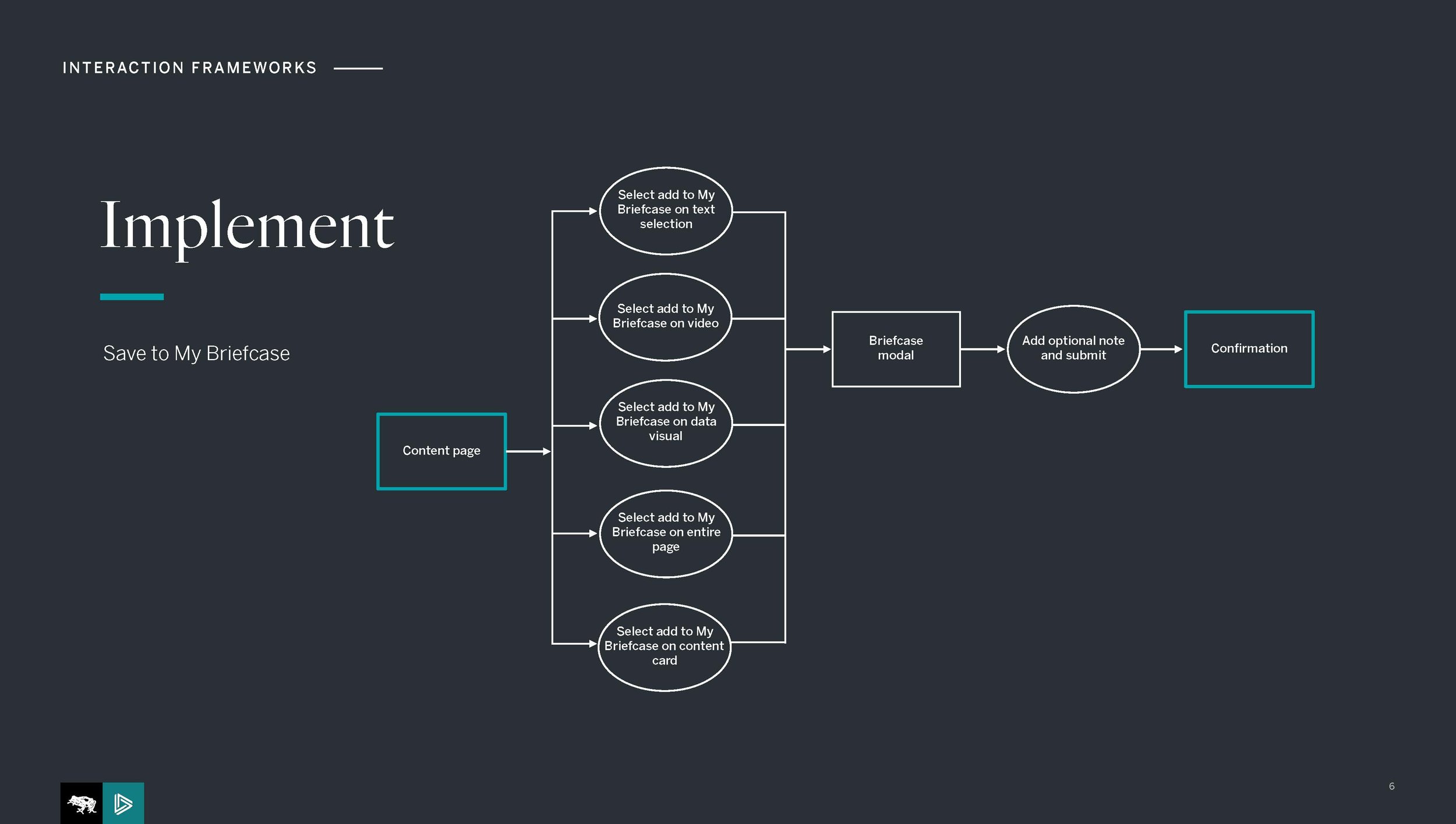
Since we used Abstract for this project, I don't have access to the final designs anymore, but see a glimpse of a few earlier flows and explorations below.
IBM POWER HA SYSTEM MIRROR RE-DESIGN
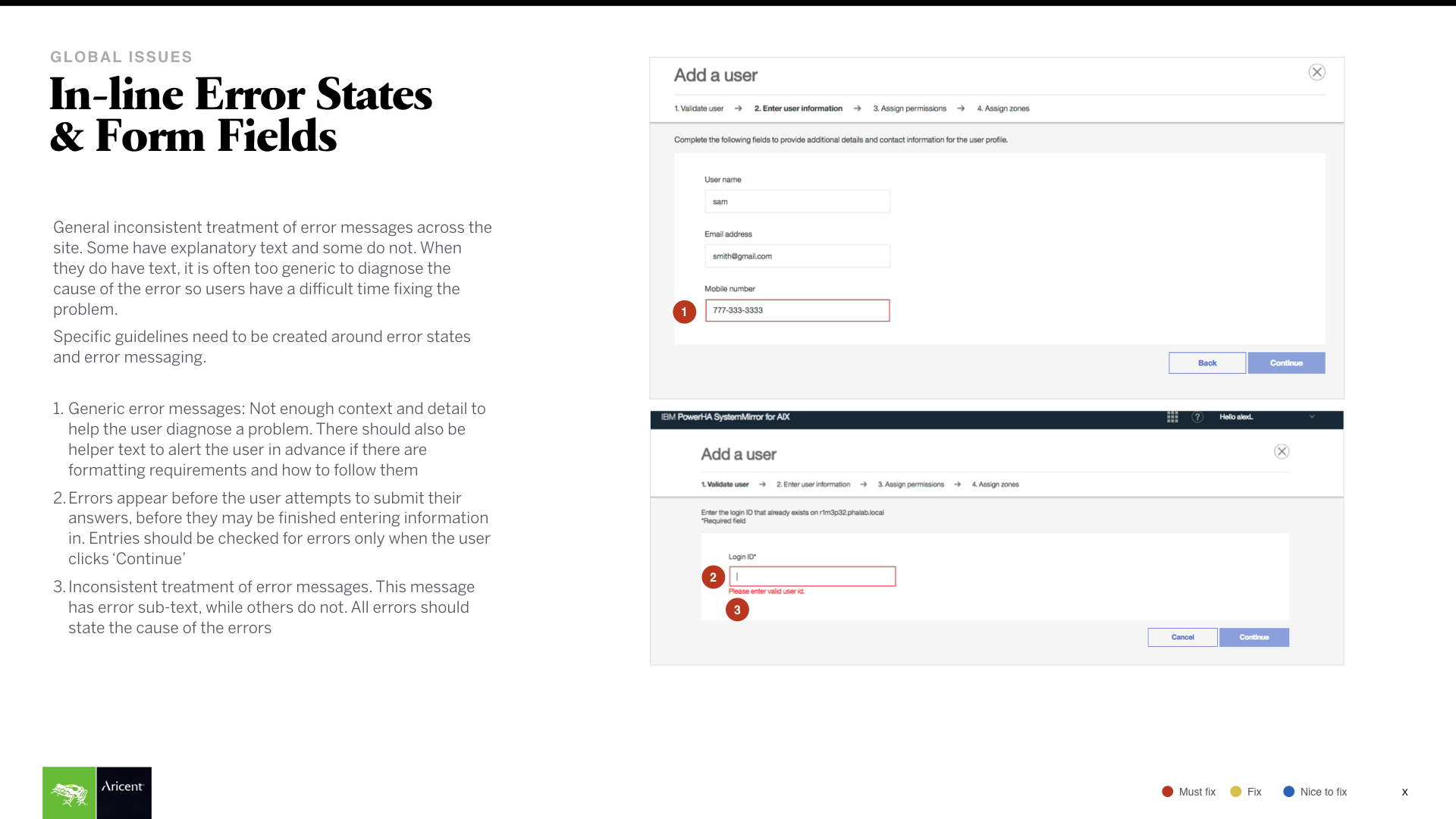
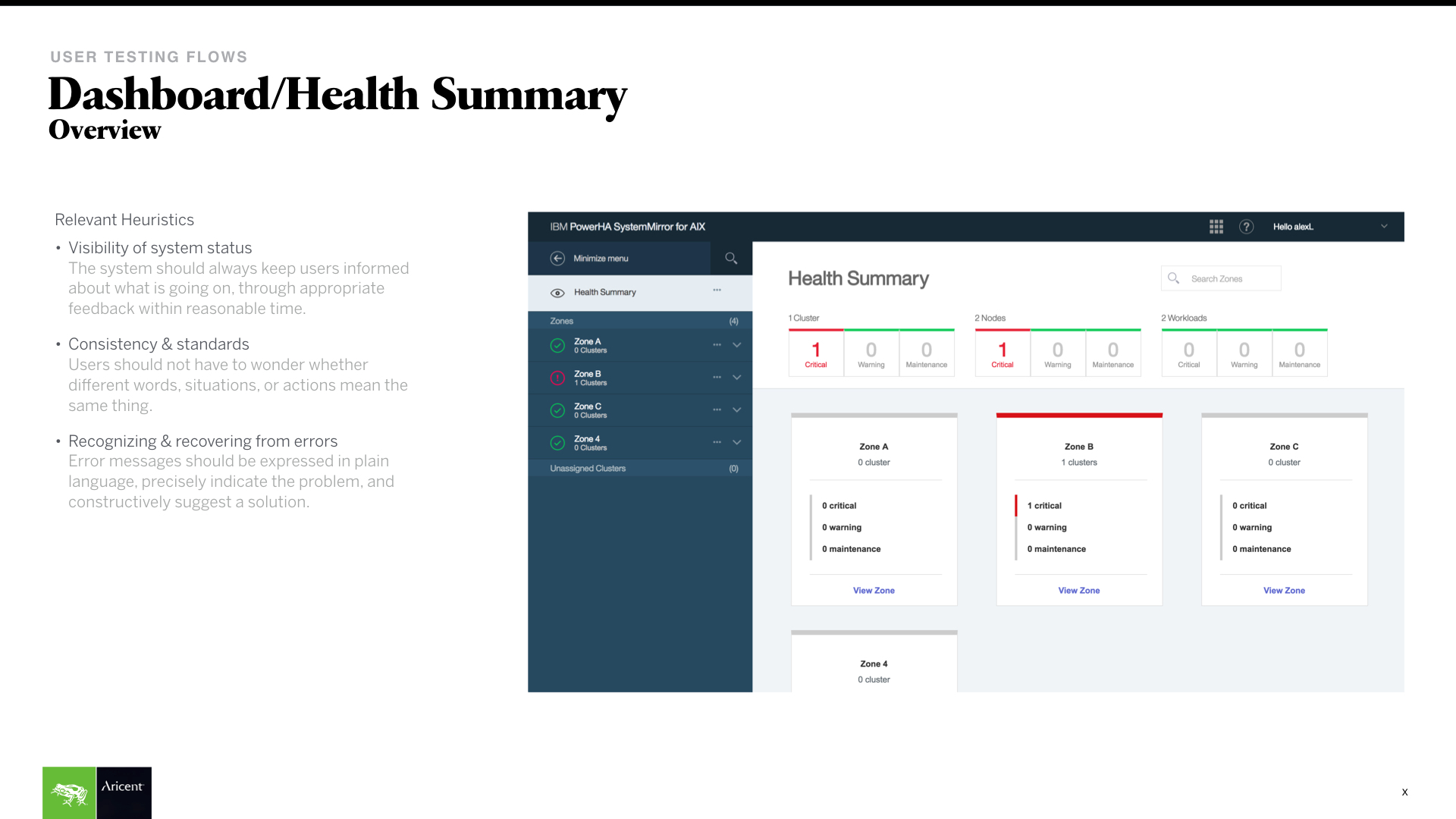
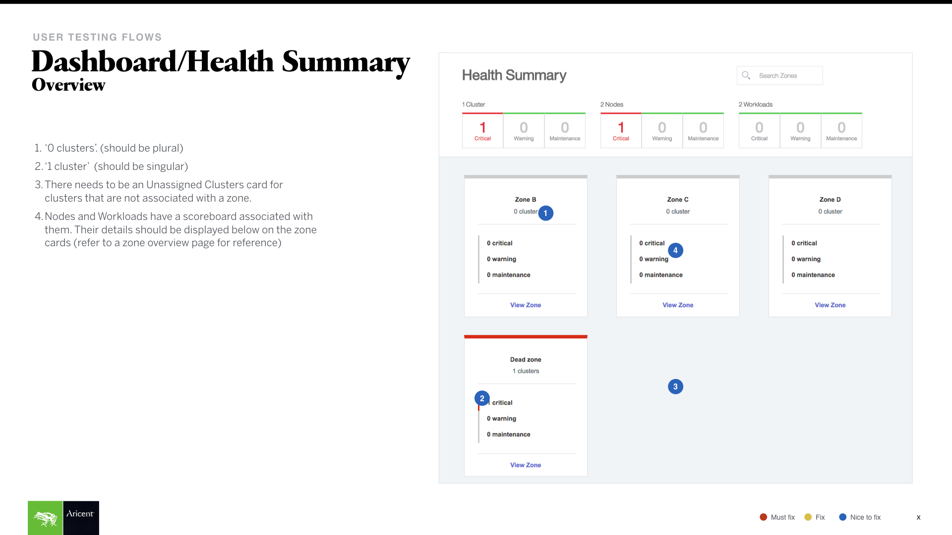
We stepped in with a small team to evaluate and user test the prior UI for the server management software the frog design had done weeks prior. We performed rigorous remote testing and a heuristic evaluation.
Roles
Remote user testing, heuristics.
design process
Stakeholder interviews: We started conducting some stakeholder interviews to get familiar with the product and how users might ideally use it. As it was quite complicated and involved specific nomenclature, this step was crucial.
Heuristic evaluation: This was done by posting every screen onto boards, rigorously going through every element and flow.
Research plan and guide: This time IBM had taken care of the recruitment, but the plan and guide was put together by us.
Remote user testing: Carefully picked a web tools and methodologies to optimize testing and connectivity across the globe.
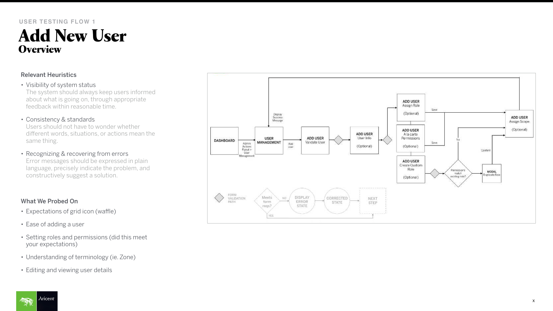
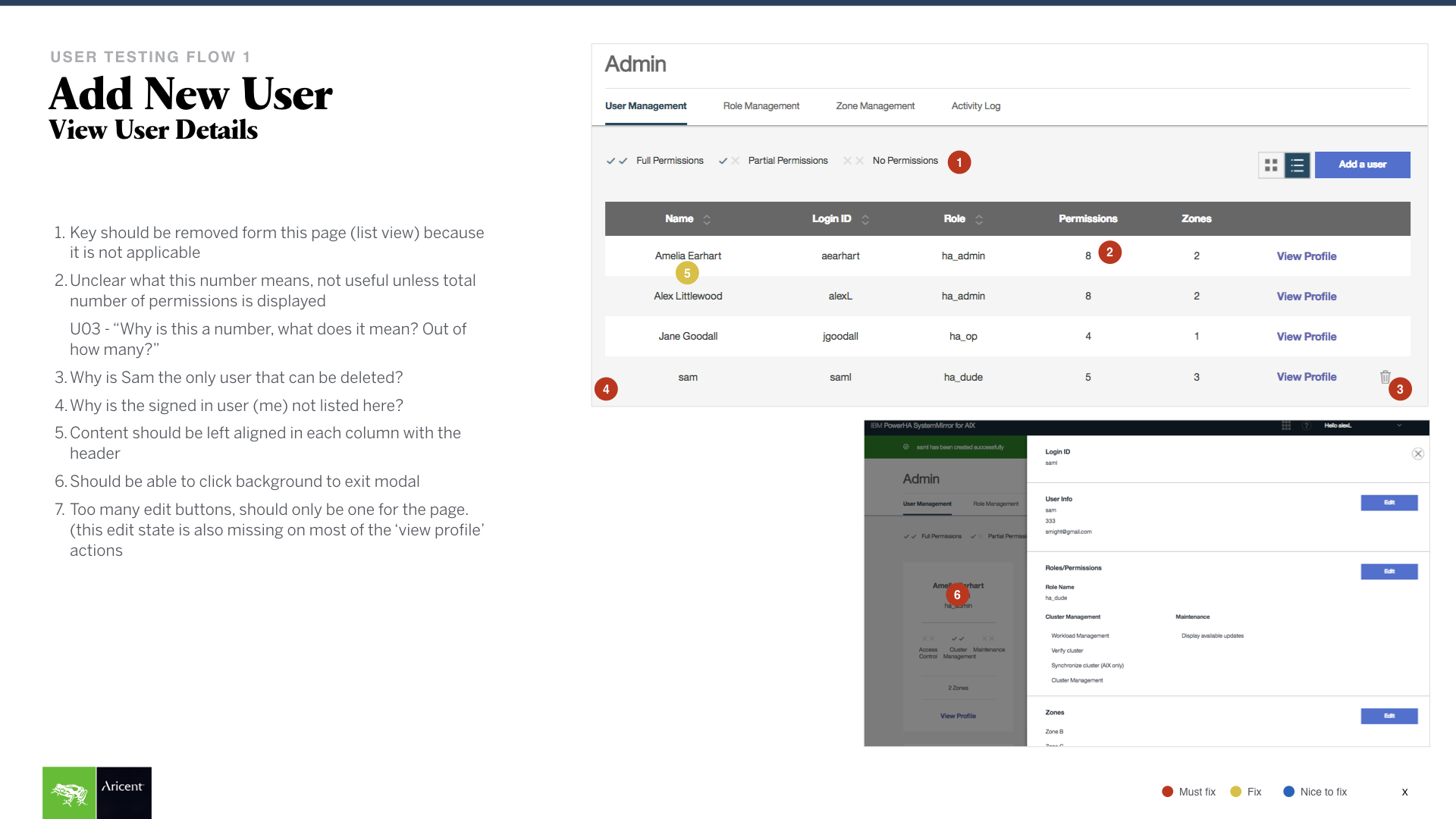
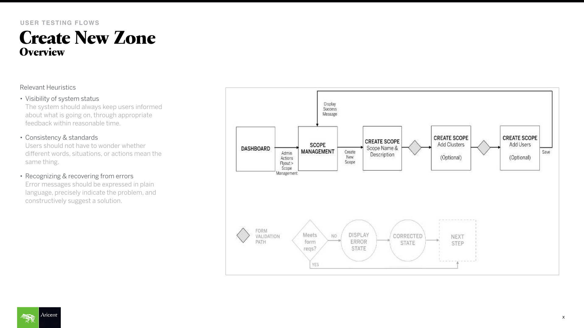
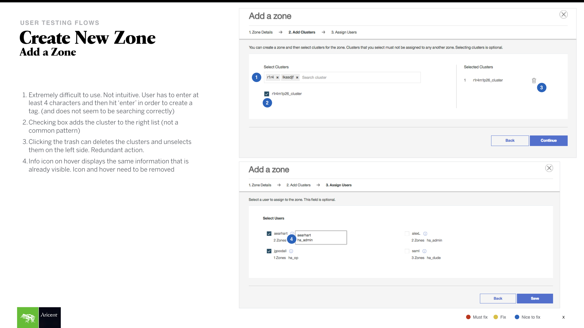
For a sample of the user tests conducted by me, see below (use the same password that got you here).
PFIZER IMPACT ACCELERATOR
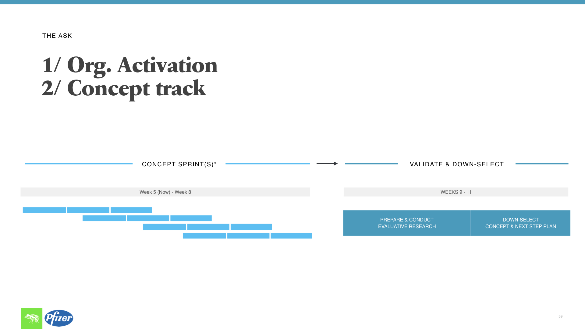
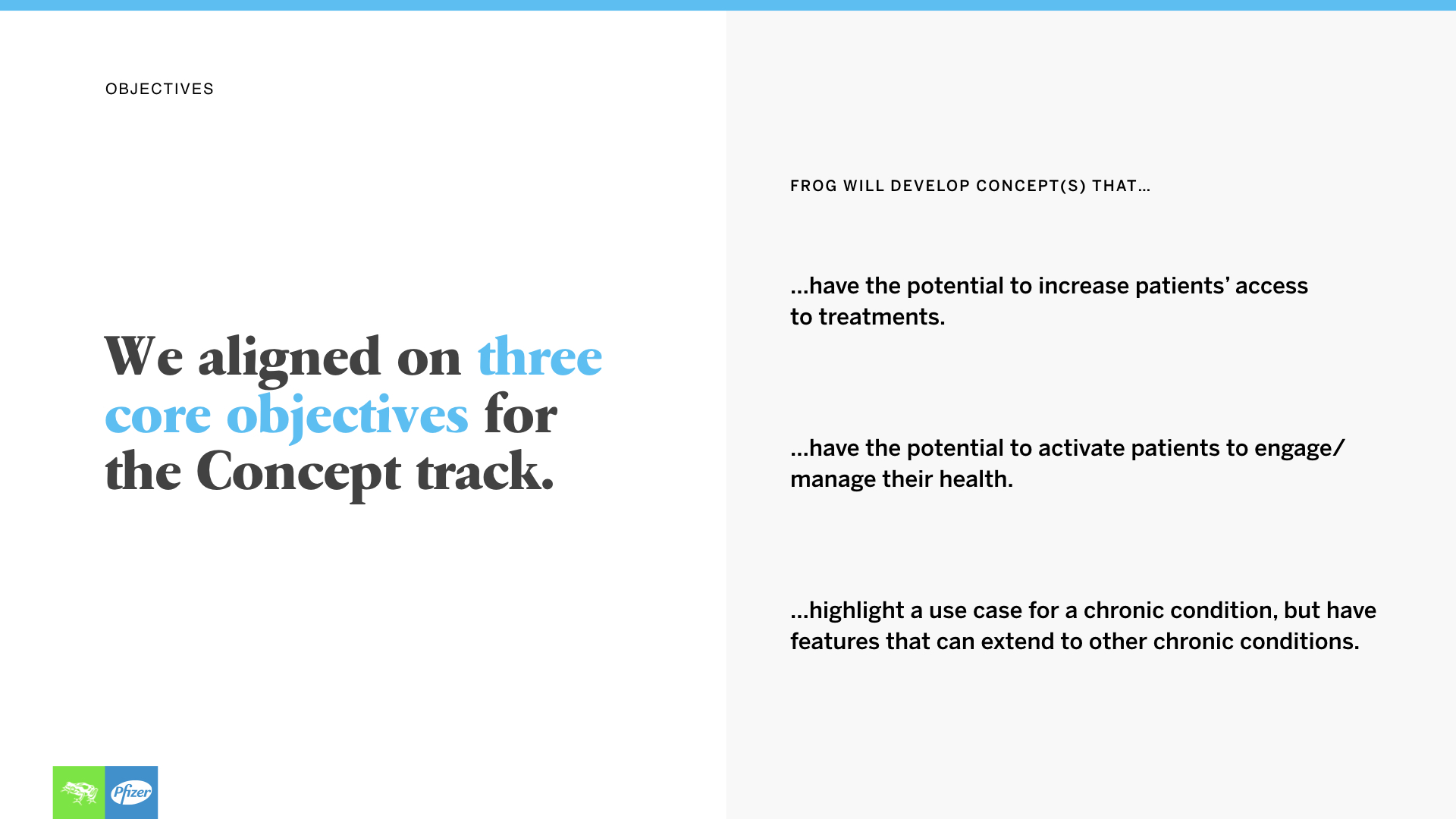
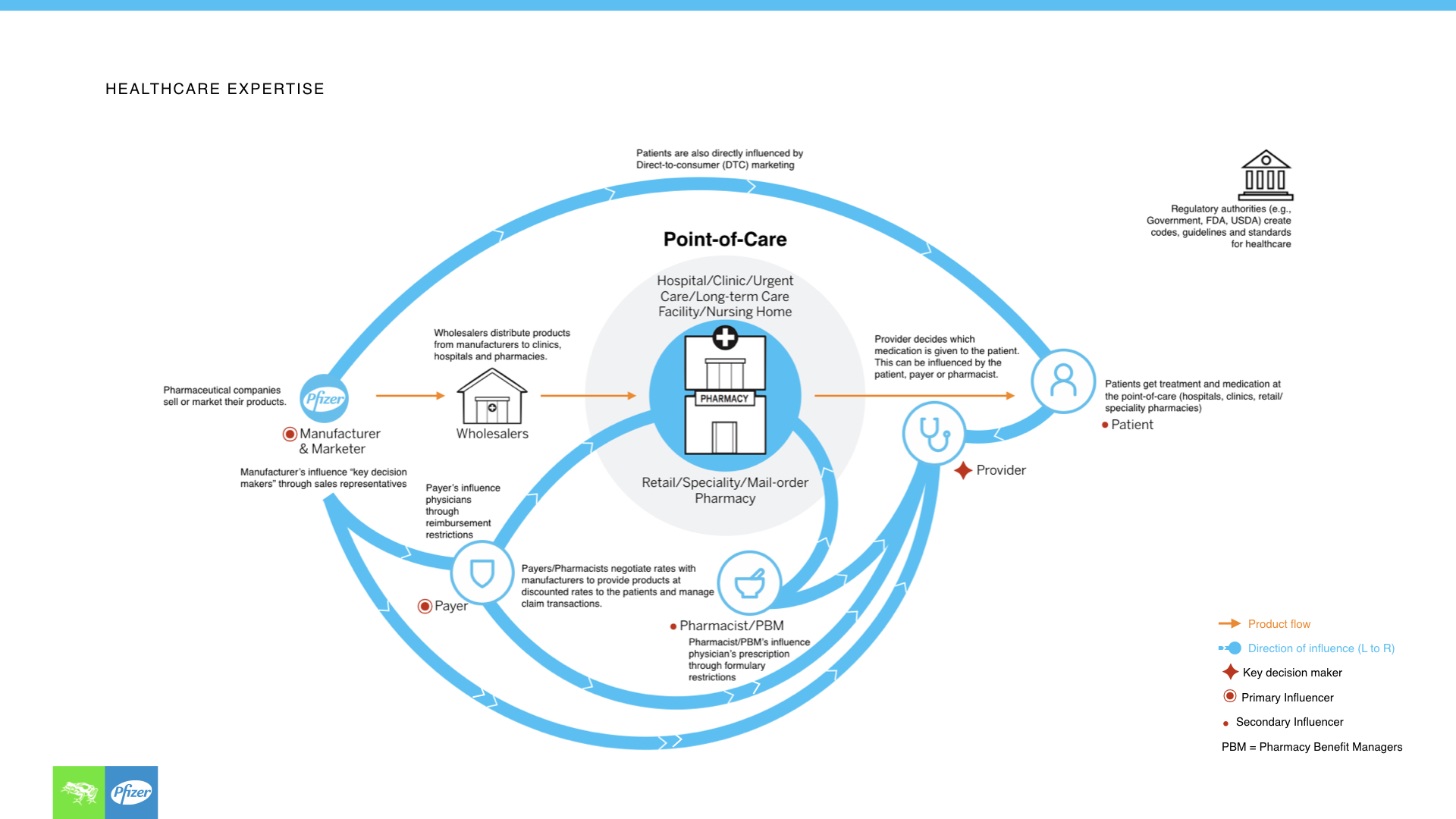
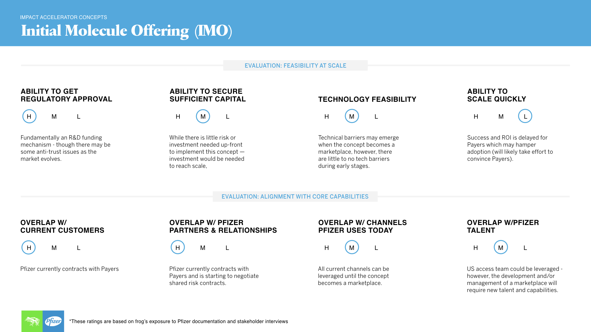
Pfizer came back to us to help them kick start their new impact accelerator. We were chosen with our healthcare expertise to quickly and strategically come up with concepts that they could use as a case study to test their new methodologies.
Roles
Strategy, concepting, UI, storytelling, lead microsite.
design process
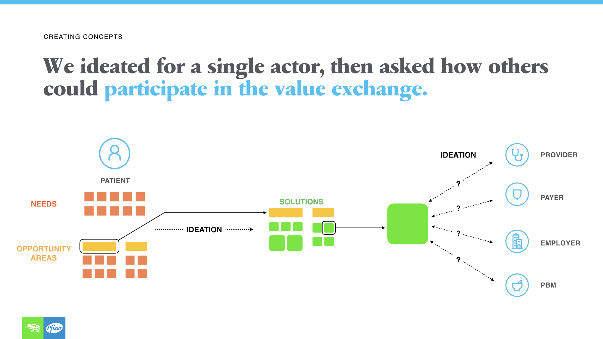
Ideation: This time we started with ideation due to the short timeframe, and selected ideas based on their reach across actors.
Down selection: Using different strategic models together with our healthcare expertise, we carefully created a set of criteria to land on the best concepts for the accelerator.
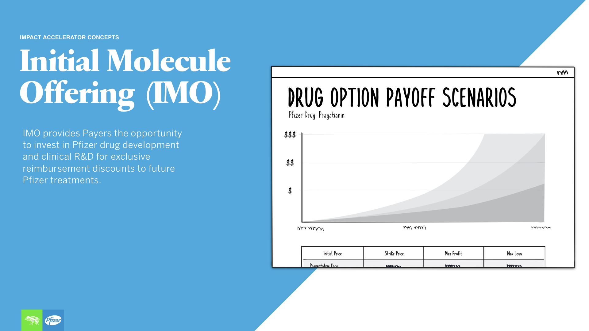
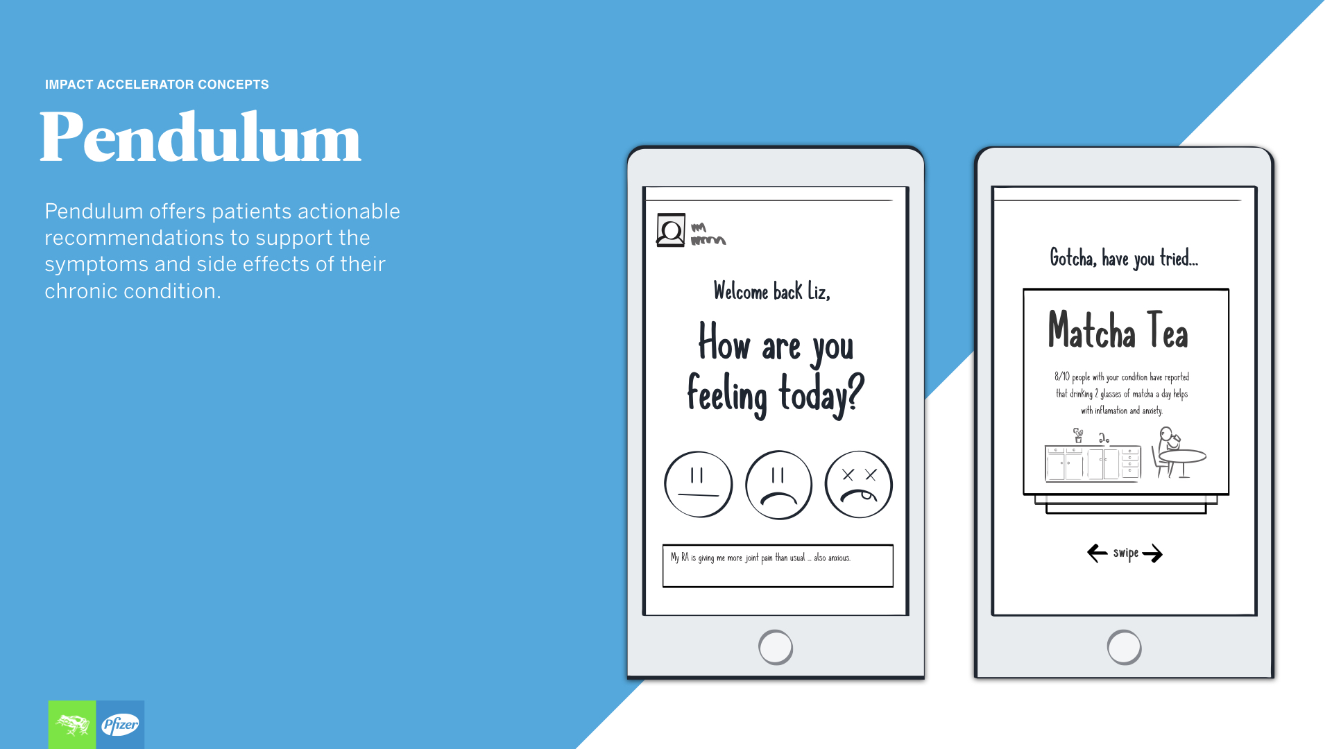
Execution: We created concept sheets that told the story of each concept with storyboards and high level information, and then created a microsite for the concept that was ranked the highest.
See the highest ranked concept microsite and the final deliverable just download the folder here and open the html file.
CIGNA HOMEPAGE, DENTAL, EAP & WELLNESS REDESIGN
Cigna needed to push their designs into the 21st century, and asked us to help us do so. This involved understanding their plans thoroughly and enjoyably making the process of finding affordable care for users a little bit easier.
Roles
Desktop + mobile UI design, user testing, detailed design.
design process
Stakeholder interviews: It was challenging to understand from their current site how coverage and the different benefits work, so stakeholder interviews were crucial.
Whiteboarding: Many whiteboarding sessions were made to figure out how to translate all the information on their current site into an easily digestible, simple user experience.
UI design: After that we went into Sketch and created a library that could be used across the team. InVision was used to comment on designs with team members remotely.
User Testing: We got feedback through low fidelity InVision prototypes in order to quickly assess if the design needed to pivot and concepts regarding their health information clicked.
Annotations: Please see a sample of the work below (flow, final homepage and wellness wireframe), and feel free to download my annotations here (please do not share).
