

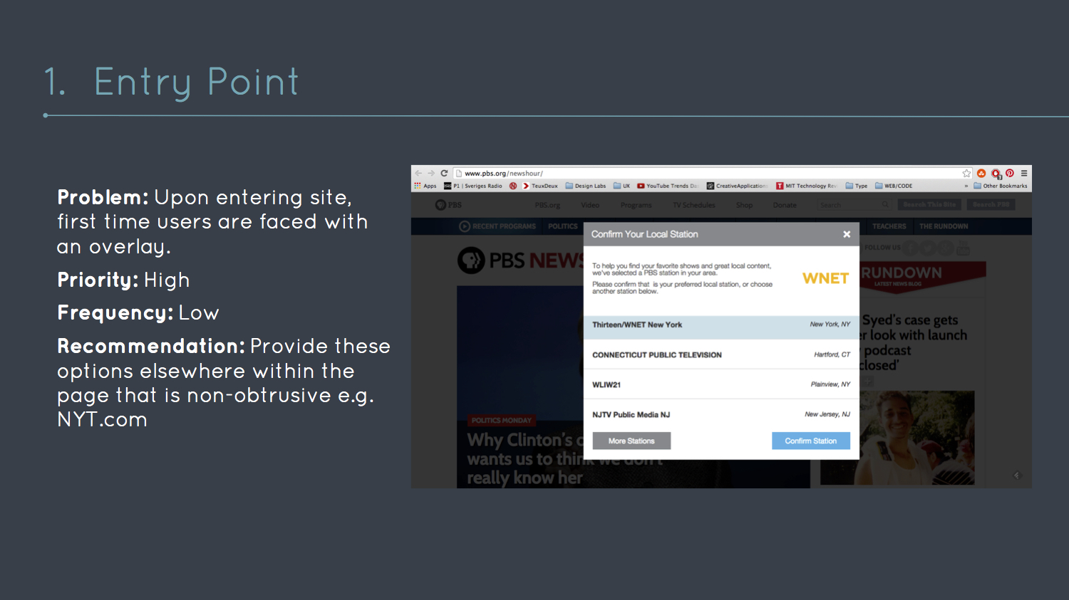
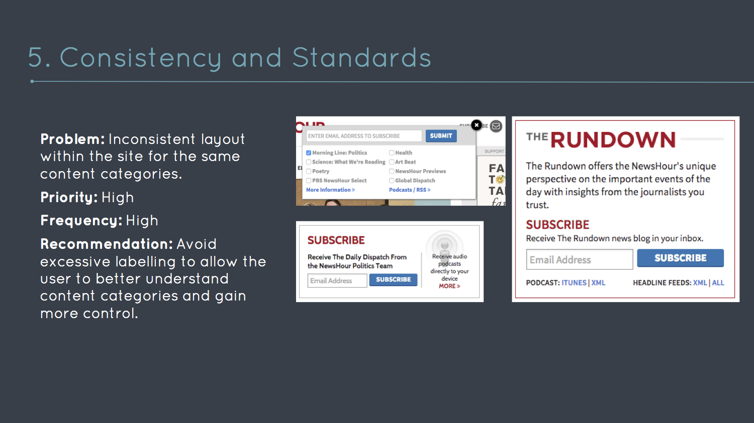
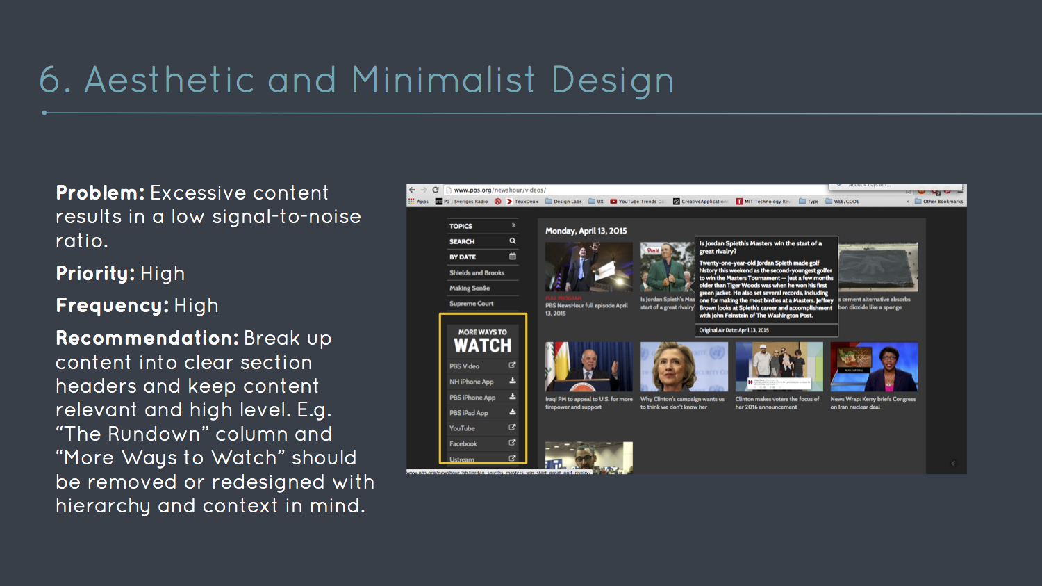
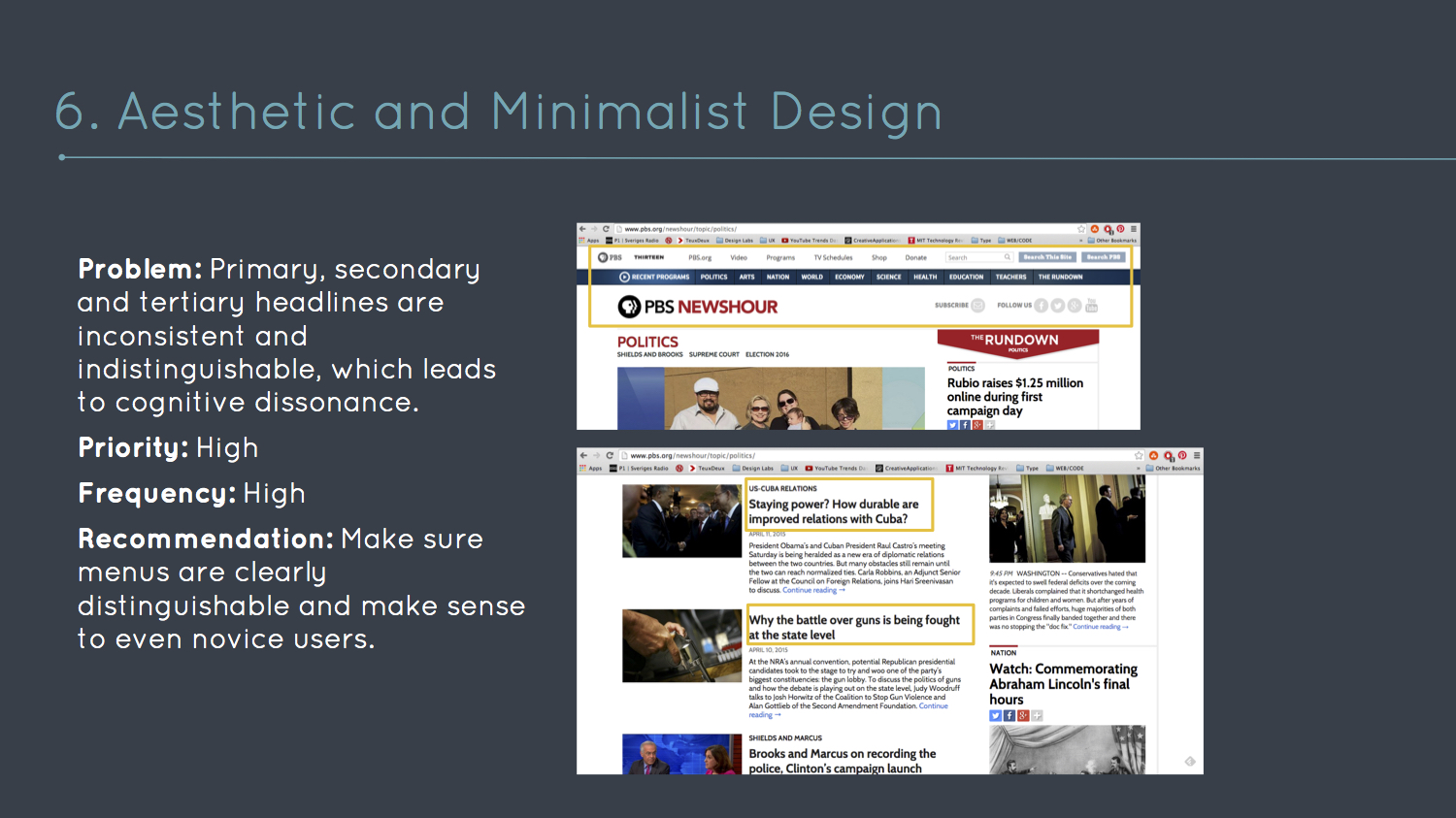
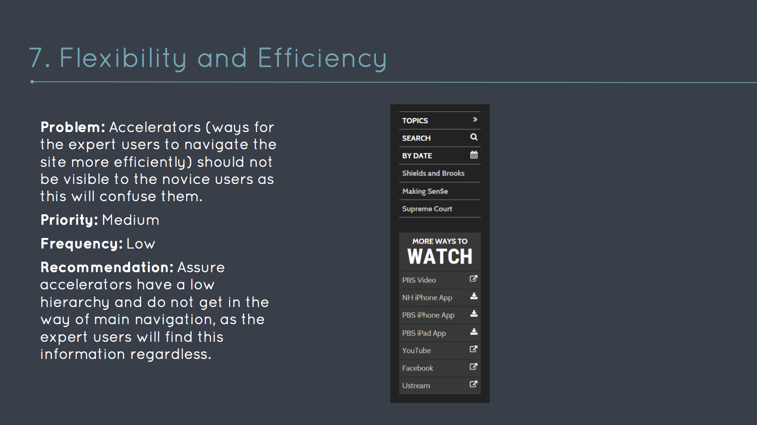
Heuristic Analysis of the PBS Newshour Web Platform
This document presents synthesized site-wide trends with specific recommendations, evaluated according to universal principles of design.


Shopper Observation
A shopper faces many distractions in the store. In this case poor route decision, visibility, consistency, mapping and a poor signal-to-noise ratio misled the user though the wayfinding process, ultimately leaving the store without the desired product.
objective
Shadow user whilst looking for the “Small Command Hooks” by M3.
Pain Points
- Poor visibility
- Difficult to categorize product
- Bumped into person behind her in frustration
- User did not succeed in finding product
PROCESS NOTES
Thinking out loud worked well, user communicated stream of consciousness. Video documentation was smooth, and complimented with notes at the end of the observation.
Take aways
- Shelves and general store layout prevented good visibility and an overview of the floor plan.
- User had no preconceived notion of which category these hooks would belong to - thus scattering the entire store, looking for visual cues in the form of functional similarities. “There are some hooks, maybe they are here?”.
- The user demonstrated frustration when finding similar hooks by M3, but not that exact one, reasoning “If they have it, it must be here. It doesn’t make any sense to not have similar products in the same place”.
- After the user had taken the tour around the store, the user returned to the similar hooks, and gave up, purchasing the similar hooks.
- The checkout area was not intuitive to find.
- Only after the checkout did the user see the right hooks, located behind the checkout area. The user blamed not finding the object on the store layout providing low visibility.
SKIPP APP
As most people still don't like using the self-checkout stations when shopping as they prefer human interaction, what other ways might we avoid standing in line? SKIPP allows shoppers to maximize their time browsing in the store, while electronically standing in line. The insights gathered after observing and interviewing shoppers at Whole Foods resulted in storyboards, wireframes and a simple app mockup.


SQUARESPACE NOTE AUDIT
Squarespace Note has a gesture based and simple user interface, unique in that it isn’t a database in and of itself, but simply a passthrough. The app is designed to allow the user to quickly jot down their thoughts and push them to the desired database. The simplicity is what makes this app desirable, the trade off being the limited functionality. Sqaurespace did a great job in providing this app to expand their user base and drive people to their web builder and hosting service, in turn gaining profit.
Although it is technically a natural user interface, there might be a bit of a learning curve to it if the user is not accustomed to gesture based interfaces. The tutorial explains this well, however it is not accessible after the app is launched for the first time. Please see the basic functionality of it below.
In order to expand on the notion of quickly recording your thoughts, an audio record function would enable people to quickly record conversations, lectures or ideas when they don’t have the time to type it out. This follows the trend of the increasing demand for audio recording, well suitable for busy lifestyles and on the go recording.
UI KIT
Below is a sample of a UI kit I designed for a startup.
